Membership Card Research
40 likes | 207 Vues
Membership Card Research. Marta Kaptur . Card 1 . The purpose of this card is to hold personal information. It is a personal business card which is given out to people so that they can contact this person in terms of business. Specifically here it is someone who works with a media company.

Membership Card Research
E N D
Presentation Transcript
Membership Card Research Marta Kaptur
Card 1 The purpose of this card is to hold personal information. It is a personal business card which is given out to people so that they can contact this person in terms of business. Specifically here it is someone who works with a media company. It is simply designed but well, it sticks with two colours blue and white, and uses the same font for the company’s logo both logo’s are presented on both sides of the card and the background colours for the front and back of the card work well together as they are contrasted. The contact details are also very clear, however they should make space of the whole of the back card with the contact details make the font a little bigger for it to be a bit more visible for people which cant specifically read things with a small font, even though the colours used are good and simple it should be more eye catching so that people actually read what is on the card.
Card 2 This card’s purpose, is that it is used for business. This card shows people clearly how to recognise the company as they have there own personal brand identity, and this is specifically what the card want us to realise. The visible bright colours are well used in this card, there is nothing much to read apart from the company’s logo and there symbol and the font is clear therefore this card would be definitely more memorable and eye catching to someone rather than card 1. I like the contrast of the front and back of the card being completely different, this works really well, as for e.g. it would not look as good if the front and back both had stripy backgrounds, it would be too colourful. However even though the cards purpose is to make notice a business company and its logo, some contact details could also be useful (card 1 shows contact details well and clearly).
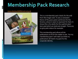
Card 3 This is an animal adoption card. Its purpose is shown clearly through the bold headline which has a big black bold font. It is simple with a logo and clear information about the adopted animal and the adopter’s name. It also has an expiry date as well which is useful and will also be crucial when I create my membership card. It uses clear colours, it is not double sided therefore once a user receives this card they can clearly read it, and it wont take them much time to read it, it is a very clear and visible card. It will be similar to what I am creating as I am also doing one to do with animals therefore what is used in this card I will take into account when creating my own animal adoption card. The animal print on the left hand side is also very pleasing and it caught my attention straight away, I think this is what makes the card look aesthetically pleasing.