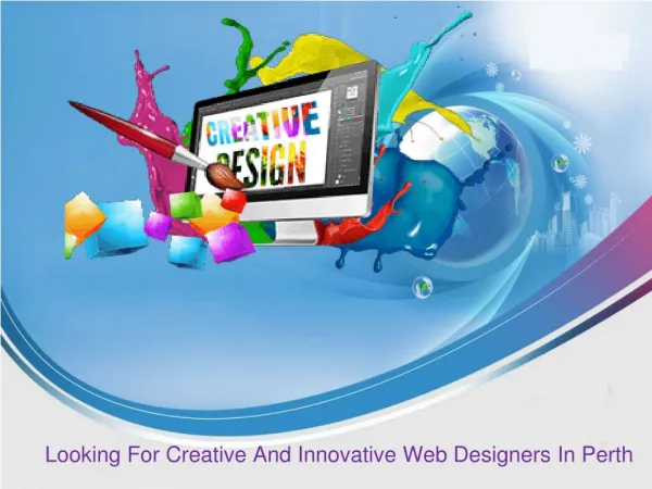
9 Creative and Innovative Navigation Web Designs
80 likes | 236 Vues
We have gathered some standard website navigation approach below that may spark your creativity. Browse through and explore them for yourself.

9 Creative and Innovative Navigation Web Designs
E N D
Presentation Transcript
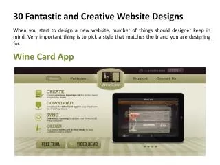
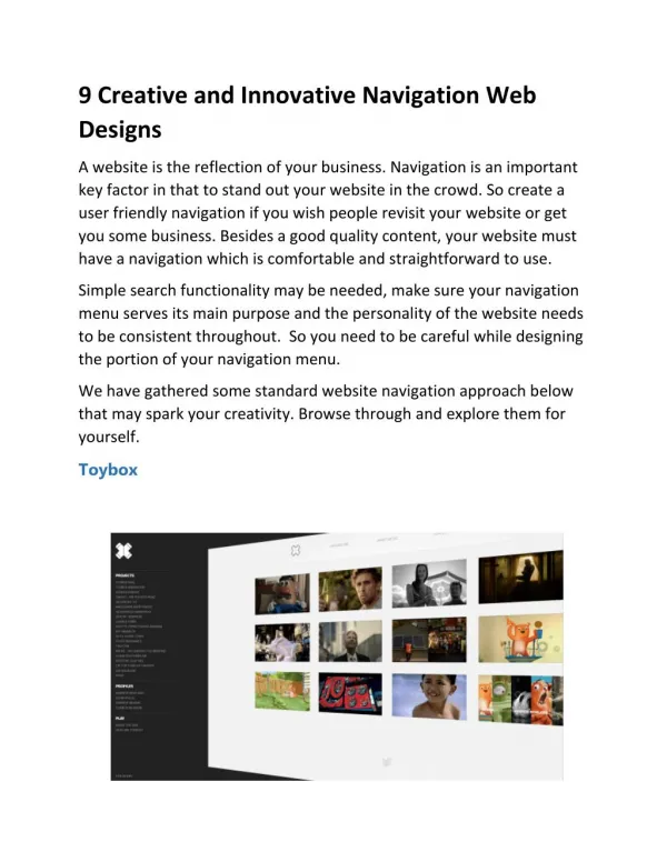
9 Creative and Innovative Navigation Web Designs A website is the reflection of your business. Navigation is an important key factor in that to stand out your website in the crowd. So create a user friendly navigation if you wish people revisit your website or get you some business. Besides a good quality content, your website must have a navigation which is comfortable and straightforward to use. Simple search functionality may be needed, make sure your navigation menu serves its main purpose and the personality of the website needs to be consistent throughout. So you need to be careful while designing the portion of your navigation menu. We have gathered some standard website navigation approach below that may spark your creativity. Browse through and explore them for yourself. Toybox
Navigation should always be there when needed, and disappear when the user wants to focus on a particular task. The navigation of this website is easy to use, and the swivel effect directs the user’s attention to the navigation bar when they’re using it. The hover effect is also fun, as the other images get pushed back and fade as the user focuses on one project. Diesel This website has navigation within each category created in a unique manner. When clicking each bucket, it zooms a bit, while the area around get blurry. Disqus Disqus offers simple yet effective navigation. The streamlined header is highlighted in white, which stands out against the blue background, and a footer navigation also appears with more options after scrolling down.
Olivier Bossel The navigation elements create an effect of exploding pixels as you hover over them. The effect is quite dynamic and contrasts with the otherwise clean design. It encourages the user to continue through the website.
House House is really amazing website for technological stuffing. Video background on the home page, parallax scrolling, and a single page design. Tsto Tsto, a design agency, has a simple yet unorthodox approach to design. A navigation element is fixed in each corner of the screen. With the “Work” tab in the top-left corner, and the “Contact” and “About” tabs at the bottom of the page.
As the user clicks through and views the large images, they get a clear idea of Tsto’s identity and work. Second Story Horizontal scrolling! Second Story’s website works like a magazine app on a tablet. It is innovative in that it doesn’t have the feel of a typical Web page and it scrolls horizontally. You can choose to view the portfolio in thumbnail view or as a slideshow.
Mostly Serious Mostly Serious has an element of playfulness to it. The navigation is designed as balloons floating around. The friendly animation creates movement on the static website and sets the tone for the brand personality. Glossy Rey With contrasting white text against a black background, the split navigation header is easy to locate and offers a really cool hover animation for each menu option.
Minimal Monkey Scrolling through articles reminds you of browsing a bookshelf. The hover effect singles out an article for the user to focus on. This website also has a clever design for the “About” and “Contact” sections: When you click on a tab, the page drops down to reveal the information. It’s a simple way to provide information without redirecting to another page.
Conclusion Above showcased some Creative and Innovative Navigation Menus. Navigation is critical or we can say that some sites do it better than others. Therefore the success of your web design is somewhat depend on how effective your navigation system is. As responsive web design can easily accessible on any device, without losing a brand image or functionality of website. Create a navigation system that is easy to use, functional, and understandable and most important fit into the theme of site. If you see some other great examples you can add them in the comments below. iMediadesign is a web design and development agency placed at toronto.