Download
1 / 42
420 likes | 455 Vues
Windows Presentation Foundation (WPF) allows developers to easily build and create visually enriched UI based applications. The classical UI elements or controls in other UI frameworks are also enhanced in WPF applications.

E N D
Controls iFour Consultancy https://www.ifourtechnolab.com/wpf-software-development
Controls • Windows Presentation Foundation (WPF) allows developers to easily build and create visually enriched UI based applications. • The classical UI elements or controls in other UI frameworks are also enhanced in WPF applications. • All of the standard WPF controls can be found in the Toolbox which is a part of the System.Windows.Controls. • These controls can also be created in XAML markup language. https://www.ifourtechnolab.com/wpf-software-development
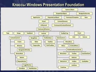
Control Library Building Blocks • ToolTip • Thumb • Border • Popup • Document Viewers • Frame • Ranges • Containers • Grid Layout • Label • Buttons • Editors • Lists • Menus and toolbars • Scroll Viewer https://www.ifourtechnolab.com/wpf-software-development
Grid Layout • Grid • Column Definition • Row Definition • Grid Lines https://www.ifourtechnolab.com/wpf-software-development
Labels • The Label control, in its most simple form, will look very much like the TextBlock which we used in another article. You will quickly notice though that instead of a Text property, the Label has a Content property. The reason for that is that the Label can host any kind of control directly inside of it, instead of just text. <LabelContent="This is a Label control."/> https://www.ifourtechnolab.com/wpf-software-development
Buttons https://www.ifourtechnolab.com/wpf-software-development
Editors • PasswordBox • TextBox • RichTextBox • InkCanvas https://www.ifourtechnolab.com/wpf-software-development
List • Four standard list controls- ListBox, ComboBox, ListView, TreeView. • List controls can be filled from one of the two sources. 1. Items Property 2. ItemsSource Property. https://www.ifourtechnolab.com/wpf-software-development
List View • List view derives from listBox • It has ability to separate view properties from control properties. • View property must be changed to grid view ad set properties on that object. https://www.ifourtechnolab.com/wpf-software-development
Tree view <TreeView> <TreeViewItem Header='Coders'> <TreeViewItem Header='Don' /> <TreeViewItem Header='Dharma' /> </TreeViewItem> <TreeViewItem Header='Noncoders'> <TreeViewItem Header='Chris' /> </TreeViewItem> </TreeView> https://www.ifourtechnolab.com/wpf-software-development
New Lists using Templates https://www.ifourtechnolab.com/wpf-software-development
Menus & ToolBars https://www.ifourtechnolab.com/wpf-software-development
Expander <Windowx:Class="GroupBoxDemo.MainWindow" xmlns="http://schemas.microsoft.com/winfx/2006/xaml/presentation" xmlns:x="http://schemas.microsoft.com/winfx/2006/xaml" Title="GroupBox Demo" Width="250" Height="180"> <Grid> <Expander Header=“Description" HorizontalAlignment="Left" Margin="10,10,0,0" VerticalAlignment="Top" IsExpanded="False" Height="299" Width="497"> <TextBlockTextWrapping="Wrap" Text="This is some text content." Margin="5"/> </Expander> </Grid> </Window> • Expander is a layout in which we can add control and expand it when we need. When have less space in our application then we can use expander layout. • We can assign the expand direction either down, up, left or right. • At the time of expander creation we can assign IsExpanded property true or false. It has the same drawback as GroupBox that it can contain only one control. https://www.ifourtechnolab.com/wpf-software-development
Group Box • The GroupBox control allows you to visually group content and provide a title for grouped elements. • When you use the default styling for a GroupBox, the child controls are surrounded by a border that includes a caption. There is no need to explicitly define a Border. • Configuring a GroupBox is similar to setting up an Expander. Both controls inherit from the same base class and include the same properties for controlling the header area and content. The key difference is that a GroupBox does not add the user interaction that permits the content to be expanded and collapsed. <Windowx:Class="GroupBoxDemo.MainWindow" xmlns="http://schemas.microsoft.com/winfx/2006/xaml/presentation" xmlns:x="http://schemas.microsoft.com/winfx/2006/xaml" Title="GroupBox Demo" Width="250" Height="180"> <Grid> <Grid.RowDefinitions> <RowDefinitionHeight="Auto"/> <RowDefinitionHeight="Auto"/> </Grid.RowDefinitions> <GroupBoxHeader="Mouse Handedness"> <StackPanel> <RadioButtonContent="Left-Handed"Margin="5"/> <RadioButtonContent="Right-Handed"Margin="5"IsChecked="True"/> </StackPanel> </GroupBox> <GroupBoxGrid.Row="1"Header="Double Click Speed"> <SliderMargin="5" /> </GroupBox> </Grid> </Window> https://www.ifourtechnolab.com/wpf-software-development
Separator • The Separator Control is used to separate items in items controls. • The intention is to divide the items on the menu or toolbar into logical groups. • It uses borders and rectangles. https://www.ifourtechnolab.com/wpf-software-development
TabControl • The WPF TabControl allows you to split your interface up into different areas, each accessible by clicking on the tab header, usually positioned at the top of the control. <Window x:Class="WpfTutorialSamples.Misc_controls.TabControlSample“ xmlns=http://schemas.microsoft.com/winfx/2006/xaml/presentation xmlns:x="http://schemas.microsoft.com/winfx/2006/xaml" Title="TabControlSample" Height="200" Width="250"> <Grid> <TabControl> <TabItem Header="General"> <Label Content="Content goes here..." /> </TabItem> <TabItem Header="Security" /> <TabItem Header="Details" /> </TabControl> </Grid> </Window> https://www.ifourtechnolab.com/wpf-software-development
Dialog • Standalone applications typically have a main window that both displays the main data over which the application operates and exposes the functionality to process that data through user interface (UI) mechanisms like menu bars, tool bars, and status bars. A non-trivial application may also display additional windows to do the following: • Display specific information to users. • Gather information from users. • Both display and gather information. • These types of windows are known as dialog boxes, and there are two types: modal and modeless. https://www.ifourtechnolab.com/wpf-software-development
A modal dialog box is displayed by a function when the function needs additional data from a user to continue. Because the function depends on the modal dialog box to gather data • the modal dialog box also prevents a user from activating other windows in the application while it remains open. • In most cases, a modal dialog box allows a user to signal when they have finished with the modal dialog box by pressing either an OK or Cancel button. • Pressing the OK button indicates that a user has entered data and wants the function to continue processing with that data. • Pressing the Cancel button indicates that a user wants to stop the function from executing altogether • A modeless dialog box, on the other hand, does not prevent a user from activating other windows while it is open. • For example, if a user wants to find occurrences of a particular word in a document, a main window will often open a dialog box to ask a user what word they are looking for. • Since finding a word doesn't prevent a user from editing the document, however, the dialog box doesn't need to be modal. • A modeless dialog box at least provides a Close button to close the dialog box. https://www.ifourtechnolab.com/wpf-software-development
Dialog-Message box • A message box is a dialog box that can be used to display textual information and to allow users to make decisions with buttons. • To create a message box, you use the MessageBox class. MessageBox lets you configure the message box text, title, icon, and buttons, using code like the following. • The following figure shows a message box that displays textual information, asks a question, and provides the user with three buttons to answer the question. stringmessageBoxText = "Do you want to save changes?"; string caption = "Word Processor"; MessageBoxButton button = MessageBoxButton.YesNoCancel; MessageBoxImage icon = MessageBoxImage.Warning; // Display message box MessageBox.Show(messageBoxText, caption, button, icon); https://www.ifourtechnolab.com/wpf-software-development
Message box(cont..) // Display message box MessageBoxResult result = MessageBox.Show(messageBoxText, caption, button, icon); // Process message box results switch (result) { case MessageBoxResult.Yes: // User pressed Yes button break; case MessageBoxResult.No: // User pressed No button // ... break; case MessageBoxResult.Cancel: // User pressed Cancel button // ... break; } https://www.ifourtechnolab.com/wpf-software-development
Other Common Dialog Boxes are • Open File Dialog • Save File Dialog Box • Print Dialog Box • A modeless dialog box, such as the Find Dialog Box shown in the following figure, has the same fundamental appearance as the modal dialog box. • Screenshot that shows a Find dialog box. • However, the behavior is slightly different, as described in the following sections. • A modeless dialog box is opened by calling the Show method. • Unlike ShowDialog, Show returns immediately. Consequently, the calling window cannot tell when the modeless dialog box is closed and, therefore, does not know when to check for a dialog box result or get data from the dialog box for further processing. • Instead, the dialog box needs to create an alternative way to return data to the calling window for processing. https://www.ifourtechnolab.com/wpf-software-development
Window • Window is the root window of XAML applications which provides minimize/maximize option, title bar, border, and close button. • It also provides the ability to create, configure, show, and manage the lifetime of windows and dialog boxes. • When you create a new WPF project, then by default, the Window control is present. <Windowx:Class="GroupBoxDemo.MainWindow" xmlns="http://schemas.microsoft.com/winfx/2006/xaml/presentation" xmlns:x="http://schemas.microsoft.com/winfx/2006/xaml" Title="GroupBox Demo" Width="250" Height="180"> <Grid> <Grid.RowDefinitions> <RowDefinitionHeight="Auto"/> <RowDefinitionHeight="Auto"/> </Grid.RowDefinitions> <GroupBoxHeader="Mouse Handedness"> <StackPanel> <RadioButtonContent="Left-Handed"Margin="5"/> <RadioButtonContent="Right-Handed"Margin="5"IsChecked="True"/> </StackPanel> </GroupBox> <GroupBoxGrid.Row="1"Header="Double Click Speed"> <SliderMargin="5" /> </GroupBox> </Grid> </Window> https://www.ifourtechnolab.com/wpf-software-development
Context Menu • A context menu, often referred to as a popup or pop-up menu, is a menu which is shown upon certain user actions, usually a right-click with the mouse on a specific control or window. • Contextual menus are often used to offer functionality that's relevant within a single control. https://www.ifourtechnolab.com/wpf-software-development
<RichTextBox> <RichTextBox.ContextMenu> <ContextMenu> <MenuItem Command="Cut"> <MenuItem.Icon> <Image Source="Images/cut.png" /> </MenuItem.Icon> </MenuItem> <MenuItem Command="Copy"> <MenuItem.Icon> <Image Source="Images/copy.png" /> </MenuItem.Icon> </MenuItem> <MenuItem Command="Paste"> <MenuItem.Icon> <Image Source="Images/paste.png" /> </MenuItem.Icon> </MenuItem> </ContextMenu> </RichTextBox.ContextMenu> </RichTextBox> https://www.ifourtechnolab.com/wpf-software-development
Third-party controls • Third-party controls are those which are not created by Microsoft but are created by some individual or company by using WPF User Control or Custom Control. Telerik and DevExpress are the most popular companies for creating third-party controls. https://www.ifourtechnolab.com/wpf-software-development
<Window x:Class = "WPF3rdPartyControls.MainWindow" xmlns = "http://schemas.microsoft.com/winfx/2006/xaml/presentation" xmlns:x = "http://schemas.microsoft.com/winfx/2006/xaml" xmlns:d = "http://schemas.microsoft.com/expression/blend/2008" xmlns:mc = "http://schemas.openxmlformats.org/markup-compatibility/2006" xmlns:local = "clr-namespace:WPF3rdPartyControls" xmlns:telerik = "http://schemas.telerik.com/2008/xaml/presentation" mc:Ignorable = "d" Title = "MainWindow" Height = "350" Width = "604"> <Grid> <telerik:RadCalculatorHorizontalAlignment = "Left" Margin = "174,25,0,0" VerticalAlignment = "Top" /> </Grid> </Window> https://www.ifourtechnolab.com/wpf-software-development
Calendar • Calendar is a control that enables a user to select a date by using a visual calendar display. • It provides some basic navigation using either the mouse or keyboard https://www.ifourtechnolab.com/wpf-software-development
Cont.…. https://www.ifourtechnolab.com/wpf-software-development
Date picker • A Date Picker is a control that allows a user to pick a date value. • The user picks the date by using Combo Box selection for month, day, and year values https://www.ifourtechnolab.com/wpf-software-development
Cont.…. https://www.ifourtechnolab.com/wpf-software-development
Image • A control that displays an image, you can use either the Image object or the Image Brush object. • An Image object display an image, while an Image Brush object paints another object with an image. https://www.ifourtechnolab.com/wpf-software-development
Cont.…. https://www.ifourtechnolab.com/wpf-software-development
Popup • Popup is a control that displays content on top of existing content, within the bounds of the application window. • It is a temporary display on other content. https://www.ifourtechnolab.com/wpf-software-development
Cont.…. https://www.ifourtechnolab.com/wpf-software-development
Progress Bar • Progress Bar is a control that indicates the progress of an operation, where the typical visual appearance is a bar that animates a filled area as the progress continues. It can show the progress in one of the two following styles − • A bar that displays a repeating pattern, or • A bar that fills based on a value. https://www.ifourtechnolab.com/wpf-software-development
Cont.…. https://www.ifourtechnolab.com/wpf-software-development
Scroll Viewer • A ScrollViewer is a control that provides a scrollable area that can contain other visible elements. https://www.ifourtechnolab.com/wpf-software-development
Cont.…. https://www.ifourtechnolab.com/wpf-software-development
Toggle Button • A Toggle Button is a control that can switch states, such as CheckBox and RadioButton. . https://www.ifourtechnolab.com/wpf-software-development
Cont.…. https://www.ifourtechnolab.com/wpf-software-development
tooltip • A tooltip is a control that creates a pop-up window that displays information for an element in the GUI. https://www.ifourtechnolab.com/wpf-software-development
Cont.…. https://www.ifourtechnolab.com/wpf-software-development