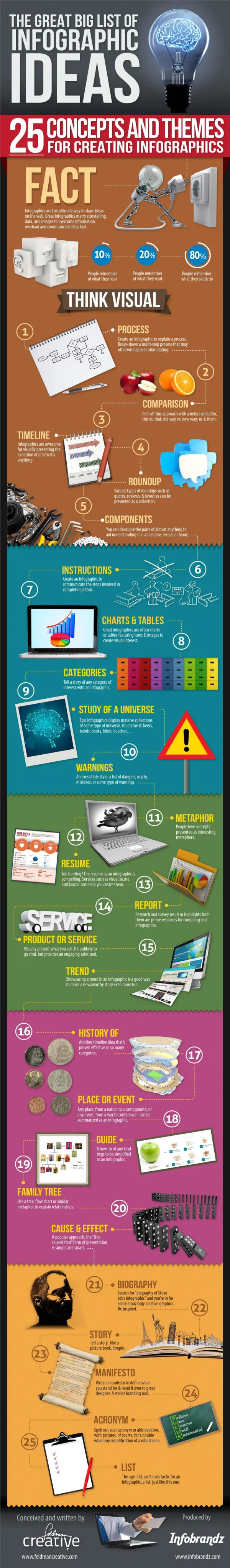
Effective Visual Design Tips for Engaging Video Conference Presentations
Creating visually appealing materials for video conference presentations can markedly enhance engagement. Our guidelines provide essential tips on using recommended typefaces, font sizes, and color schemes to ensure clarity and contrast. Titles should be bold at 40pt, with supporting text at 32pt, while maintaining a minimalist approach to avoid clutter. Visual elements like images can enhance appeal but may limit text space, so it’s important to balance both effectively. If you need assistance in reworking your existing presentation, feel free to reach out!

Effective Visual Design Tips for Engaging Video Conference Presentations
E N D
Presentation Transcript
Graphics & Visual Ideas Guideline tips are available for developing good looking visual materials for a videoconference presentation. Strong layouts can be difficult to visualize. We prepared the following slides as an aid. If you have an existing presentation that may not work well on television and need our help to rework it before you speak, please contact us as soon as possible.
Typeface and Font Sizes • The next four slides have the same text. • They use recommended typefaces and font sizes for each on-screen purpose. • We crammed about as much on each slide as possible and suggest you do not exceed this average number of characters. • These fonts are: Arial, Comic Sans MS, Tahoma and Lucida Sans Unicode. • Avoid font sizes lower than 20 pt.
The Best Titles are Bold 40pt. with Shadow • Text is best at 32 pt. with Shadow. • You can reduce • Supporting text to 28 pt. with Shadow. • Text is best at 32 pt. with Shadow. • You can reduce • Supporting text to 28 pt. with Shadow. • Text is best at 32 pt. with Shadow. • You can reduce • Supporting text to 28 pt. with Shadow.
The Best Titles are Bold 40pt. with Shadow • Text is best at 32 pt. with Shadow. • You can reduce • Supporting text to 28 pt. with Shadow. • Text is best at 32 pt. with Shadow. • You can reduce • Supporting text to 28 pt. with Shadow. • Text is best at 32 pt. with Shadow. • You can reduce • Supporting text to 28 pt. with Shadow.
The Best Titles are Bold 40pt. With Shadow • Text is best at 32 pt. with Shadow. • You can reduce • Supporting text to 28 pt. with Shadow. • Text is best at 32 pt. with Shadow. • You can reduce • Supporting text to 28 pt. with Shadow. • Text is best at 32 pt. with Shadow. • You can reduce • Supporting text to 28 pt. with Shadow.
The Best Titles are Bold at 40pt. with Shadow • Text is best at 32 pt. with Shadow. • You can reduce • Supporting text to 28 pt. with Shadow. • Text is best at 32 pt. with Shadow. • You can reduce • Supporting text to 28 pt. with Shadow. • Text is best at 32 pt. with Shadow. • You can reduce • Supporting text to 28 pt. with Shadow.
Preset Color Schemes • The nice thing about schemes are that • They provide a good color match and • They maintain a nice contrast ratio between the text and the background. • The nice thing about schemes are that • They provide a good color match and • They maintain a nice contrast ratio between the text and the background.
Images Decrease Text Space Adding Graphics or Photos, limits available text space as you design layouts. If need be, repeat the image for each point that follows.
Images Decrease Text Space Re-use the image, until you have made all points about the aspects of the visual presented. Vertical image layouts require more thought.
Images Decrease Text Space Twisted-pair Coaxial Fiber optic Horizontal layouts work best, but text space is always limited by the number and size of photos or graphic elements.
Images Decrease Text Space Be brief and to the point. Twisted Try fewer words per line for even better results. Coaxial Less is more on television. Fiber
We at OU-HCOMTELEHEALTHhope these slides are helpful. • If you have questions or need help, please feel free to give us a call. • Dan Smith, 740-593-2460 • smithd6@ohio.edu • Phil Swatzel, 740-593-9592 • swatzel@ohio.edu