Common Presentation Mistakes and How to Avoid Them
290 likes | 410 Vues
Presentations need to be clear and engaging to effectively convey your message. This guide by Robert Yee highlights common mistakes such as overcrowding slides with text, using unreadable fonts, and overwhelming your audience with multimedia. It emphasizes the importance of maintaining a balance between spoken content and visual aids. Also discussed are tips for structuring your presentation, choosing the right software, and engaging with your audience. Follow these guidelines to make your presentation effective and memorable.

Common Presentation Mistakes and How to Avoid Them
E N D
Presentation Transcript
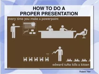
HOW TO DO A PROPER PRESENTATION Robert Yee
Common Mistakes and What Not to Do • There is no need to make it more complicated than you need to • Your presentation is supporting information and shouldn't be overly complex • Don't have multitudes of information • It shouldn't be a wall of text that is repeating exactly what you are saying • If you want people to read, then don't talk • If you want people to listen to you, don't make them read • I mean really, if you have this much text on a slide, there is no way for people to be listening (absorbing your information) and reading (absorbing what they see), cause we are old and most people older than me have a very hard time receiving multiple forms of input. Also, research says that even you can't multitask as well as you think.
Common Mistakes and What Not to Do... continued. • Avoid multimedia unless it's relevant. • Later, we'll revisit multimedia and when it's right to use. • Don't try being too creative with how it looks. • This isn't an art project, it's a presentation. • The slides support the spoken presentation, not the other way around.
More Common Mistakes: • Don't use: • Comic • Decorative • or other fancy fonts, if they are at all difficult to read • Clear fonts that I would recommend:
Arial (sans serif -without serif (tails))
Times New Roman (serif - tails)
Lucinda Sans (mixed serif – note the tail on the 'a')
Getting started with a Presentation Pick a presentation program that works
Microsoft (Office) Power Point • Free at school, or purchased (about $100) • We have it here • Most popular business presentation software
Open Office – Impress • Free download • Not as fancy • Can be saved to PowerPoint format. (though this can be buggy so test it)
iWork- Keynote • Apple Keynote (MAC ONLY!!!) • As seen in An Inconvenient Truth • $79 for the sweet
Google Docs Presentation Google Docs • Internet based • Free (you must make a google account) • Can be saved to your computer
Short Term Options • See if trial versions are available • Free for 30 days • Locks up after 30 days
Hierarchy • Hierarchy is the clear presentation of importance of multiple items • If it's important make it BOLD • If it's special, make it ITALICS • The lower the level of importance the smaller the text • In theses slides: • title is 44pt font • first bullet is 32 pt • sub bullets 28pt • Tertiary bullets 22pt
Don't Crowd the Information • You can have as many slides as you want • No need to cram all of your information onto a single slide • If it's a major point or element, give it it's own slide
Format your Presentation • Pick a nice background that fits your presentation them • Be uniform with transitions
Page 1: Stir up some interest • Get your presentation up on the computer and on the screen before you set up anything else • Make a title page • Have a couple clear images of your project with you in it • Have the project title on this page and your name
Robert Yee Presentation Title Page Example
Introduction • An introduction gives an overview of what you are discussing • Include background information about the project
Body: In the Beginning • Where did you start? • Use images and supporting notes to inform us about the your growth. • We do not need to see your notes
Body: Progress • Show and discuss you projects progress • Did you stumble? • Was it easy or hard? • If you had a hiccup show it
Body: The Finished Product • Show your work and progression • Make sure you are displaying the finished product
Conclusion • The conclusion slide should be like a title page, but with more of a time line of images • Reflect on your project
Conclusion: Wrap Up • Discuss what you have gathered from the project • Make points to positive and negatives • Ask for questions about your work • Thank the panel for their time
P.S. Movies • Place the video at the end of the presentation so to not push for time • IF you use multimedia, make it its own slide • keep it short • 15-20 seconds max • A video is only to show a performance, not to burn time • i.e.: a video of you ballroom dancing
Movie Example • Use the right format • AVI will run on almost all widows machines. • TEST the video on the computer you will be presenting on!!!
Better Safe than Sorry • Save your work 4 times • Thumb drive • S: drive (your account here at school) • As a PDF file (that can be printed out if necessary • And email it to yourself • “My dog ate my homework” doesn't fly here, either you have it or you don't
Keys for Speaking • Practice, practice, practice • Don't talk at the panel, talk to them • BREATH • being nervous is OK, passing out isn't • If you don't have anything to say, then don't say anything • Umm, uhh, like, and … are poor word choices, pause and collect your thoughts rather than trying to push through and stutter