Download
1 / 16
170 likes | 346 Vues
This is the best color scheme. Yellow over dark blue. Which is a two color screen with lighter on top fading to darker on bottom. Denotes and influences calmness. Slows breathing and heart rate. Often associated with dry, formal presentation due to overuse. Stimulates interaction.

E N D
This is the best color scheme Yellow over dark blue. Which is a two color screen with lighter on top fading to darker on bottom.
Denotes and influences calmness. Slows breathing and heart rate. Often associated with dry, formal presentation due to overuse. Stimulates interaction. Promotes discussion. Blue Green
Avoid Brown • Connotes uneasiness, passivity, immaturity. • Unimportance and appears as a washed out blue to about 25% of the population who have difficulty with red/green perception issues.
Text for Retention • Highlighting specific texts aids in retaining not only the information highlighted, but the entire page. • Highlighting is best used for stressing points but also for assisting in mentally cataloguing or arranging the information for the reader.
Timing • Study of timing of information shows that presentation of information is most effective when it is received 7 seconds prior to the accompanying.
Timing is important • Slides are best put up 7 seconds before the speaker begins speaking. • This gives the audience time to orient to the new information.
Text is Important • Text should be in standard fonts • Text should be limited to no more than 7 bullets on a slide • Text should be of a font size that is readily readable. • Use bullets and encourage the reader to scan to the most important item.
Pictures • No more than one picture per slide • Picture should always be on point • If picture needs a legend to understand, be sure to provide it
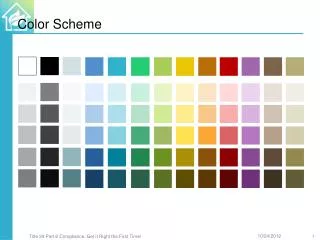
Colors • Yellow over blue is one of most effective • Red is good with limited use, but not with greens • In some groups red may be a problem (accountants)
More on Color • Avoid Blue text over black background • Text to background should generally be color wheel opposites • Color adds power and enhances memorization
Use simple shapes when presenting graphics Photos are not necessarily as powerful as shapes Simple is best Avoid long sentences. Limit graphs or pictures to one main thought. Avoid being too Artsy
Effectiveness • Use of visuals increases persuasiveness by up to 43% over an audio presentation alone. • Audiences expect the better presenters to use high quality visuals.
Colors • Background colors affect mood. • Culture influences color choice. • Pink is considered frilly, yet pink tinted colors bring warmth and work well. • Colors such as rust, rose, magenta are all pink in undertones and work well.
Reds • Reds bring emotion, but can increase aggressive reactivity to presentation. • Reds associated with passion, desire, competitiveness. • Increases pulse rate, breathing rates, risk taking behaviors. • Use it to make points.
Black • Denotes professionalism and finality • Also starkness and emphasizes the black and white aspects of an issue. • Reserve for formal presentations or use in the last slides to note the ‘final word’ or bottom line.
Gender • Men prefer reds that have yellow-brown undertones such as rust. • Women prefer blue based reds, such as brick red, maroon, burgundy, and crimson.