
Ybf
E N D
Presentation Transcript
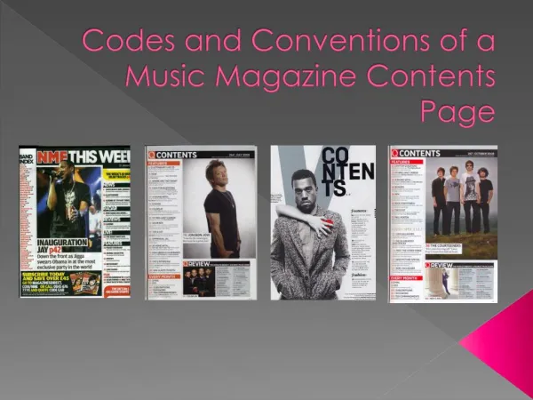
The word contents is in capital letters and is bold, it is the biggest text on the page, therefore stands out from the rest. Also, it is found in the top left hand corner in this magazine, which follows the codes and conventions as it is at the top of the page. The date on the contents page reinforces the one on the front cover. The main image is the biggest on the page, this is because it is usually a picture of the artist who the main cover line on the front cover is about. For example, this magazines cover line is clearly about Jon Bon Jovi, who is used as he is a very popular musician. The page numbers are bold, and different colour to the subheadings but this usually reflects to front cover colour scheme, also they are all in line so it is easier for the audience to find their desired article. These are probably different to the front cover’s cover lines, this allows the audience to further know what the magazine is about. This magazine has subsidiary images of Coldplay, this is done so that people who are not fans of Jon Bon Jovi can be drawn in through the use of other popular artists, also they may have featured on a cover line and sub line on the front cover , therefore feature on the contents page.
The word contents It is very big and bold and tends to be in capitals, somehow it is separate from the rest of the other texts and also bigger than the rest of the texts. Also, the colour of it usually fits in with the colour scheme but has a specific font, usually the magazines own. The word is also usually found at the top of the magazine, either at a corner or in the middle.
Main Image It is usually an image of the artist, who the main cover line on the front cover is about.
Subsidiary images Usually about the cover lines and sub lines on the front cover, this allows a wider target audience to be reached.
Page numbers Tells the audience where the articles are located. The numbers are made evident, as they are usually made bold or blocked off, they also reflect the colour scheme and are either on the left or are in line with each other. They also go chronologically per section. The font tends to be size 12/13 for the headline or bold or in capitals and it tends to be size 11 for the sub lines. Also, there is a line gap between each section.
Colour scheme The colour scheme is usually a reflection of the colour scheme on the front cover.
Date This is placed in the contents page to reinforce the date, from the front cover.
Cover lines They are usually different to the front cover’s cover lines, this allows the audience to further know what the magazine is about.
Editor’s letter It introduces the audience to what is in the magazine and helps to establish what is happening. It also helps to establish a relationship between the reader and the magazine.
Subscription advert It help’s the magazine to guarantee income, also it allows the reader to know that, long term, the subscription will be cheaper for them.
Feature article These are articles that are specific only to that issue, which allows the reader to understand this.
Regular articles These can be labelled anything from, ‘regulars’, ‘every month’ or ‘this week’. Things that are regular can be posters, reviews, competitions, etc.
Masthead This includes the magazines logo, therefore the masthead allows the audience to recognise the magazine.
Smaller version of front cover It is usually small and in the corner of the page.
Social media pages This allows the magazine to be a cross-media product, and allow the audience to know when the magazine is out, through social media.
Layout Usually in columns, set up in two main areas, so that the contents page is organised.