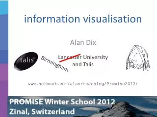
information visualisation
information visualisation. Birmingham. Alan Dix Lancaster University and Talis. www.hcibook.com/alan/teaching/Promise2012/. example Map your moves. where New Yorkers move (10 years data) distorted map circle = moves for one zip code red – out blue – in overlaid.

information visualisation
E N D
Presentation Transcript
information visualisation Birmingham Alan Dix Lancaster Universityand Talis www.hcibook.com/alan/teaching/Promise2012/
exampleMap your moves • where New Yorkers move (10 years data) • distorted mapcircle = moves for one zip code • red – outblue – in • overlaid http://moritz.stefaner.eu/projects/map%20your%20moves/
exampleMap your moves • interactive: selecting a zip code shows where movements to/from • also hiding: what you don’t show also important http://moritz.stefaner.eu/projects/map%20your%20moves/
what is visualistion? making data easier to understandusing direct sensory experience especially visual! but can have aural, tactile ‘visualisation’
direct sensory experience N.B. sensory rather than linguisitic sort of right/left brain stuff! but ... may include text, numbers, etc.
visualising in textalignment - numbers • think purpose! • which is biggest? 532.56179.3256.3171573.94810353.142497.6256
visualising in textalignment - numbers • visually: • long number = big number • align decimal points • or right align integers 627.865 1.005763 382.583 2502.56 432.935 2.0175 652.87 56.34
visualising in textTableLens like a‘spreadsheet’ ... ... but some rows squashed to one pixel high numbers become small histogram bars
focussome rowsin full detail contextwhole datasetcan also be seen in overview visualising in textTableLens N.B. also an example of focus+context
especially visual visual cortex is 50% of the brain! ... but disability, context, etc., may mean non-visual forms needed
why visualisation? • for the data analyst • scientist, statistician, probably you! • for the data consumeraudience, client, reader, end-user
why visualisation? understanding consumer focus on well understood, simple representations rhetoric
why visualisation? to help others see what the analyst has already seen understanding consumer infographics rhetoric data journalism http://www.guardian.co.uk/news/datablog/2010/oct/18/deficit-debt-government-borrowing-data
why visualisation? the business plan hockey stick! understanding consumer rhetoric to persuade readers of particular point(and not others!) lies, damn lies, and graphs
why visualisation? understanding analyst powerful, often novel visualisations, training possible exploration
why visualisation? to make more clearparticular aspectsof data understanding consumer confirming hypotheses noticing exceptions exploration e.g. box plots in stats graph from: Measurement of the neutrino velocity with the OPERA detector in the CNGS beam
why visualisation? seeking the unknown avoiding the obvious understanding wary of happenstance consumer exploration to find new thingsthat have not been previously considered
a brief history of visualisation from 2500 BC to 2012
a brief history ... • static visualisation • the first 2500 years • interactive visualisation • the glorious ’90s • and now? • web and mass data • visual analytics
static visualisationfrom clay tablets to Tufte • Mesopotamian tablets
static visualisationfrom clay tablets to Tufte • Mesopotamian tablets • 10thCentury time line
static visualisationfrom clay tablets to Tufte • Mesopotamian tablets • 10thCentury time line • 1855 Paris-Lyon train timetable
static visualisationfrom clay tablets to Tufte • Mesopotamian tablets • 10th Century time line • 1855 Paris-Lyon train timetable • Excel etc.
static visualisation • read Tufte’s books ... • The Visual Display of Quantitative Information • Envisioning Information • Visual Explanations
interactive visualisation • early 1990s growing graphics power • 3D graphics • complex visualisations • real-time interaction possible
... and now • loads of data • web visualisation • data journalism http://www.guardian.co.uk/news/datablog/2010/oct/18/deficit-debt-government-borrowing-data http://www-958.ibm.com/software/data/cognos/manyeyes/
plain visualisation visualisation data
visual analytics data visualisation processing directinteraction
the big picture organisationalsocial & politicalcontext ? action world decision data visualisation processing directinteraction
choosing representations • visualisation factors • visual ‘affordances’ • what we can see • objectives, goals and tasks • what we need to see • aesthetics • what we like to see what we can see what we need to see what we like to see
trade-off • visualisation factors • visual affordances • objectives, goals and tasks • aesthetics • static representation trade-off • interaction reduces trade-off • stacking histogram, overview vs. detail, etc. etc. • interaction reduces trade-off • stacking histogram, overview vs. detail, etc. etc.
? relaxing constraints • normal stacked histogram • good for: • overall trend • relative proportions • trend in bottomcategory • bad for others • what is happening to bananas?
make your own (iii) relaxing constraints • interactive stacking histograms ...or ... dancinghistograms • normal histogramexcept ... dancinghistograms normal histogramexcept ...
make your own (iii) relaxing constraints • interactive stacking histograms ...or ... dancinghistograms • normal histogramexcept ... • hover over cell to show detail
demonstration make your own (iii) relaxing constraints • interactive stacking histograms ...or ... dancinghistograms • normal histogramexcept ... • hover over cell to reveal detail • click on legendto changebaseline
kinds of interaction • highlighting and focus • drill down and hyperlinks • overview and context • changing parameters • changing representations • temporal fusion
Shneiderman’svisualisation mantra • overview first, • zoom and filter, • then details on demand overview zoom and filterusing sliders detailson demand http://www.sapdesignguild.org/community/book_people/visualization/controls/FilmFinder.htm
displaying groups/clusters • numeric attributes • use average or region • categorical attributes • show values of attributes common to cluster • text, images, sound • no sensible ‘average’ to display • use typical documents/images • central to cluster ...or spread within cluster
using clustersthe scatter/gather browser take a collection of documents scatter: • group into fixed number of clusters • displays clusters to user gather: • user selects one or more clusters • system collects these together scatter: • system clusters this new collection...
keywords (created by clustering algorithm) ‘typical’ documents(with many cluster keywords) displaying clustersscatter-gather browser
hierarchical data • hierarchies are everywhere! • file systems • organisation charts • taxonomies • classification trees • ontologies • xml