Color and Text Guidelines
510 likes | 542 Vues
Ableism is deeply ingrained in society, posing as natural and necessary discrimination. This presentation explores how even seemingly benign features like stairs can perpetuate ableist ideals. Designed for accessibility, it offers guidelines and tips for creating inclusive presentations for those with low vision.

Color and Text Guidelines
E N D
Presentation Transcript
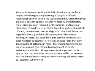
Ableism is so pervasive that it is difficult to identify until one begins to interrogate the governing assumptions of well-intentioned society. Within the space allowed by these rhetorical premises, ableism appears natural, necessary, and ultimately moral discrimination required for the normal functioning of civilization. Consider a set of stairs. An ableist culture thinks little of stairs, or even sees them as elegant architectural devices —especially those grand marble masterpieces that elevate buildings of state. But disability rights activists see stairs as a discriminatory apparatus—a "no crips allowed" sign that only those aware of ableism can read—that makes their inevitable presence around government buildings a not-so-subtle statement about who belongs in our most important public spaces. But the device has become so accepted in our culture that the idea of stairs as oppressive technology will strike many as ludicrous. (Cherney, 4)
Color and Text Guidelines For the Development of Power Point, Computer and Web Page Presentations and Text Applications for Audiences that may Include Persons with Low Vision
This is a presentation developed by the American Printing House for the Blind. Viewers are invited to download and use this presentation for the dissemination of information about accessibility issues for persons with low vision. Distribution of this presentation for payment is strictly prohibited, as is changing the content thereof. C 2008 American Printing House for the Blind
When you design for audiences that may have persons with low vision, put yourself in their shoes by imagining you are viewing the presentation through a shower curtain. What will you need to be able to actually see the presentation?
Research Shows San Serif fonts should always be used for text and headings of more than one line. Some good choices are: Verdana Tahoma APHont Antique OliveArial
Headings should be 32 points or larger for Power Point, 22 or larger for web pages and print.
A. Subheadings Subheadings should be 30 points or larger for Power Point, 20 or larger for web pages and print.
Text should be 28 points or larger, if possible, for Power Point Presentations, 18 or larger for web pages and text. Bold text is more visible than standard text.
Remember for PRINTED text: Standard Print = 12 points Enlarged Print = 14 and 16 points Large Print = 18 points or larger Enhanced Print = 18 points or larger with additional formatting to make the document more readable.
Formatting for ENHANCED PRINT: 18 point or larger text 1.25 spacing between lines Margins flush left and rag right Block paragraphs, no indents San serif font, wide bodied No columns Lines of text average 39 characters Use of color and/or b/w line drawings Complete guidelines available at: www.aph.org/edresearch/lpguide.htm
Avoid italics, if possible. Better choices are: Underscoring, “enclosing in quotation marks,” or bolding.
Backgrounds • Should be simple, not graphical, and should be one color, preferably light pastel or white if black print is used. • Two color gradients are acceptable where one is white and the other is pastel. .
Two color gradients are also acceptable where one is not white if the pastel colors are adjacent on the color wheel.
Gray should be avoided in both text and background • Gray should be avoided in both text and background
Shades of gray should not be used together either as graphic features, background or text Shades of gray should not be used together either as graphic features, background or text because there is almost no contrast
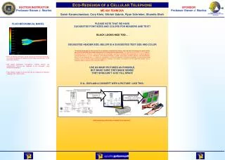
Text and background should be of high contrast. If the text is dark, the background should be light. If the text is light, the background should be dark.
Some good text/background color combinations are: Dark green and white Dark red and white Yellow and violet Violet and white Dark blue and yellow Black and white Black and yellow Pink and black Dark blue and white
Because they provide poor contrast, certain colors should not be used together either as graphic features, background or text: Red and green Blue and black Green and black Violet and black Red and black Dark blue and violet Two values of the same color
Complex or graphic backgrounds make text Difficult to read. Keep backgrounds simple so text will be visible.
Shadowed text also limits the contrast between the letters and the background.
Shadowed text also limits the contrast between the letters and the background.
Acceptable ANIMATION FEATURES include Fly in from left Wipe right Appear Typewriter Laser from right
Slides should be simple with no more than 3 different blocks of information, nor more than six individual lines of information per block .
Avoid putting information in columns if possible. Lines of text of 28-39 characters are preferred • Bulleted lists are an exception. • No more than six bulleted lines
Where bulleted lists occur side by side, text of one list should be on a different colored background to avoid confusion: • zebra • emu • gazelle • flamingo • giraffe • fur • feathers • horns • legs • neck
Avoid divided words at the ends of lines, because it is difficult for the person with low vision to read. I pledge allegiance to the flag of the u- nited states of America, and to the re- public for which it stands, one nation under God, indivisible with justice and lib- erty for all.
LETS TALK ABOUT GRAYSCALE GRrrrrrrrrrr
Grayscale is not a good option for photos, graphics, graphs, maps or charts. It should be avoided if at all possible. Here’s why.
Four gradations, though not ideal might be distinguishable, but what about more than that ? How does that look to the person with low vision?
What could you do instead? High Contrast Areal Patterns
Here is why Grayscale is not useful for persons with low vision. What the devil is this?
Grayscale photos are not advisable because they do not provide good contrast.
Color provides much better contrast in most instances.
If color is not possible, clean black-and-white illustrations are preferred. No Grayscale!
Where maps or charts are included, color is preferred over grayscale. Text on maps or charts should adhere to APH large print guidelines including print size.
Here are the colors that color blind people see. YELLOW RED GREEN PURPLE
ALMOST EVERYONE CAN SEE THESE COLORS even those with sex-linked color blindness.
So why don’t we use them in universal design?
We could have This!
Even though everybody likes blue, we should avoid it as a background color for slides, presentations, posters Computer screens and text. Blue makes the eyes work 2 trillion times harder per second than red, pink, orange or yellow. Make default screens, and backgrounds warm, pastel colors.
Make choices that will: • provide excellent contrast • provide comfort to the reader • be easy to interpret • be large enough • be friendly to people with visual impairments and/or color blindness
When making printed handouts from Power Point slides, two or fewer slides per page is preferred. Remember, what you do to make your presentation accessible for the person with low vision will ultimately make it more readablefor everyone.
For more information please see, Kitchel, E. (2004). Guidelines for the Development of PowerPoint Presentations for Audiences that may Include Persons with Low Vision. American Printing House for the Blind. Available at http://www.aph.org/tests/ppguide.html Kitchel. E. (2001). Large Print: Guidelines for Optimal Readability and APHont(TM) a font for low vision. American Printing House for the Blind. Available at http://www.aph.org/edresearch/lpguide.htm


![[PDF] Bovine Pathology: A Text and Color Atlas Kindle](https://cdn7.slideserve.com/12519034/slide1-dt.jpg)
![[PDF READ ONLINE] Color Atlas and Text of Histology](https://cdn7.slideserve.com/12532714/slide1-dt.jpg)