SE7EN
SE7EN. Analysis of Title Sequence Produced by Umair Hussain. Initial shot.

SE7EN
E N D
Presentation Transcript
SE7EN Analysis of Title Sequence Produced by Umair Hussain
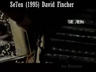
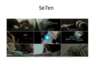
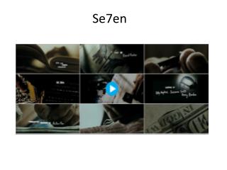
Initial shot • The initial shot of the title sequence shows a blank book/journal in focus. This adds a very dark and sinister effect as the room is dark as well. The audience becomes curious as to why this book is important. As well as this the audience can also see an out focused pair of hands behind the book which adds to the mysterious initial shot. The non diegetic music in the background sounds distorted and eerie which adds to the horrifying effect.
Close ups and shot changes • After some research on the Se7en title sequence I have found out that only the title sequence used 70 total shots within 2 minutes. Of which most of them were close ups to keep the mysterious character’s identity hidden. This would on average mean 2 shots were used in a space of 1.16 seconds. The reason for this is to keep the audience curious because they cannot analyse the mise en scene quick enough. Although the only thing the audience would be able to notice would be the creepy detail such as the close up shots of the knives and carving tools. This lets the producers control what the audience see and feel. The close ups are also very focused on detail such as the figure cutting his own skin off. While doing this the background was out of focus so this is the only image the audience can pay attention to.
Storyline/Content • The storyline/content of the title sequence is quite unclear which is what makes the title sequence more creepy and sinister as the audience is wondering what is the connection between all the images and shots. In the title sequence we see a mysterious figure cutting his own fingertips which insinuates he is a psycho and is possibly removing his fingerprints. This starts to make the audience and assume which drags them into the movie further. We also know the figure is male by his manly hands as well as his rough broad outline. He then writes in the blank book and reads over and crosses out words like ‘Pregnant’, ‘intercourse’ and ‘transsexual’. This shows this man is not mentally well. We also know this man is linked to religion and possibly thinks he is God because he cuts out the word God from the dollar bill and then tapes down a picture of what seems to be a torture idea of a man with a contraption around his head which includes a screw going through the front of his face to the back of his head. We then see many flashing images of the creepy male sewing his book together which could imply he is creating his own bible or religious scripture.
Mise en Scene • The mise en scene of the title sequence included many strange objects which would not be common possessions. This included knives, carving tools, sewing tools, screws, old scriptures, random dollar bills and film reels. The film reels shows us this film is not set in modern times as now there is an up rise in digital technology. All the objects listed above were in various shots which were flashed on screen very quickly so the audience only sees them very quickly. In addition there were many shots that included random writing such as “C-24” which were flashed extremely quick so the audience only sees them subliminally which may mean something later in the film.
Font/Titles • The font of the titles are seen to be very rough and untidy. They also flicker a lot which adds to the thriller/horror genre as they are not still and boring. As well as this they are bright white on a flickering grey and black background which is a sharp contrast between the two. The font would be classed as a handwritten font which makes us think automatically this is the font of the male figure. The font is also not big so this leaves a lot of blank space in the background which seems filled with all the flickering.
Conclusion • In conclusion Se7en has a very powerful title sequence which makes the audience curious and leaves them wanting more which forces them to continue the movie. Se7en initialised the genre very well (Thriller/Crime) by using techniques such as a quick image changes as well as the use of props and mise en scene. Lighting was also used very well (low key).

