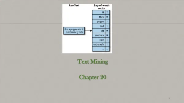

Chapter 12: Text
E N D
Presentation Transcript
Chapter 12:Text Created with www.wordle.net
Chapter 12 Text • Human Issues Concerning Text • The Reading Process • The Reading Purpose • Paper versus Screens • Using Text in Interaction Design • Technical Issues Concerning Text
Human Issues Concerning Text • The Reading Process • Saccades: Quick, jerky movements • Fixations: Intermittent pauses on areas of interest • Visual and cognitive processing occurs during fixation but not during saccades. • If text is difficult to comprehend, if it includes long or unfamiliar words, fixations increase in duration
Human Issues Concerning Text • The Reading Process
Human Issues Concerning Text • The Reading Process We read extended text passages more quickly in lowercase than uppercase • Lowercase presentation is more common • Lowercase words have more distinctive shapes
Human Issues Concerning Text • The Reading Purpose • Continuous process (novel) • Scanning • Reading from screens or paper • Paper is more flexible than electronic media • We often rely on our spatial memory when we search for information Place holders
Human Issues Concerning Text • Annotation aids comprehension • I have done quite a lot of annotation research. Have a look here http://www.cs.auckland.ac.nz/research/hci/digital_ink/annotation_tools/index.shtml
Using Text in Interaction Design • Commentary/Instrumental • Legibility • Readability • Physical Factors
Using Text in Interaction Design • Commentary – Text that informs • The most common form is help text (information website fall into this category) • Contextual help provides immediate assistance to users without requiring them to leave the context in which they are working, such as pop-up menus. • Procedural help provides the steps necessary for carrying out a task. • Reference help serves as an online reference book. • Conceptual help provides background information, feature overviews, or processes.
Using Text in Interaction Design • Instrumental – Text that does work • Controls: the control’s function and its label are viewed as one entity • Buttons • Checkboxes • Radio Buttons • Icons • Hyperlinks
Using Text in Interaction Design • Hypertext Hypertext links must give unambiguous indications of the target destination • Krug - Don’t Make Me Think (2006) - suggests that what is important is not so much the number of links that a visitor must click but rather the quality of the links • Visually impaired – screen readers will tab between links and read the link text. • The most unhelpful links are multiple ‘click here’
Using Text in Interaction Design • Legibility - Legibility is an essential first step in the reading process • font size • foreground/background contrast • Take environmental conditions into consideration • Consider age and possible vision impairments • Our capacity to perceive details decreases with age
Using Text in Interaction Design • Readability • Comprehension is affected by: • Line length • Line spacing • Formatting • Margin width • Scrolling • It is also affected by grammatical issues, such as semantics and syntax
Using Text in Interaction Design • Font size • Factors that affect font size: (Horton, 1994) • Reading Distance—Greater distances require larger text. • Screen Resolution—Smaller text requires greater resolution to keep the characters clear and legible. • Text/Background Contrast—Negative contrast is optimal (black type on a white background). • Visual Acuity of User—Not all users have 20/20 vision. • Type of Reading—Text can be scanned, read word by word, or read character by character
Using Text in Interaction Design • Font size • General benchmarkformula for font size, given normal vision and optimal conditions Font Size = 2d(tan(/2)) X DPI • Line length • Line length affects reading performance but not comprehension • Lines of greater length are read more quickly • People prefer medium line lengths
Using Text in Interaction Design • Margin width • Shorter lines—4 inches—with large margins increased reading performance • Maximal use of white space • Vertical line spacing • The spacing between lines of text (single spacing, double spacing, etc.) is called leading • Double spacing has been shown to improve reading speed • It might necessitate a smaller font size to increase the amount of visible information per screen • Alignment • Use left or justified • right and centre are harder to read because can’t easily find beginning of the line
Using Text in Interaction Design • Contrast - Contrast sensitivity decreases significantly with age • Color Contrast • Because black and white have the highest contrast the addition of any color will reduce the contrast • Luminance contrast is more significant than color contrast
Using Text in Interaction Design • Scrolling versus paging • Scrolling facilitates maintenance and printing • The choice of paging versus scrolling depends on task and layout Scrolling Paging
Technical Issues Concerning Text • Components of Digital Text • Character Set = Character Repertoire + Character Codes + Encoding Scheme
Technical Issues Concerning Text • ASCII • Basic ASCII uses 7-bit encoding, which allows it to represent 128 characters. • Including alphanumeric and some nonprinting characters such as line feed and carriage return • ASCII was extended to 8 bits, allowing for 256 characters • Unicode – incorporates older coding systems and has representations for all (modern, don’t think you will find representations for ancient Egyptian or Mayan) written languages
Technical Issues Concerning Text • Fonts Serif Sans serif Cursive • People still argue whether serif or san serif is easier to read on a screen • Cursive text requires high-resolution screens • Variable-width font ioioioioio • Fixed-width font ioioioioio
Technical Issues Concerning Text • Fonts
Technical Issues Concerning Text • Web Text • Structure • Presentation • Web Fonts • Hypertext • The fundamental difference between web text and paper is that web text is dynamic • Browser window size • Operating system (fonts, colours) • Device size
Technical Issues Concerning Text • Web Text – Structure • HTML elements are used to create the structure of a web page <title>Company Name—Area of Site—Specific Page</title> <h1> Topic #1</h1> <h2>Sub-topic #1</h2> <h2>Sub-topic #2</h2> <h3>Sub/Sub-topic #1</h3> <h1>Topic #2</h1> <h2>Sub-topic #1</h2> <h2>Sub-topic #2</h2>
Technical Issues Concerning Text • Web Text – Presentation • Cascading Style Sheets (CSS) are used to create the presentational aspects of a web page • Some markup elements have inherent presentational qualities. • Styles must be appropriate for the markup elements to which they are assigned. • Styles must be derived from and serve to clarify the content. • Styles should not compete with the content. • Styles should not conflict with user’s expectations.
Technical Issues Concerning Text • Web Fonts • We can use the CSS font-family property to specify a particular font – it must reside on the user’s computer • Fonts like Times New Roman and Arial are the most prevalent on the Internet due to their large installed user base • At low point sizes, serif fonts suffer reductions in legibility • Georgia, Verdana, and Trebuchet maintain legibility at small sizes and have been designed to facilitate reading on the Web
Technical Issues Concerning Text • Hypertext • Hyperlinks have three states • Normal – blue • Active – red • Visited – purple Hypertext links at Useit.com
Technical Issues Concerning Text • Hypertext • Hyperlinks must be obvious • Try to avoid ‘click here’ • CSS can be used to change the color of hyperlinks • There are four possible states a:link { color: red } /* unvisited links */ a:visited { color: blue } /* visited links */ a:hover { color: yellow } /* user hovers */ a:active { color: lime } /* active links */
Technical Issues Concerning Text Hover and active links on the Amazon.com Web site Side navigation links
Technical Issues Concerning Text • Globalization/Localization • Direction • Alignment • Space • Collating sequences • Delimiters • Diacriticals
Technical Issues Concerning Text Directionality is an issue not only for text presentation, but also for the design of the entire interface A translation will not use the same amount of space as the original text Avoid puns; they do not translate well Abbreviations and acronyms must be used carefully
Putting it all together • Design Scenario (p 494 – 505) • Uses an example to discuss the variety of issues that need to be considered • Well worth a careful read. ;-)