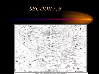
SECTION 5, 6
SECTION 5, 6. HOMEWORK. READ AC 00-45 Constant Pressure Charts (Section 5.2) Freezing Level Graphics (Section 5.3) Lifted Index Analysis Chart (Section 5.4) Convective Outlook Chart (Section 6.4) Products for Tropical Cyclones (Section 6.5) Volcanic Ash Advisory Products (Section 6.6)


SECTION 5, 6
E N D
Presentation Transcript
HOMEWORK • READ AC 00-45 • Constant Pressure Charts (Section 5.2) • Freezing Level Graphics (Section 5.3) • Lifted Index Analysis Chart (Section 5.4) • Convective Outlook Chart (Section 6.4) • Products for Tropical Cyclones (Section 6.5) • Volcanic Ash Advisory Products (Section 6.6) Review Section 5.5-5.7 Weather Depiction Chart Radar Summary Chart Convective Sigmets, Sigmets and Airmets
Australia Accident • Police say both planes were on the ground at Gunbalanya, about 330 kilometres east of Darwin, when one of the plane's engines started up after its pilot accidentally knocked the propeller. Senior Constable Nathan Conelius says the pilot had been in the process of preparing the aircraft to be taxied to another area when he exited the aircraft and accidentally knocked the propeller, causing the engine to start."The plane's moved forward at full speed for about 20 metres before it's collided with the rear of another Cessna, which caused extensive damage to the tail and wing of that plane."The collision sent debris flying over an area about the size of a football field."He says the damaged plane is a write-off.The pilot was breath-tested but returned a negative alcohol reading.The Australian Transport and Safety Bureau was notified but the bureau says it is unlikely to investigate the matter further."We're satisfied that it was just a simple accident and we won't be taking the matter any further," Senior Constable Conelius said.
HPC Aviation Charts • HPC Surface Analysis Charts • http://www.hpc.ncep.noaa.gov/html/sfctxt.html#avnsfc • Search cntrl f “aviation” • Zoom in aviation HPC aviation charts • http://www.hpc.ncep.noaa.gov/sfc/awcsfcwbg.gif
Meteorological Calculators • http://www.hpc.ncep.noaa.gov/html/calcbody_txt.html
HPC Short Range Forecasts • Short Range Forecasts (Fronts and Precipitation) • http://www.hpc.ncep.noaa.gov/html/fcsttxt.html#shortrange
HPC Forecasts • HPC Quantitative Precipitation and Snow Forecasts • http://www.hpc.ncep.noaa.gov/qpf/qpftxt.html
HPC Medium Range Forecasts • http://www.hpc.ncep.noaa.gov/html/fcsttxt.html#mediumrange • 3-7 day forecast products
Heat Index Products • http://www.hpc.ncep.noaa.gov/html/fcsttxt.html#heatindex • Other Products • http://www.hpc.ncep.noaa.gov/html/fcsttxt.html#otherprod
ASOS Userguide • http://www.nws.noaa.gov/asos/pdfs/aum-toc.pdf
SECTION 5.2 CONSTANT PRESSURE ANALYSIS CHART • Constant Pressure Chart • Combining these charts help to determine the three-dimensional aspect of depicted pressure systems.
SECTION 8 CONSTANT PRESSURE ANALYSIS CHART • Constant Pressure Chart • Alternate term for Isobaric Chart; a weather map representing conditions on a surface of equal atmospheric pressure. For example, a 500 mb chart will display conditions at the level of the atmosphere at which the atmospheric pressure is 500 mb. The height above sea level at which the pressure is that particular value may vary from one location to another at any given time, and also varies with time at any one location, so it does not represent a surface of constant altitude/height (i.e., the 500 mb level may be at a different height above sea level over Dallas than over New York at a given time, and may also be at a different height over Dallas from one day to the next).
CONSTANT PRESSURE ANALYSIS CHART • Computer generated is observed primarily by balloon ascending radiosonde packages. • Each package consists of wx instruments and a radio transmitter. • Covers a surface of equal pressure • twice daily • valid at 12Z and 00Z balloon released at this time as well.
Where to find these charts • http://weather.noaa.gov/fax/barotrop.shtml • http://www.erh.noaa.gov/gyx/weather_balloons.htm
CONSTANT PRESSURE ANALYSIS CHART • Data from each observation station are plotted around a station circle on each constant pressure chart. The circle identifies the station position. The data plotted on each chart are: • Temperature, temperature/dew point spread, wind, height of the surface above sea level, and height change of the surface over the previous 12- hour period
CONSTANT PRESSURE ANALYSIS CHART • The temperature and spread are in degrees Celsius, wind direction is relative to true north, wind speed is in knots, and height and height change are in meters. The station circle is shaded black when the spread is 5 degrees or less (moist atmosphere), and open when spread is more than 5 degrees (dry atmosphere)
STATION DATA • Wind: Triangle=50knots, large line=10knots, small line 10knots. • Wind direction is in degrees true • Wind speed in knots • If wind data is missing the letter “M” is plotted in the pressure section.
STATION DATA • Height is found in the top right hand corner and gives the height of the constant pressure surface in meters above mean sea level • Each of the charts displays these number differently • See page 5-28
Observational data • Observational data can be from: • Radiosonde observations • Weather reconnaissance aircraft • Aircraft observations on-time and on-level • Aircraft observations off-time or off-level • Satellite wind estimates
STATION DATA • Temperature = Celsius found in the top left hand corner • If below 0 prefaced with a minus sign. • Left blank if missing • Temp/Dew Point spread - found in the bottom right hand corner in Celsius. An “X” is plotted when the air is extremely dry. Left blank if missing.
STATION DATA • Hc= constant pressure height change which occurred during the previous 12 hours in tens of meters. • Example +04 = height of the surface rose 40 meters and -12 means the height fell by 120 meters
STATION DATA • Aircraft and satellite observations are also used as information sources for constant pressure charts. • A square is used to identify an aircraft reporting position.
STATION DATA • A star is used to identify a satellite reporting position . Satellite information is determined by identifying cloud drift and height of cloud tops. • Aircraft and satellite data are plotted on the constant pressure chart closest to their reporting altitudes.
STATION DATA • Variations of height are analyzed by contours, variations of temperature by isotherms, and variations of wind speed by isotachs. • Contours are lines of constant height, in meters, which are referenced to mean sea level. • They are used to identify and characterize pressure systems on constant pressure charts.
STATION DATA • Contours are drawn as solid lines and are identified by a three-digit code located on each contour. • Contour patterns on constant pressure charts can be interpreted the same as isobar patterns on the surface chart. For example an area of low height = area of low pressure
STATION DATA • Isotherms= lines of equal temperature. • An isotherm separates colder air from warmer air. Isotherms are drawn as bold, dashed lines on constant pressure charts. Isotherm values are identified by a two-digit block on each line. The two digits are prefaced by “+ or -”. • Drawn at 5 degree intervals on each chart.
STATION DATA • Isotachs = lines of equal wind speed. Isotachs separate higher wind speeds from lower wind speeds. • Isotachs are analyzed on the 300, 250, and 200mb chart. • Drawn as short fine dashed lines. • Values are identified by a two or three digit number followed by a K on each line. • Drawn at 20 knot intervals starting at 10KTs
STATION DATA • Zones of very strong winds are highlighted by hatches. Hatched and unhatched areas are alternated at 40 knot intervals beginning at 70 knots. • 70-110 hatched • 110-150 not hatched • etc….
CONSTANT PRESSURE ANALYSIS CHART • 6 separate standard charts • 850mb 5,000 • 700mb 10,000 • 500mb 18,000 • 300mb 30,000 • 250mb 34,000 • 200mb 39,000
CONSTANT PRESSURE ANALYSIS CHART • USEFUL: • can determine areas of high winds • gives the upper air wx picture • can determine possible levels of icing • can determine the right altitude for best wind in combination with the best wx • look for the high and low pressure systems of associated wx
SECTION 5.3 Freezing Level Graphics • A freezing level chart shows the height of the 0 degree C constant-temperature surface • ADDS • http://adds.aviationweather.noaa.gov/icing/frzg_nav.php • Initial analysis and forecast at 3, 6, 9 and 12 hours in the future. • Initial analysis and 3 hour forecast are updated hourly. The 6, 9, 12 hour forecast are updated every three hours.
SECTION 5.3 Freezing Level Graphics • Regions with white indicate the surface and the entire depth of the atmosphere are below freezing. • Hatched regions represent areas where the surface temps is below freezing with multiple freezing levels aloft. • If color change by more than one color compared to the scale such as orange to blue this indicates multiple freezing levels.
SECTION 5.3 Freezing Level Graphics • Old freezing level charts can be found at • http://weather.noaa.gov/pub/fax/QYSA00.TIF