Download
1 / 35
350 likes | 515 Vues
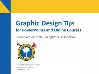
Graphic Design Tips for PowerPoints and Online Courses. South Carolina State Firefighters’ Association. Developed by Margi Stone Cooper Oklahoma State University Revised May 1, 2012. Presentation Topics. This presentation discusses: Titles for opening screens Text and typography

E N D
Graphic Design Tipsfor PowerPoints and Online Courses South Carolina State Firefighters’ Association Developed by Margi Stone Cooper Oklahoma State University Revised May 1, 2012
Presentation Topics This presentation discusses: • Titles for opening screens • Text and typography • Colors and fonts • Charts, graphics, and special effects • Overall format
Title Slides and Opening Screens • Reveal the main idea of the presentation. • Be brief, but accurate. • Include the name of the presenter and/or the organization.
Fire Hydrants • This title is vague and does not tell what the presentation is about. • What is going to be said about fire hydrants?
How to Flow Test a Fire Hydrant • This title is more specific. • The audience knows exactly what the presentation is about.
Text and Typography Think about the… • Amount of text on each slide • Placement of text • Font size • Font style • Letter and word arrangement • Wording and spelling
In a PowerPoint Presentation… Each screen should: • Not distract from the message • Be easy to read • Be limited to about 6 lines of 6 to 8 words Compare this PowerPoint screen with the multimedia course screen on the next page.
In an Online Course… Screens for online multimedia courses can, of course, be much more text-heavy than PowerPoint slides. When developing content for a multimedia course, limit the number of words to 150 per screen. Whether for multimedia courses or PowerPoints, each screen should focus on your message and be easy to read. Your audience should not have to use a dictionary to understand your message—use simple language. Also, list your main ideas with bullets or numbers. In most cases, text should be set flush left with a “ragged” right margin. Forced justification (where both outer margins of the text are straight) causes irregular word spacing, which makes text difficult to read. Adding more than one space after the punctuation at the end of a sentence also can cause spacing irregularities. In any media (including a printed document), limit line length to no more than about 125 characters, and keep headlines, subheads, and body fonts consistent throughout the course or presentation.
Placement of Bulleted Statements • Align bulleted statements on the left margin, like this. • Never center bullets; it makes them hard to read. • Avoid setting text flush right, because this forces the reader to have to hunt for the beginning of the next line.
Avoid Awkward Line Breaks • Prepositional phrases should remain on one line. • Avoid breaking hyphenated words. • Avoid “dangling” words (or “widows”). • Keep thoughts and subjects together on one line.
Good Examples of Bad Line Breaks • Proofread your message before sending it. • Wait until late in the day to check e- mail. • Never forward rumors or old wives’ tales – these cause harm and waste time.
Wording and Spelling • Avoid unintentional meaning: Spiders hide under leaves and bark. • Watch out for typos, especially those that are proper words: The Precedent spoke before Congress. • Use simple language: Try the word “use” instead of “utilize.”
Avoid Huge Fonts • Fonts that are too large make the line length too short and hurt legibility: A pitot tube measures flow pressure.
Choosing Font Styles • Limit the use of italics to individual words or short phrases. • Statements in all italics can be difficult to read. • Likewise, it is often hard to read artistic fonts; use them sparingly.
Typeface Selection • Avoid mixing typefaces within a word, phrase, sentence, or paragraph. • Thin-stroke, serif letters often don’t show up as well as thick-stroke gothic letters. • Use typefaces consistently.
Letter Case • SENTENCES IN ALL CAPITAL LETTERS LACK SHAPE AND CAN SLOW A READER. • DON’T use capital letters for emphasis. • Use both upper- and lowercase letters.
Avoid Stacking Letters and Words Fire Hydrants Must Be Opened Slowly O H S P Y L E D O N R W A L N Y T S Rotating text on-end is preferred.
General Guidelines for Using Color • Use no more than 5 colors per slide. • Too many colors makes reading difficult and distracts the from your message. • Keep the color scheme consistent. • Do not vary colors within a word. • Background and foreground colors should contrast well.
Poor Color Choices The audience will have a difficult time trying to read the screen of your course or presentation. This slide shows a very bad use of color. Alternating color combinations will make your audience search for your main points. Only usedifferent colors to highlight key points whennecessary.
Color in Sentences and Phrases • Some colors stand out against a background; some don’t. • Don’t alternate colors within aword. • Avoidalternatingtext colorswithinaphrase. • But, subtly changing the color of a keyword or phrase can help draw attention.
Background vs. Text Colors • “Value” is the relative lightness or darkness of a color. • Colors may be different, but they can have similar values. • Choose background and text colors that contrast in value.
Examples of Poor Contrast Red and green do not contrast well; these colors tend to “reverberate.” Red and royal blue do not contrast well because they are similar in value. Dark colors such as black against dark blue also do not produce good contrast.
Good Color Contrast Red and White Black and White White and Blue Yellow and Blue Black and Yellow Green and White Periodically step back from the computer to ensure you can read your screens without straining. Remember, if you’re creating slides that will be projected, overhead lights are usually dimmed, but meeting rooms are seldom very dark, which makes good contrast especially important.
Dark on Light? Or Vice Versa? There are no hard and fast rules for designing the overall look and feel of an online module or course. A couple of decades ago when multimedia courses were first developed, designers overwhelmingly chose light-colored fonts on dark backgrounds. Back then, it was thought was that light backgrounds and dark type would cause eye strain, much like trying to read the printing on a lit light bulb for hours on end. But years of experience has told us that is not the case. Nowadays, many designers choose dark backgrounds to increase the energy efficiency of the computer display, since in requires more power to project a white screen and it produces more heat. While energy-conscious designers may advocate that “black is the new green,” the fact is that it depends on the device your using. For example, with new liquid-crystal displays, white screens tend to consume less energy than black screens. The Bottom line? Make sure there’s plenty of contrast between your background and text and you’ll be fine.
Avoid “Busy” Backgrounds • Heavily textured and geometric backgrounds can obscure the text. • Use minimal textures and background designs. • Photos may be used with care. • Use plain backgrounds when careful reading is required.
Some photo backgroundscan obscure text. Consider placing text in a color box if you must use a photograph as a background.
Using Charts and Graphics • Include enough information so your audience understands the chart. • Avoid overloading a chart with information. • Use graphics that are relevant to the topic being presented. • Avoid using poor quality graphics or filler art.
Adequately Label Graphics This graph is clean and simple. But is it adequately labeled to convey the meaning? (No, of course.)
Avoid “Information Overload” The bars on this graph are impossible to distinguish. Again, this graph is not clearly labeled.
Use Relevant Graphics Annual Report to the Executive Board January 2013 The above graphic does not tie in with the subject.
Overall Format • Limit the use of special effects. • Format the presentation with the audience and the subject in mind. • Be consistent with the design. • Learn how to take advantage of the powerful graphic design capabilities of PowerPoint!
Limit the Use of Special Effects Do not use a special effect that serves no purpose. Use special effects only when appropriate. Special effects can be distracting.
Keep the Design Consistent Use a template with... • The same color palette. • The same typefaces. • Similar slide layouts. Think of “white space” as a design element and use it to your advantage.
Check Your Text! Type symbols correctly. Use a degree symbol instead of a superscript lowercase “o.” Double-check symbols after the multimedia developer finishes your project, because symbols have a habit of reverting when text is copied from one software program to another. Also, be sure check weblinks because URLs sometimes change.
Quick Summary • Use meaningful titles. • Make sure your text is legible. • Text color should contrast with the background. • Use appropriate images and label charts and graphics. • Limit the use of special effects. • Be consistent with the overall format. • Proofread!