Colors and schemes
250 likes | 385 Vues
Colors and schemes. Colors are very effective in communication. Since we have color vision, we have become accustomed to think in colors Roses are red, grass is green etc. There’s a color assigned to most everything The same kind of thinking can be carried over to visual communication

Colors and schemes
E N D
Presentation Transcript
Colors are very effective in communication • Since we have color vision, we have become accustomed to think in colors • Roses are red, grass is green etc. • There’s a color assigned to most everything • The same kind of thinking can be carried over to visual communication • To differentiate your company, you need to devise a set of colours to use
The problem with colors • The problem is that there is no standard set of defined meanings for colors • There are sets of meanings, but they are culture-dependent and geographically specific • White is jubilant in the West but the color of grief in Asia • Yet you need to come up with your company colors • Therefore you must do a bit of research
COLORS ASSIGNMENT • On the next slide there is an array of colors and regions of the world, as well as cultural entities • Try to locate as many meanings associated with the colors for the regions and entities listed • Do not worry if your meanings seem to be contradictory or overlapping • The point is in the search and in the realization that you must do your homework before you can decide on colors
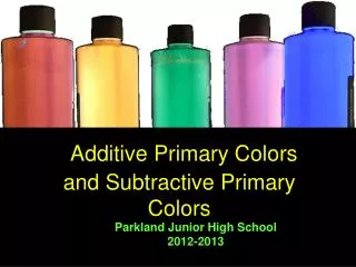
While you do the array, let’s see some stuff about color systems • The Additive system • RGB - Red Green Blue – sum of all colors is white • White color contains all color information available to the eye • If you filter white for Red, Green or Blue and then recombine, you get white • RGBs are given in constituent values: 122,123,220 (all values 0 < x < 255) means
RGB is also • Known as the arriving light system • A mix system, where all colors depend on the mixture of the constituent red, green and blue colors • “Used” by all light sources • Sun • Television, displays etc. • See http://en.wikipedia.org/wiki/RGB
The counterpart color system, CMYK • Cyan, magenta, yellow, key (or blacK) • This is a subtractive color model, which means that inks “subtract” brightness from white. • This is the color model used in four-color printing which is why it is also referred to as the ‘process color’ system • ””hite is the natural color of the paper or other background, while black results from a full combination of colored inks. To save money on ink, and to produce deeper black tones, unsaturated and dark colors are produced by substituting black ink for the combination of cyan, magenta and yellow.” –Wikipedia • http://en.wikipedia.org/wiki/CMYK
Systematizing colors • CIE Color standards are a mathematical representation of colors, but not much use for the general public • Eurostandard colors are a standard set of color pigments which allows for some continuity • Even then, hues will be different between production batches • On the screen, there is no real method to guarantee a similar display experience on different computers • On the screen the color space is wider than on print • Printing surfaces also affect the colors • And hey… you eye only sees some 10,000 hues anyway.
Pantone • Pantone is a commercial color provider • Their main products are the Pantone chips and corresponding colors • There are both an RGB and a pigment based definition • In principle, a Pantone-based paint or ink is always of one color, but there may be small differences in hues
Practical aspects of color use • First off the bat, try to define which colors would best represent your customer company • Try to avoid the most used colors, such as Fazer’s blue, Viking Line’s red, Post yellow/orange etc • Also remember that the colors must work in b/w too • Pick one to three basic colors and one pop-out attention color for indicating new items and other noteworthy stuff • You may have to readjust your color set as you think of new uses
You need to consider several aspects of color • Psychological • Blue is calmin, red is energetic etc. • The psychological aspect is usually considered the most important in creating a visual image • Aesthetical • Adding a sense of space (or diminishing such) using vhite or black etc. • Visibility • DayGlo paints as seen on emergency vehicles • For a curious web experience, visit http://www.day-glo.com
Signal aspects of color • Red is a forbidding color • Association with blood maybe? • Yellow is a warning • Association with bees? • Green indicates safe • Why? Is it because of grass being a benign material? • White, gray, black • Neutral information colors? • Blue is considered a positive information-carrying color • But what is this assumption based on?
Color combinations • Blue and red • Context-dependant • Cold and hot • Use complementary (opposite) colors for contrast • red and green • blue and orange • yellow and purple
Significance of colors • Color symbolics are usually derived from religion, superstition, and art • Symbolics are culture-specific and very different in different regions of the world • What does this mean for designing colors for companies? • It is very hard to get a full description for the significance oif any single color
This means that… • You always need to try to see whether your color scheme is applicable for the market • Also, you need to check for saturation • For example, it would not do to market your cruise ship using a certain strong red color, or chocolate using a warm blue • Postal services are primarily yellow all over the world • Of course, you can try and use a color at the market area even if it is dominantly used; you have to use it in a different mode so that there is no risk for mix-up
Exercise: Color replacement • Think of four significant company colors • For example Nokia blue, Neste blue/green, Viking Line red • Change the color to a very different one with image processing • Think of the connotations or thoughts the original color brings, and then what the changed colors bring to mind • Prepare to discuss your thoughts and show some of the edited colors
Exercise: Color schemes for three companies • Pick three of the following five fictional companies • Think of their business area, age, market, target audience etc. • Find three colors (two basic colors and one attention color) that best match the company in your mind • Present the colors as swatches , maybe 500 x 200 px • Prepare to report on your color selection in Moodle
Transport company • Kokko Transport is a trucking and logistics company • Founded in 1950, it is primarily operating in domestic traffic, but they also do foreign runs • There are 20 trucks and about 100 people employed • Kokko Transport works hard to project an environmentally friendly image
Consulting company • Regulus Consulting works in the management consulting business • It has 30 consultants and a total workforce of 55 • Its core areas are finance and tax planning as well as human resources management • It was founded in 1958 and is now one of the most valued domestic consultancies in Finland
Media relations company • Ohyeah Media Relations is a three-year-old company which specializes in managing media for the music industry • Its main clients are all major record companies • It also represents some rising Finnish bands and stars • It works through controlling artist information that is given to the media as well as through arranging parties and happenings • Ohyeah is known for its aggressive marketing
Von Flügel, Attorneys at Law • Von Flügel is the third-oldest law firm in Finland • With 30 attorneys and a total staff of 100, it is a middle-sized firm • It is known for its high billing and an unbeaten percentage of cases won • Cases often are high profile, but the firm itself keeps a low profile • They also have international cases mostly in Europe but also in the Americas
Import/Export company • Cheapex Imports is a company that imports merchandise for sale at low-price markets • The main import area is China, but some products also come from South America and the Far East • The slogan of the company is, ”More for Less!” • Though it is small, with only 50 employees, its owner’s personal visibility is notable (Mr Lehtonen sponsors horse racing) and it is well known
Use this format for your presentation • Basic colors RGB 153, 255, 102 • RGB 128, 0, 128 • Attention color(s) • RGB 255, 204, 0
Now, when we go forward… • Next we will talk about logos and logo design. • Be prepared to use your knowledge of colors in the design of logos • Also be prepared to edit your choice of colors as the design process goes forward • There often is a need to adjust colors when logos are done or the purposes of the colors change • This is nothing to worry about. It happens frequently.