Developing Poster Presentations in the Natural Sciences
Developing Poster Presentations in the Natural Sciences. Introduction.

Developing Poster Presentations in the Natural Sciences
E N D
Presentation Transcript
Introduction Welcome to the online version of the Writing Center's Developing a Poster Presentation in the Natural Sciences Workshop. Feel free to use the arrow below to advance to the next slide, or you can use the drop-down menu below to skip ahead.
Why Create a Poster? Whether your poster is for a class or a professional conference, the reason for creating it is the same: there are a lot of people with data to present, but time does not permit everyone to give a 10-15 minute talk. Posters for class projects usually require a less formal approach than do those presented at conferences; differences will be noted in some sections.
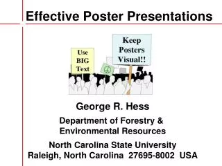
Critical Attributes • Clarity - Make your presentation easy to understand so that ideas can be grasped in one read. • Brevity - Your readers are standing, not sitting, so they will tire quickly; get your point across using as few words as possible without sacrificing clarity. • Simplicity - Readers with 100 posters to peruse do not want to get bogged down by overly complex presentations. • Neatness - Looks are important, so take care when assembling your poster. Do not make it too fancy, though, and avoid a cluttered look; occupy only 65 to 75 percent of your available space.
Contents • Ingredients of a Standard Poster • Technical Details - size and organization, typefaces, and general writing tips • Materials and Construction • Generalized Example Poster
Ingredients of a Standard Poster • Title • Abstract • Introduction • Materials and Methods • Results • Discussion • Acknowledgments • Literature Cited
The Title Make it descriptive—the reader should be able to decide quickly whether to read more or not. Your title may be better if it suggests some of your conclusions. Make it big—you want your title to grab everyone’s attention. Include your name below the title—readers should know whose great poster they are reading! Do not use the word “by” in front of your name. You may also need to put your address or class and instructor’s name here.
The Abstract This is a very brief summary of your research. Take the bare essentials of the introduction, methods, results, and discussion and express them in fewer than 200 words. Citations are typically left out. For a class poster the abstract may be more brief, perhaps only 50 to 100 words, or your instructor might not require one at all. This should be the last thing you write, but it is the first thing the reader should see after the title. Read some abstracts in a professional journal to get a better idea of what goes into one.
The Introduction This is where you will put the background information necessary to bring readers up to date on your topic. It will also establish the importance of your own research. If your poster is for a class project and consists only of library research, then the introduction, and especially the methods and results sections, might be omitted. Instead, create your own sections that best organize the information you have and give the new sections appropriate headings. Do not forget citations!
The Materials and Methods Section Do not describe in detail every step of your experiment. Where possible, use brief descriptive terms for procedures (e.g. “gel electrophoresis”) and include citations where they are described thoroughly; if readers want to know more, they can either ask you personally or find a cited reference at a later time. With some additional questions or research, your readers should be able to reproduce your experiment.
The Results Section Here you present the data you collected and the results of any analyses you performed. Figures and tables can be extremely effective, especially when supplemented with a few well-written sentences. Explanations of your data can be placed either in the body or, if simple enough, in the text accompanying a graphic; be very clear either way. The results section is for data presentation only; save your discussion and conclusions for the next section.
The Discussion Section This is where you discuss your findings and present what you have concluded based on those findings. Make sure your data actually support your conclusions. You may want to compare all of this with the findings of other researchers. If your poster is based on library research only, this section might instead be a brief summary, but it should still sound confident and conclusive. Readers should be left with the feeling that they know something they did not know previously.
The Acknowledgements Section Surely there is someone with whom you discussed in detail the topic of your poster; thank them for helping you better understand the principles involved or for their engaging conversation. Perhaps another person helped you find an interesting subject to study; here you can express your gratitude for the inspiration they gave you. Remember that there is always someone who deserves your thanks.
The Literature Cited Section If no required format has been specified, adopt one that is used in an important journal from your field of research. In the natural sciences this will typically be based on APA guidelines. Make sure all of the citations in your text refer to a document or communication listed in this section. Conversely, make sure that each listing is cited at least once in your poster. Note, however, that a bibliography is different and may contain more references than are cited in the text.
Technical Details • Size and Organization • Typefaces to Use • General Writing Tips
Size and Organization The size allowed for your poster will probably be specified to you. For class posters, standard 56x71cm poster board is often used, and 4x6ft is the limit commonly imposed at professional meetings. Your readers should be guided from one section of your poster to the next. This can be accomplished most naturally by arranging sections in vertical columns from left to right. Figures can go anywhere near related text.
Typefaces to Use • Try "Times New Roman," or another easily readable typeface at different sizes • The poster should be easily read from 6 ft away • For the title, try 36 or 48 point type; make your name one size smaller and the rest here two sizes smaller • The body, from the abstract through the acknowledgments section, should be 20 to 26 point type; if your abstract will already have been published in a meeting schedule, make it a size or two smaller • For text associated with tables and figures, try 16 point type • Try 12 or 14 point type for the literature cited section
General Writing Tips • Do not use contractions (i.e., "don't" or "can't") • Use only standard and commonly used abbreviations (such as i.e. and e.g.) • Use a spell checker • Justify all text for a neater look
Materials and Construction • Foam core from a craft store can be messy, but some people like it for the main poster material. • Matte board from a framing store is heavy but sturdy, and it is not at all messy; I prefer it. • Try using construction paper as a matte to go between text sheets and the primary board; use a combination of simple colors—one for the main board and another for matte—that looks pleasing. • With text justified, nearly everything can be cut square for a neater look; cut your matte ½ to ¾ in. larger per side than your text paper. • Spray adhesives made by 3M and others work very well, but be careful; they adhere instantly!