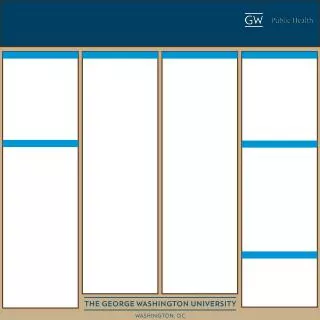
Poster Construction using PowerPoint
Poster Construction using PowerPoint. “Starting from Scratch”. Information you will need?. Title/Logos Authors Topic Headers Content Images Charts & Graphs Equations Preparation Time! Approximately 15 hours to construct. Brain Dump.

Poster Construction using PowerPoint
E N D
Presentation Transcript
Poster Construction using PowerPoint “Starting from Scratch”
Information you will need? • Title/Logos • Authors • Topic Headers • Content • Images • Charts & Graphs • Equations • Preparation Time! • Approximately 15 hours to construct
Brain Dump • Write or sketch out all ideas for your poster (Before opening PowerPoint) • Organize/Reorganize your ideas on paper • Sketch out multiple options • Select the one you like best • Decide on a color scheme • Exp. Title Boxes: blue, Text: white, Background: Grey • Decide on a final poster size
Choosing a Color Scheme • Who is your audience • Is text legible from at least 6ft away? • If the viewer is colorblind… • Does the visual image of the poster get lost, if the colors are not as vibrant or clear? • Problem colors include: reds, greens and sometimes blues • What colors would relate well with your topic? • Yellow, purple, green, black…etc. • What about pastel colors?
Choosing a Color Scheme • Color Blind Comparison Common Color Blindness Normal
Choosing a Color Scheme • Start with the basics PowerPoint Color Chart Color Wheel
Colors that work well together: Complimentary (opposites) Color Wheel
Colors that work well together: Analogous (3 colors next to each other) Color Wheel
Standard Color Chart PowerPoint Color Chart
Custom Color Chart PowerPoint Color Chart Choosing a Color Scheme Saturation Level Color Picker Choose Custom Color using RGB
Final Poster Size? • What is your final poster size? • Most display boards are going to be: • 4’ x 4’ = 48” x 48” • 4’ x 8’ = 48” x 96” • Maximum size for PowerPoint slide = 56 inches • If larger than that, please set up at half size • Choose 200% when printing • Maximum printing width = 49.5” • Length is recommended between 8’ – 9’ (cutting table length)
Locating Good Quality Logos • Never use Web Logos • When they are enlarged, they become distorted • For Kansas State University Logos, please visit… • www.oznet.ksu.edu/techweb • Click KSRE Image Gallery
Locating Good Quality Logos cont. • Click KSRE Logos • Select a category from list • 4-H • College of Ag • K-State • K-State Research and Extension • KSRE “Knowledge for Life” • Powercat, etc.
Locating Good Quality Logos cont. • Choose the PRINT version (.jpg or .gif) • Transparent versions work best on colored backgrounds
Constructing Your Poster • Start PowerPoint • Create a new blank presentation using “Blank Slide”
Constructing Your Poster cont. • Change the page size • Set to either half or full size of the final poster
Inserting Text • Select a primary typeface and font size • Choose typeface before entering all text • Text spacing will change with a different typeface • You may use up to 2 different typefaces • One for title/headings • One for main text • Choose a font that is legible • Serif or Sans Serif • Scripts - not very legible Brush Script Std -16 This is random text to serve as an example of how text spacing can change when you change the typeface. Baskerville Old Face -16 This is random text to serve as an example of how text spacing can change when you change the typeface. Verdana -16 This is random text to serve as an example of how text spacing can change when you change the typeface. Arial -16 This is random text to serve as an example of how text spacing can change when you change the typeface.
Text Styles • Serif – Baskerville Old Face • Sans Serif - Arial Brush Script Std -16 This is random text to serve as an example of how text spacing can change when you change the typeface. Verdana -16 This is random text to serve as an example of how text spacing can change when you change the typeface. Baskerville Old Face -16 This is random text to serve as an example of how text spacing can change when you change the typeface. Arial -16 This is random text to serve as an example of how text spacing can change when you change the typeface.
Inserting Text • Insert a Text Box • Insert>Text Box • Drag the box as large as you need it Tip: • To align text boxes, use your guides and grid • View>Grid and Guides • Ctrl + arrow keys make for shorter, more precise moves
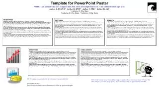
Complete Poster Example • 4’ x 8’ poster

