Download
1 / 26
290 likes | 609 Vues
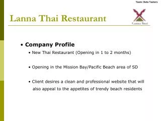
Lanna Thai Restaurant. Company Profile New Thai Restaurant (Opening in 1 to 2 months) Opening in the Mission Bay/Pacific Beach area of SD Client desires a clean and professional website that will also appeal to the appetites of trendy beach residents. Competitive Analysis Websites.

E N D
Lanna Thai Restaurant • Company Profile • New Thai Restaurant (Opening in 1 to 2 months) • Opening in the Mission Bay/Pacific Beach area of SD • Client desires a clean and professional website that will • also appeal to the appetites of trendy beach residents
Competitive Analysis Websites Kafe Yen – Chosen because it’s a trendy Thai-Fusion restaurant in Pacific Beach Rambutan Thai – Chosen because the client suggested this was his favorite Chive – Chosen to have a non-Thai perspective of what a great restaurant website can aspire to be Hanaoka – Chosen because it has a different design than the other 4 and is also in Pacific Beach Rama Thai – Chosen because Rama is (arguably) the best Thai restaurant in San Diego
Functionality (1/3) • Overall Positives Each website provided the basics; address, phone, hours. This main function of any restaurant website is to provide these basics. address phone hours
Functionality (2/3) • Overall Negatives There was very little advanced functionality such as online Reservations or online to-go orders. Chive was the only website that allowed making e-reservations, but this was done via email and not through the website.
Functionality (3/3) • Exceptionally Good/Bad Bad Good Hanaoka has a great 360 degree virtual tour! Kafe Yen links to MapQuest rather than providing a map on their website. This opens in a separate window making navigation difficult.
Content (1/3) • Overall Positives Every website provided a menu in some form or another. This leads to the conclusion that a menu is essential content.
Content (2/3) • Overall Negatives Some websites included unrelated content, such as links to purchase clothing. It just doesn’t seem right to purchase clothing from a restaurant website.
Content (3/3) • Exceptionally Good/Bad Bad Good This is the only picture on Rama’s website!! Rama included information about awards. Pictures of the food are an important part of a restaurant’s website. Rama has none!
Site Architecture (1/3) • Overall Positives There was an distinct pattern in the types of divisions of content of all the websites. Menu (5)
Site Architecture (1/3) • Overall Positives There was an distinct pattern in the types of divisions of content of all the websites. Contact (4)
Site Architecture (1/3) • Overall Positives There was an distinct pattern in the types of divisions of content of all the websites. Map/Dirrections (4)
Site Architecture (2/3) • Overall Negatives Some category headings were obscure ??? ??? ???
Site Architecture (2/3) • Overall Negatives Some category headings were obscure menu! ??? ???
Site Architecture (2/3) • Overall Negatives Some category headings were obscure menu! Catering ???
Site Architecture (2/3) • Overall Negatives Some category headings were obscure menu! Catering Employment!?
Site Architecture (3/3) • Exceptionally Good/Bad Bad Good Rambutan covers the bases well providing a good division of pages without going overboard. Kafe Yen has little in the way of architecture. The site has only 2 pages.
Navigation (1/3) • Overall Positives All of the restaurants’ websites have consistent mainnavigation bars. The navigation bar is always the same and never moves around.
Navigation (2/3) • Overall Negatives Secondary navigation however is not consistent leading to confusion. Secondary navigation links appeared all over the page making it seem unorganized.
Navigation (3/3) • Exceptionally Good/Bad Bad Good Click, click, click, click, click, click, click… On Rambutan’s menu there are quick-links to specific types of food allowing you to quickly find what you’re most interested in. Rama has a horrible design for scrolling through their menu and awards. The user must continuously click to scroll (no click and hold possible).
Design (1/5) • Overall Positives 1) Use of Flash added a lot to the websites that used it. Animated background Animated navigation
Design (2/5) • Overall Positives 2) Short pages so that all of one page fits on the screen together eliminating the need to scroll. All of one page fits into one screen. If additional room is needed then simply create a new page specific to that category.
Design (3/5) • Overall Positives 3) Great pictures make your mouth water and give you an idea about the style of the restaurant! Effective food photography! Clear view of the restaurant’s style.
Design (4/5) • Overall Negatives Poor choices in text color resulted in many cases of unreadable text due to the text’s color being very close to the background color. What does that say?!
Design (5/5) • Exceptionally Good/Bad Bad Good Chive has a very artistic design and great color scheme. Pink? Need we say more.
Conclusion • From these 5 websites we have found a few “must haves” as well as a few pitfalls to avoid. Must Haves Pitfalls to Avoid • Basic info (phone, address, etc) • Menu • Smart architecture • Consistent navigation • Short pages • Great mouthwatering images • Don’t limit functionality • Have clearly defined categories • Don’t make users work • Poor color schemes