IMAGES
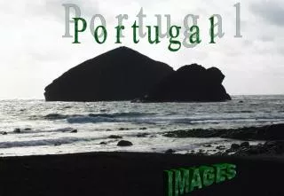
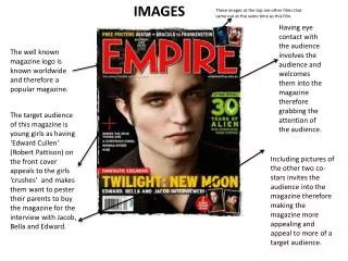
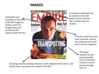
IMAGES. Including an advertisement for alcohol on this film poster is ironic how the film is about drug and alcohol. Having the main character on the front of the film magazine relates to the film straight away and familiarises the audience with the film. .

IMAGES
E N D
Presentation Transcript
IMAGES Including an advertisement for alcohol on this film poster is ironic how the film is about drug and alcohol. Having the main character on the front of the film magazine relates to the film straight away and familiarises the audience with the film. The eye contact from the main character involves the audience and invites them into the magazine. The target audience would be young adults (15+) as this films’ context is not for anyone younger than 15. Including a woman looking seductive on the magazine front cover could reveal some clues about the context of the film.
COLOURS This bright colour of red stands out from the magazine and catches the audiences’ eye. The colour black is a very visual colour and therefore by deciding to include text that is black it will stand out from the rest of the magazine. The colour of white could represent naivety and not knowing what’s going on. However it could also represent being blank inside and once the characters have taken the drugs they become numb and unaware of what’s happening therefore the colour links to the context of the film. The woman in the red dress relates to the colour of the title. Also having the woman's’ name in red also links to the colour of her dress and the title of the film therefore the magazine links well together.
LAYOUT Including an advertisement for alcohol on this film poster is ironic how the film is about drug and alcohol. And having it at the top shows that from this film alcohol is a big priority. The title being at the top of the magazine cover is the most important item on the magazine as it shows what magazine it is. The title of the film is also a vital part to the magazine cover as it allows the audience to recognize what film the magazine is displaying. Having the image in the middle of the magazine layout connects the film and magazine together showing the audience what the film is about. Having the barcode hidden away on the magazine therefore shows the irrelevance of the barcode to the film. Including a woman looking seductive on the magazine front cover could reveal some clues about the context of the film-however it isn’t vital as it isn’t at the top with the main character.
WRITTEN TEXT Including an advertisement for alcohol on this film poster is ironic how the film is about drug and alcohol. And having it at the top shows that from this film alcohol is a big priority. The title being at the top of the magazine cover is the most important item on the magazine as it shows what magazine it is. The title of the film is also a vital part to the magazine cover as it allows the audience to recognize what film the magazine is displaying. This piece of written text relates to the film as it is an article on the film and details about the film. Including a woman looking seductive on the magazine front cover could reveal some clues about the context of the film-however it isn’t vital as it isn’t at the top with the main character.
Each of the main characters are labelled with a number so you know who the main characters are-this is helpful for the audience. IMAGES The facial expressions on these two characters makes you wonder why they are smiling-are they happy characters? What are they smiling at? The body language of these characters show them to appear uncomfortable –again this makes the audience question ‘why?’ This character is pointing straight at the audience-this is very effective to draw the audiences’ attention. The title is very clear therefore enabling the audience to recognize the film.
The biggest clue on this poster of any information about the film is the description of each character here. NARRATIVE The facial expressions on these two characters makes you wonder why they are smiling-are they happy characters? What are they smiling at? Why is he pointing? With these two characters it makes you wonder why do they look so uncomfortable? From this woman’s clothing she appears to look like she is flirty and seen as a sexual character.
COLOURS The numbers and text link to the film title by having them both orange. Having all the characters in black and white makes the audience notice the characters more as they are the main image and although they are in black and white they stand out from the brightly coloured title. The title being highlighted by the orange colour makes the title stand out from the poster-as all the characters are in black and white.
Having the main characters in the middle of the poster draws all the attention to the characters on the poster. LAYOUT The eye contact from each character and body language makes the layout stands out more-it works successfully. The plot is not clear by the poster however the numbers and text gives you a slight clue as to what the film is about. Having the age rating so small underneath the title shows that the age rating is not that important to the film. Laying out the title underneath the black and white characters makes the title stand out-therefore the title appears more vividly.
The written text above the characters gives clues to the audience about the plot and storyline. WRITTEN TEXT The target audience for the film seems like it varies as the age rating is an 18 so therefore it would have to be 18 year olds and over. Having the title so big on the film poster familiarises the audience with the film.