The Magazine You Read While Waiting for Your Movie: A Creative Design Concept
Dive into a unique design concept inspired by the magazines we thumb through while waiting for our favorite films to start. This presentation explores a vibrant color scheme and gradient mirroring magazine covers, along with a playful twist on typography featuring colorful letters instead of capitals, reminiscent of movie entertainment styles. Discover insightful graphics that highlight the relevance of multimedia in storytelling, showcasing a captivating design that evolves with each slide. Join me in exploring this creative journey and share your thoughts!

The Magazine You Read While Waiting for Your Movie: A Creative Design Concept
E N D
Presentation Transcript
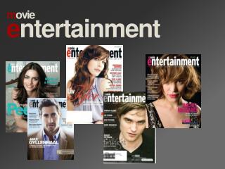
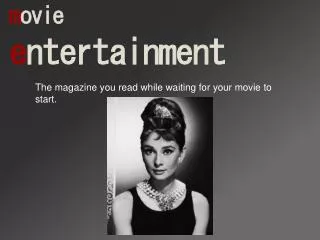
movie entertainment The magazine you read while waiting for your movie to start.
testing • colour scheme and gradient similar to the magazine cover. • instead of capitols we use different coloured letter like movie entertainment does.
design with graphic insert Text about the graphic! And how incredibly important this graphic is. Look it’s a baby!
design with graph Graph one Graph two
slide with video • If only I could rip a video from the net! Sorry guys. I’ll work on that. FAIL!
that’s it folks! • so those are my ideas about the slid show. Let me know what you think.