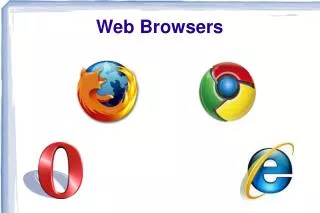
Web Browsers
Web Browsers. And Mobile Web Browsers. What is a mobile Web browser? Why do Web pages look differently on different Web browsers? What is Web page rendering ? What is a viewport?. Guiding Questions. Most popular Web Browsers.

Web Browsers
E N D
Presentation Transcript
Web Browsers And Mobile Web Browsers
What is a mobile Web browser? • Why do Web pages look differently on different Web browsers? • What is Web page rendering? • What is a viewport? Guiding Questions
A mobile browser, also called a microbrowser, minibrowser, or wireless internet browser (WIB), is a web browser designed for use on a mobile device such as a mobile phone or PDA. Mobile browsers are optimized so as to display Web content most effectively for small screens on portable devices. Mobile browser software must be small and efficient to accommodate the low memory capacity and low-bandwidth of wireless handheld devices. Mobile Browsers Source: wikipedia
Source: Stat Counter, 2013 Mobile Web Engines
Mobile Web Browsers Source: Stat Counter, 2013
Not all browsers render all web content in exactly the same way. • Web content doesn't need to look exactly the same across every browser and device. • As long as it still provides a good user experience and gives them access to the content and services required by their current browsing experience. Web content
Your Web browser uses a rendering engine • The rendering engine will start getting the contents of the requested document from the networking layer. • For better user experience, the rendering engine will try to display contents on the screen as soon as possible. Web browser rendering
The screen resolution of the monitor or screen • The operating system • The web browser • Individual user preferences Why don’t Web pages look the same on all Browsers?
Web browsers do not render pages pixel by pixel. They read the entire code and produce an output depending on your code. There are, however, differences in the code interpretation. Therefore you should check the way your website looks on different browsers and operating systems. Web Browser Output
Always test your website in multiple browsers to ensure consistency! http://browsershots.org/ Test your site here Test your Website
The viewport is the area a web browser has to display a web page. • The size of that area determines the layout of the page (for example how text flows from line to line) • On desktop browsers the viewport can be resized by dragging the browser window into any size desired. On mobile devices it is controlled using the viewport meta tag. What is a Viewport?
Different mobile browsers have slightly different implementations of the viewport meta tag. • The viewport meta tag is an HTML meta tag that lives inside the <head> element of a web page. It was originally created by Apple when they released Mobile Safari for the iPhone and though not an official standard it has since been adopted by many other mobile browsers Viewport problems
Zooming is a common action when users find a website too small for comfortable viewing. Or, to put it another way, websites that are designed too small are very common. There is really no “perfect” size, because almost everyone has at least some level of visual impairment, since our eyes inevitably deteriorate with age. Zooming & Browsers
With the increase in touchscreen devices, pinch-to-zoom has become the standard way to enlarge fixed-sized content designed for larger screens (i.e. much of the Web today). A word about Zooming
Mozilla Firefox has a built-in tool in its browser Tools for Responsive Web Design


