Optimizing Mobile Website Presentation: Considerations and Best Practices
140 likes | 241 Vues
This presentation covers key aspects for designing a mobile website, such as download and rendering times, compatibility with mobile browsers, screen dimensions, input difficulties, and contextual relevance. It also addresses handling bandwidth, latency, and provides five rules for designing usable mobile sites. Additionally, it discusses the mobile web ecosystem focusing on user behavior categories. Lastly, it suggests possible layout options for mobile pages like index, programs offered, clubs, login, student home, information, course list, and timetable pages.

Optimizing Mobile Website Presentation: Considerations and Best Practices
E N D
Presentation Transcript
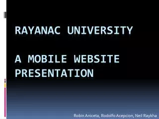
Robin Aniceta, Rodolfo Acepcion, Neil Raykha Rayanac university a mobile website presentation
Introduction • Does it download in a reasonable time • Does it render in a reasonable time • Can it be rendered properly by the mobile browsers • Does the page accommodate the reduced screen dimensions of mobile phones • Does the page accommodate the difficulty of input • Is it appropriate for the mobile context
Dealing with Bandwidth and Latency • Bandwidth. Avoid large graphics. These are rarely appropriate for a mobile context • Latency. Reduce the total number of resources (files) used by either eliminating them or combining them • Reduce Page weight (total size of page)
Five Rules for Designing Usable Mobile Web Sites • 1) The mobile web is mobile • 2) Context is King • 3) The devices are (very) different • 4) Forget your dotcom thinking. You need unique content and design • 5) Never forget rules one to four
The Mobile Web Ecosystem – The User • “Bored now” • Users who have time to kill. These users are mainly users who may be stuck on traffic, on a long bus/train ride to work or back home, etc. • “Repetitive now” • Users who are always on the top of their news. These users are mainly users who repetitively check scores, grades, assignments, etc. • “Urgent now” • Users who are in need of the information A.S.A.P. These users are users who mainly check for schedules, meetings, conditions, etc.