
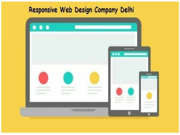
Responsive Web Design and Development Company
Today's web world is not just limited to desktop. People love multi-task and do their internet on mobile devices that they can carry with them wherever they go. In such a scenario, it is important that your site works just as easily on mobile devices as on PCs. And the way to ensure smooth compatibility from device to device is by Responsive Web Design.

Responsive Web Design and Development Company
E N D
Presentation Transcript
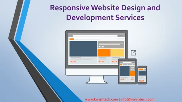
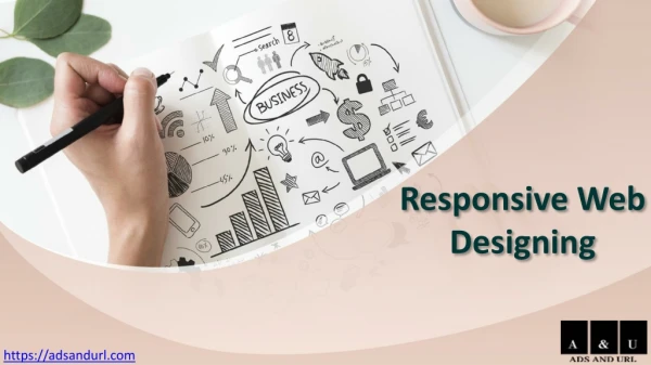
Responsive Website Design and Development Services www.kunshtech.com| info@kunshtech.com
Introduction Gone are the days, when a website was designed for a singleton desktop screen. The technological advancements and expansion technology, dragging web designers' to think beyond the traditional methods. As a matter of fact, wonder how much do you scroll through the World Wide Web on a daily basis using a Phone or Desktop? of a mobile WWW.KUNSHTECH.COM| INFO@KUNSHTECH.COM
What do you mean by Responsive Design? Previous to this concept, in order to read full information on the page, one needed to either move through X-Y coordinates by scrolling left right using touch OR zoom out the display which was even worse. Whereas, in Responsive Web Design, there is no need of scrolling left-right or zoom-in zoom-out anymore. Responsive web design and development allow designs, images and text and most of the front- end elements to respond according to the device or screen size. In short, it will give you the optimum viewing experience for all seize of devices. For example, the web page will look almost the same (unless coded differently for different device sizes) for the 4-inch Mobile Display and the 40-inch TV Display. - ‘All screen,one solution.’ We recommend you to look back at your present web design, or if you’re thinking about developing a new one, from scratch - do consider this is as the most advantageous option. The best responsive web design services utilize fluid grids, flexible images and CSS to render a website as per the width of the browser. For Responsive Web designer, the ultimate goal must be gearing the UI and UX of a website design across various devices and screensizes. WWW.KUNSHTECH.COM| INFO@KUNSHTECH.COM
Why Responsive Web Designing is so Important Imagine your website visitor (essentially a potential customer or client) has to zoom-in to read the text or see an image on his/her mobile device. And your competitor has a mobile responsive website where the same user gets a much better user experience because of the Responsive Web Designing. What will be the outcome? Obvious, your user will prefer your competitor’s website eventually leading to a loss of a potential customerfor you! Developing a countless version of the same website for its compatibility over every device out there - does not sound a practical solution. Moreover, it would be much costly. Albeit future technologies are changing and getting updates at a rapid pace, it might seem next to impossible to maintain static web. Whereas, ResponsiveWebDesign isa bulletproofsolution to future webtechnologies. The statistics itself shows Responsive Web design has immensely growing demands. Over here, designing a website that is compatible with all browsers and its different versions, as well as with the hardware devices is the much-preferred option. The best dope is to test your website design on as many devices as you can. Formoldto new, to each possibleoption. WWW.KUNSHTECH.COM| INFO@KUNSHTECH.COM
Key elements of Responsive Web Design With a large amount of different mobile manufacturers putting out some amazing phones and mobile devices, it is difficult to standardise dimensions responsive websites for all of them. The model size and resolution keeps on changing. Yet, you can find out which browsers and web pages are the most popular amongyour visitors. Just by looking atGoogle analytics. At the endof the day, you will endup with achunk of devices, browsers and resolutions that are being used by people of different continents. Now, what on earth will decide about the standard dimensions for your Website Design? - Being one of the top leading Web DesignCompany with dedicated and experienced web designers,let us helpyou getstarted. • • • The designmust be builtwith a flexiblegridfoundation. Imageswhich has been incorporated into the designhas to be flexible (responsive)themselves. Different views must be enabled indifferent contexts WWW.KUNSHTECH.COM| INFO@KUNSHTECH.COM
Advantages of using Responsive Web Design • You will end up saving a lot of time and it will go easy on your pockets. By building only one solution for all typeof devices, you were providingan amazing experience to the userswith a minimumworkforce. • Responsive web design means, there only one version that needs to be updated with all the trendy features and news. Hence, your back-end developer can work effectively, as everything is going at the same place. • For your front-end developer, the process will become easy, as they do not have to create multiple style sheets, yet there isa lot of work interms of buildinga slick,responsivedesign. • Maintaining an individual mobile design will require additional testing support. Having a separate mobile and desktop design also necessitates two content strategies, two different administrative interfaces and a complex one might require two development team. Responsive designs’ “one size fits all” approach leads to less headache for developers, business owners, and at some point consumers are also beingbenefitted. WWW.KUNSHTECH.COM| INFO@KUNSHTECH.COM
Wrapping up Designing a perfect website is a smart investment for any startup or well-established business. It helps you create your virtual personality. As each business is serving a specific purpose and that should be the main focus. In order to cater perfectly, we devote ourselves, for the customers’ requirements and stick to it. We have a team of dedicated Web Designers, who specialized in crafting wonderful yet functional progressive web designs. Kunsh Technologies offers cost-effective andhigh-quality websolutions. Incase you have any specificrequirementsabout yourweb design.Pingus,we are morethan happyto hear itfromyou. WWW.KUNSHTECH.COM| INFO@KUNSHTECH.COM
Contact us Kunsh Technologies 719A, Sakar IX, Near Old RBI, Ashram Road Navrangpura, Ahmedabad. Gujarat. India. 380009 IN: +91 9879550620 | +91 (79) 4032 2593 Visit Us www.kunshtech.com Mail Us info@kunshtech.com


