Elementary Statistics
A STEP BY STEP APPROACH BLUMAN | MAYER Canadian Edition. Elementary Statistics. Chapter 2: Frequency Distributions and Graphs. 2-1 Introduction 2-2 Organizing Data 2-3 Histograms, Frequency Polygons, and Ogives The Histogram The Frequency Polygon The Ogive Relative Frequency Graphs

Elementary Statistics
E N D
Presentation Transcript
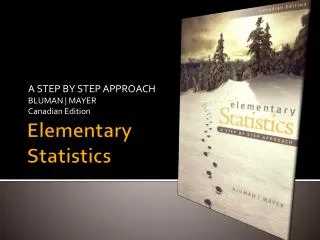
A STEP BY STEP APPROACH BLUMAN | MAYER Canadian Edition ElementaryStatistics
Chapter 2: Frequency Distributions and Graphs • 2-1 Introduction • 2-2 Organizing Data • 2-3 Histograms, Frequency Polygons, and Ogives • The Histogram • The Frequency Polygon • The Ogive • Relative Frequency Graphs • Distribution Shapes • 2-4 Other Types of Graphs • Pareto Charts • The Time Series Graph • The Pie Graph • Misleading Graphs • Stem and Leaf Plots • 2-5 Summary
Chapter 2: Frequency Distributions and Graphs 2-1 Introduction • This chapter describes methods of organizing raw data into logical form derived from a variety of sources • Rationale: Large amounts of data can be difficult to read, analyze and interpret without proper organization • The most convenient method of data organization is construction of a frequency table • Visual methods of data organization derived from a frequency table include charts and graphs • This chapter will illustrate procedures for creating tables and charts for both qualitative and quantitative raw data
Chapter 2: Frequency Distributions and Graphs 2-2 Organizing Data • Raw Data • Unorganized data in original form collected using an appropriate sampling method • Frequency Distribution • Raw data organized in table form using classes and frequencies • Class – qualitative categories or quantitative groupings containing data • Frequency – count of number of data values within a class • Types of Frequency Distribution Tables • Categorical –classes are represented by qualitative (non-numeric) data • Example: Letter grades A, B, C, D, F • Grouped – classes are represented by quantitative (numeric) ranges of values • Example: Numeric grades 70 – 79, 80 – 89, 90 - 99 • Ungrouped – classes represented by quantitative (numeric) individual values • Example – Age of students 18, 19, 20, 21
Chapter 2: Frequency Distributions and Graphs 2-2 Organizing Data • Categorical Frequency Distribution Procedure – qualitative data • Make a table containing all categories in order (i.e. A, B, C, D…) • Tally each data value into each category (1 tick for each data value in class) • Obtain the frequency (tally count) for each category • Find the percentage of values in each class • Percentage = (Class Frequency / Total Frequency) * 100 • Sum the totals for each class Raw Data (blood types) Frequency Distribution
Chapter 2: Frequency Distributions and Graphs 2-2 Organizing Data • General Conventions for Grouped Frequency Tables – quantitative data • Limit number of classes between 5 and 20 • Class width preferably is an odd number so that midpoint is same unit as data points - optional • Classes must be mutually-exclusive (non-overlapping) • Classes must be continuous (no breaks even for classes with a zero frequency) • Classes must be exhaustive (include all data values) • Classes must be of equal class width (exception open-ended distributions, i.e. <100 ) • Grouped Frequency Distributions • Columns in a grouped frequency table may include the following • Class Limits – groupings (range) containing data values (gaps between classes) • Class Boundaries – data groupings in which there are no gaps between classes (Note: always 1 more decimal place then class limits and raw data values) • Class Midpoints – single value representing the middle of a class • Tally – raw count of data values that fall into a class • Frequency – numeric sum of the tally for each class • Cumulative Frequency - count of number of values that are less than or equal to the current class • Relative Frequency – proportion or percentage of values that fall into a class
Chapter 2: Frequency Distributions and Graphs 2-2 Organizing Data • Grouped Frequency Distribution • Determine the class limits and class boundaries • Class Width= Range (highest – lowest value) / # of classes -> round up (nearest whole number) • 1st class must contain lowest value and last class highest value • Tally each data value into the appropriate class, then insert frequency (count) • Find the cumulative frequency (sum of data ≤ current class) for each class Raw Data (final grades) Frequency Distribution Table
Chapter 2: Frequency Distributions and Graphs 2-2 Organizing Data • Ungrouped Frequency Distribution • Determine the class limits (single values) and class boundaries (range of values) • Tally each data value into the appropriate class • Obtain the frequency (count) for each class. • Find the cumulative frequency for each class. Raw Data (fuel consumption l/100 km) Frequency Distribution
Chapter 2: Frequency Distributions and Graphs 2-3Histograms, Frequency Polygons, and Ogives • Introduction to Statistical Graphs • Another method of presenting and describing data distributions is by creating pictorial charts and graphs from both ungrouped (raw) data and grouped data (frequency table) • The four chart types in this section include the … • Histogram – bar chart • Frequency Polygon – line chart • Ogive – Cumulative Frequency Polygon • Relative Frequency Graphs – bar and line charts • Distribution Shapes – patterns will be shown and explained for different types of charts
Chapter 2: Frequency Distributions and Graphs 2-3Histograms, Frequency Polygons, and Ogives • Histogram • A chart type in which vertical bars represent class frequencies • X-axis – width of each bar represents the lower and upper class boundaries from the frequency table • Y-axis – height of each bar represents the frequency of the associated class from the frequency table
Chapter 2: Frequency Distributions and Graphs 2-3Histograms, Frequency Polygons, and Ogives • Frequency Polygon • A chart type in which dots, connected by lines, represent class frequencies • X-axis – class midpoint from the frequency table • Class midpoint - lower class limit (or boundary) + upper class limit (or boundary) divided by two • Y-axis – a dot is placed above the midpoint of each class representing class frequency • Note: include previous and next class midpoint with a frequency of zero to complete frequency polygon
Chapter 2: Frequency Distributions and Graphs 2-3Histograms, Frequency Polygons, and Ogives • Relative Frequency Polygon • A chart type in which dots, connected by lines, represent class relative frequencies • X-axis – class midpoint from the frequency table • Y-axis – a dot is placed above the midpoint of each class representing class relative frequency • Relative Frequency = class frequency divided by total frequency • Note: include previous and next class midpoint with a frequency of zero to complete frequency polygon
Chapter 2: Frequency Distributions and Graphs 2-3Histograms, Frequency Polygons, and Ogives • Ogive • A chart type in which dots, connected by lines, represent cumulative frequencies • X-axis – begin with first lower class boundary and continue to last upper class boundary • Y-axis – place a dot at each upper class boundary for each class • Note: include cumulative frequency of zero for first lower class boundary to complete chart
Chapter 2: Frequency Distributions and Graphs 2-3Histograms, Frequency Polygons, and Ogives • Distribution Shapes • The shape of a distribution provides additional information on the spread of the data and provides clues on the appropriate statistical technique to use (in later chapters) Examples of different distributions are shown below Right-skewed = positive skewed Left-skewed = negative skewed
Chapter 2: Frequency Distributions and Graphs 2-4 Other Types of Graphs • Pareto Chart • Bar chart for sorted categorical (qualitative) data in descending order • Pie Chart • Circle divided into sections representing frequencies for each category
Chapter 2: Frequency Distributions and Graphs 2-4 Other Types of Graphs • Time-Series Chart • Line chart illustrating data trends over time
Chapter 2: Frequency Distributions and Graphs 2-4 Other Types of Graphs • Stem-and-Leaf Plots • Sorted data plot that uses the stem as the leading edge of the data value with the remaining part of the data value used to form groups or classes • Procedure – sort the raw data, then group into classes, then plot using the leading digit as stems and the trailing digits as leaves (evenly spaced apart) 1. Raw Data (cardiograms) 2. Sort Data 3. Group Data (classes) 4. Plot Data
Chapter 2: Frequency Distributions and Graphs 2-4 Other Types of Graphs • Misleading Charts • Charts containing actual data may be drawn to emphasize a point or make a misleading comparison • Example 1 – changing the scale to emphasize a comparative chart Actual Chart Misleading Chart Correct zero starting point Incorrect non-zero starting point
Chapter 2: Frequency Distributions and Graphs 2-4 Other Types of Graphs • Misleading Charts • Example 2 – changing the perspective to over-emphasize a difference Actual Chart Misleading Chart
Chapter 2: Frequency Distributions and Graphs 2-5 Summary • Chapter 2 reviewed the following main concepts • This chapter described methods of taking unstructured raw data and classifying the data into a more readable tables called frequency distributions • Chart making techniques were illustrated in order to visualize data including the creation of commonly used line charts, bar charts and pie charts. • Other types of graphs were reviewed that helped to make the data more readable, such as Pareto charts, time-series charts and stem-and-leaf plots. • A first look at distribution shapes provided incites on the importance of recognizing patterns in the data which will aid in determining statistical techniques in later chapters.
Chapter 2: Frequency Distributions and Graphs Chapter Quiz • Quiz – multiple choice questions for chapter 2 • External link: Bluman / Mayer, Elementary Statistics • Online Learning Centre • Click here for chapter 2 quiz questions • Answer the 10 questions and submit your results

