Visualizing the Supply Chain
This presentation explores various visualization techniques for the supply chain, emphasizing the importance of flow charts to track parts and optimize processes. It covers transportation maps depicting interstate commerce shipments from California, showcasing unique modes of transport analyzed through geographic and statistical data. Additionally, the session incorporates mashups with extreme weather data, highlighting the impact of tornadoes on freight logistics from 1950 to 2010. Participants will gain insights into effective visualization strategies that enhance supply chain understanding.

Visualizing the Supply Chain
E N D
Presentation Transcript
Visualizing the Supply Chain Bay Area R Users’ Group 2011.12.13 Anthony Sabbadini sabbadini@economicriskmanagement.com
Outline • 1. Flow Charts • 2. Transportation Maps • 3. Mashups
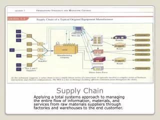
Flow Charts with ‘diagram’ library(diagram) names <- c("Chicago", "Detroit", "Fremont", "LA", "Memphis", "San Antonio", "Tijuana") M <- matrix(nrow = 7, ncol = 7, byrow = TRUE, data = c( # ch de fr la me sa ti 0, 1, 0, 0, 0, 0, 0, #ch 0, 0, 0, 0, 0, 0, 0, #de 1, 0, 0, 1, 1, 1, 1, #fr 1, 0, 0, 0, 1, 0, 0, #la 0, 0, 0, 0, 0, 0, 0, #me 0, 0, 0, 0, 0, 0, 0, #sa 0, 0, 1, 1, 0, 1, 0 #ti )) png(’nummi.png') pp <- plotmat(M, pos = c(1,3,2,1), curve = 0.1, name = names, lwd = 1, box.lwd = 2, cex.txt = 0.8, box.type = "square", box.prop = 0.5, arr.type = "triangle", arr.pos = 0.4, shadow.size = 0.00, prefix = "f", main = "NUMMI network") dev.off()
Interstate Commerce Shipments from California (2007) source: http://ops.fhwa.dot.gov/freight/freight_analysis/faf/index.htm
Spoke Networks with ‘geosphere’ library(maps) library(geosphere) # Unique transportation modes modes <- unique(california$DMODE_MEANING) # Color pal <- colorRampPalette(c("#333333", "white", "#1292db")) colors <- pal(100) # Cycle through the transportation modes for (i in 1:length(modes)) { pdf(paste("value_mode", modes[i], ".pdf", sep=""), width=11, height=7) map("world", col="#191919", fill=TRUE, bg="#000000", lwd=0.05, xlim=xlim, ylim=ylim) csub <- california[california$DMODE_MEANING == modes[i],] csub <- csub[order(csub$Value..mil.),] maxcnt <- max(csub$Value..mil.) for (j in 1:length(csub$GEOGRAPHY)) { arc <- csub[j,] inter <- gcIntermediate(c(arc[1,]$Long_origin, arc[1,]$Lat_origin), c(arc[1,]$Long_dest, arc[1,]$Lat_dest), n=100, addStartEnd=TRUE) colindex <- round( (arc[1,]$Value..mil. / maxcnt) * length(colors) ) lines(inter, col=colors[colindex], lwd=0.6) } dev.off() }