Download
1 / 6
60 likes | 185 Vues
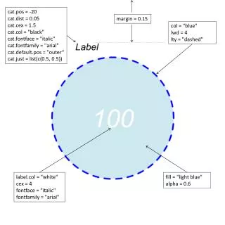
This project explores data visualization techniques emphasizing distribution characteristics. Utilizing parameters like point position, color schemes, and font styles, we create an appealing representation of data. The settings include a black italic font on a light blue background, enhancing readability against dashed lines. This project highlights the importance of aesthetic elements in data interpretation and presents various configurations to achieve a professional look, making the data more engaging for viewers.

E N D
cat.pos = -20 cat.dist = 0.05 cat.cex = 1.5 cat.col = "black" cat.fontface = "italic" cat.fontfamily = "arial" cat.default.pos = "outer“ cat.just = list(c(0.5, 0.5)) margin = 0.15 col = "blue" lwd = 4 lty = "dashed" label.col = "white" cex = 4 fontface = "italic" fontfamily = "arial" fill = "light blue" alpha = 0.6
ext.text = TRUE ext.line.lwd = 1 ext.dist = 0 ext.l = 1 ext.pos = 0 ext.text = TRUE ext.line.lwd = 2 ext.dist = -0.15 ext.l = 0.95 ext.pos = -4 scaled = TRUE inverted = FALSE scaled = TRUE inverted =TRUE
rotation = 2 reverse = TRUE rotation = 1 reverse = FALSE
euler.d = FALSE euler.d = TRUE
rotation = 40 rotation = 0
euler.d = TRUE & scaled = TRUE euler.d = TRUE & scaled = FALSE euler.d = FALSE & scaled = FALSE