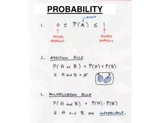
Probability
Probability. January 08, 2013. Riddle Me This. The more you have of it, the less you see. What is it? darkness. Kick Off. Evaluate the expression using the correct order of operations. 5 + 3 2 / 3 - 7 1. Choosing an Appropriate Display.

Probability
E N D
Presentation Transcript
Probability January 08, 2013
Riddle Me This.. • The more you have of it, the less you see. What is it? • darkness
Kick Off • Evaluate the expression using the correct order of operations. 5 + 32 / 3 - 7 • 1
Choosing an Appropriate Display Learn to select and use appropriate representations for displaying data.
x x x x x x 1 7 9 2 5 3 6 1 Choosing an Appropriate Display There are several ways to display data. Some types of displays are more appropriate than others, depending on how the data is to be analyzed. Use a bar graph to display and compare data. Use a line plot to show the frequency of values. Use a stem-and-leaf plot to show how often data values occur and how they are distributed.
Choosing an Appropriate Display Use a circle graph to show how a set of data is divided into parts. Use a line graph to show how data change over a time period. Use a Venn Diagram to show relationships between two or more data sets.
Choosing an Appropriate Display Additional Example 1A: Choosing anAppropriate Display The students want to create a display to show each species of butterfly as a percentage of all species in the butterfly family. Which type of graph would they use? Explain. Circle graph; each listed species is a part of the whole population.
Choosing an Appropriate Display Additional Example 1B: Choosing anAppropriate Display The students want to create a display to show the relationship between the species of butterflies in the park. Choose the type of graph that would best represent this data. Venn diagram; it shows butterflies cannot be two species.
Choosing an Appropriate Display Check It Out: Example 1A The students want to create a display to show the total number of roses in the garden and see which ones occurred more frequently. Line plot; it would display the total number of roses and allow the students to see the frequency.
Choosing an Appropriate Display Check It Out: Example 1B The students want to create a display to show the number of English Roses in the garden compared to the total percentage of roses. Circle Graph; it would display each species of roses in the garden as a percentage of the whole population.
Choosing an Appropriate Display Additional Example 2: Identifying theMost Appropriate Display The table shows the number of visitors to the butterfly park during a four month period. Explain why each kind of display would or would not appropriately represent the data.
Choosing an Appropriate Display Additional Example 2A: Identifying theMost Appropriate Display Circle Graph A circle graph shows how a set of data is divided into parts. The circle graph does not accurately display the number of visitors per month, so it is not appropriate in representing the data.
Choosing an Appropriate Display Additional Example 2B: Identifying theMost Appropriate Display Bar Graph A bar graph displays and compares data. The bar graph appropriately displays and compares the data and the number of visitors during each month.
Choosing an Appropriate Display Additional Example 2C: Identifying theMost Appropriate Display Line Plot A line plot shows the frequency of values. May June JulyAug X X XX 100 200 300 400 500 600 700 800 900 1000 There are only four data values to display, so it does not appropriately display the frequency in which visitors visit the park.
Choosing an Appropriate Display Additional Example 2D: Identifying theMost Appropriate Display Line Graph A line graph shows how data changes over time. The line graph appropriately displays and compares the data and the number of visitors during each month.
Choosing an Appropriate Display Check It Out: Example 2 The table shows the weight of 4 animals at the Animal Sanctuary. Explain why each kind of display would or would not appropriately represent the data.
Choosing an Appropriate Display Check It Out: Example 2A Line Graph A line graph shows how data changes over time. The line graph does not appropriately display and compare the different animals weight.
Stems Leaves 1 7 8 0 21 0 42 0 Choosing an Appropriate Display Check It Out: Example 2B Stem-and-Leaf Plot A stem-and-leaf plot shows how often data values occur and how they are distributed. There are only 4 data values, and how often they occur and how they are distributed are not important.
Choosing an Appropriate Display Check It Out: Example 2C Circle Graph A circle graph shows how a set of data is divided into parts. A circle graph appropriately shows the proportionate amount of weight compared to the total weight of all the animals.
Choosing an Appropriate Display Check It Out: Example 2D D. Bar Graph A bar graph displays and compares data. The bar graph appropriately displays and compares the weight of each animal.
Insert Lesson Title Here Choosing an Appropriate Display Lesson Quiz: Part I For each description of the data set, tell what type of display would be most appropriate. 1. The number of points scored per game by the basketball team during the season. 2. The number of books read by each student in third period English class. Line graph Line plot
Insert Lesson Title Here Choosing an Appropriate Display Lesson Quiz: Part II 3. The percentage of the variety of cakes made by a bakery. 4. The number of magazine subscriptions sold by each member of the sales staff. Circle graph Bar Graph
Choosing an Appropriate Display • Shakespeare vs. Harry Potter Task • WRITE NAME ON PAPER • Due Date: Monday, January 14th • Review Task • Use dice for question 1 to determine which word to start on • HW: WB 7-7, page 64