Using SPSS for Graphic Presentation
Using SPSS for Graphic Presentation. Various Graphics in SPSS Pie chart Bar chart Histogram Area chart Line chart Scatter plot Various Options for Graphics in SPSS Simple graphics: Use Chart option in Analyze > Descriptive Statistics > Frequencies

Using SPSS for Graphic Presentation
E N D
Presentation Transcript
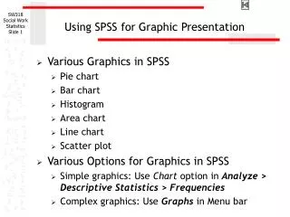
Using SPSS for Graphic Presentation • Various Graphics in SPSS • Pie chart • Bar chart • Histogram • Area chart • Line chart • Scatter plot • Various Options for Graphics in SPSS • Simple graphics: Use Chart option in Analyze > Descriptive Statistics > Frequencies • Complex graphics: Use Graphs in Menu bar
Histogram in SPSS (1) Suppose we want to create a histogram showing survey respondents’ age [age] distribution. We start it with opening Frequencies window by clicking Analyze > Descriptive Statistics > Frequencies.
Histogram in SPSS (2) After you move the variable of interest [age] to the variable box, click on Chartsbutton at the bottom of the window.
Histogram in SPSS (3) Then, a new window pops up. Here you click on Histograms in Chart Type box. Now click on Continue button to finish the Charts setting and OK button to see the Output.
Histogram in SPSS (4) Histograms are useful to present overall distribution pattern of interval level variables, such as age [age].
Pie Chart in SPSS (1) Suppose we want to create a pie chart showing survey respondents’ marital status distribution. We start it with opening Frequencies window by clicking Analyze > Descriptive Statistics > Frequencies.
Pie Chart in SPSS (2) After you move the variable of interest [marital] to the variable box, click on Chartsbutton at the bottom of the window.
Pie Chart in SPSS (3) Then a new window pops up. Here you click on Pie charts in Chart Type box and Frequencies in Chart Values box. Now click on Continue button to finish the Charts setting and OK button to see the Output.
Pie Chart in SPSS (4) This is the output window you will see. The first two tables are the same Frequencies tables as you saw in the last class. But, now you have a pie chart that graphically shows the distribution of the survey respondents’ marital status [marital].
Pie Chart in SPSS (5) In this chart, however, there is no exact frequencies or percentage information which might help the audience better to understand the distribution of marital status. Of course we can add those info onto this chart. It starts with opening a SPSS Chart Editor window by double-clicking the chart.
Pie Chart in SPSS (6) First, click on Chart > Options in the window.
Pie Chart in SPSS (7) In the Pie Options window, you click on Values of Labels box to add frequency or Percents to add percent value onto the chart (You can choose either or both of them). Then, click on OK button.
Pie Chart in SPSS (8) Now, you can see the percentage value for each category is added under each value label.
Bar Chart in SPSS (1) Follow the direction of Pie Chart in SPSS slide 1 through 3 but select Bar charts option at this time. Also, select whether you use frequency values or percentage values for chart values by clicking one in the Chart Values box. Then, click on Continue and OK buttons.
Bar Chart in SPSS (2) Since we selected “Frequencies” of the Chart Values options in the previous slide, this bar chart presents frequency value for each category of marital status.
Clustered Bar Chart in SPSS (1) Assuming you want to present how the distributions of marital status [marital] of the survey respondents are different by gender [sex] group. Then, you may need this type of “clustered bar chart”.
Clustered Bar Chart in SPSS (2) For this kind of complex chart, we use Graphs menu in the menu bar. Select Graphs > Bar to open a bar chart window.
Clustered Bar Chart in SPSS (3) Select “Clustered” in the middle of three graph options and “Summaries for groups for cases” in the Data in Chart Area box. Then click on Define button.
Clustered Bar Chart in SPSS (4) First, select which value you want for bars to represent in the chart among the options of Bars Represent box. To select frequencies of each category, choose “% of cases”.
Clustered Bar Chart in SPSS (5) Select [marital] from the list of variables on the left and move to the “Category Axis” text box by clicking the triangle button in between. Also, select and move the variable [sex] to the “Define Clusters by” box. Now click on OK button.
Clustered Bar Chart in SPSS (6) Since we selected “% of cases” in the “Bars represent” options, bars in the chart represent percent values for marital status of the survey respondents. Also, as shown in the legend, red bars are for male respondents’ marital status whereas green bars are for female. By double clicking the chart, you can open the Graph Editor window.
Clustered Bar Chart in SPSS (7) You can add exact percent value of each bar using Format > Bar Label Style in the SPSS Chart Editor window or simply clicking icon from the icon bar.
Clustered Bar Chart in SPSS (8) You can also add a title for graph and/or footnotes in the SPSS Chart Editor window. This slide shows a Clustered Bar Chart with value labels, titles, and footnote.
Stacked Bar Chart in SPSS (1) If you selected “Stacked” instead of “Clustered” in slide 18, you would have a Stacked Bar Chart shown in the next slide.