Download
1 / 30
300 likes | 450 Vues
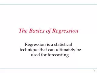
The Basics of Regression. Remember back in your prior school daze some algebra? You might recall the equation for a line as being y = mx + b. Or maybe you had the form y = a + bx. Maybe you even had another form. Did you?

E N D
Remember back in your prior school daze some algebra? You might recall the equation for a line as being y = mx + b. Or maybe you had the form y = a + bx. Maybe you even had another form. Did you? Notice how the y term is on the left of the equal sign. It looks like y is all by itself, but actually it is called the dependent variable. The value of y depends on the value of x. x is the independent variable. On the right side the variable x has a coefficient with it called the slope. The slope can be negative or positive, or even zero. The term that is on the right with no x hooked to it is called the y-intercept, or intercept for short. The intercept can be positive, negative or zero.
y This height is called the intercept. x Here I show three different lines with the same intercept. But, different lines could have different intercepts. Intercepts can even be negative.
2 Say we move from a dot one unit away in the x direction. The slope then tells us how far we have to go in the y direction to get back to the line. y 1 The dot on the line is represented by an x value and a y value. ? 1 x 3 Note on the upward sloping (to the right) curve when we went over to the right on x we have to go up on the y variable. On the flat line we wouldn’t move in the y direction at all, and on the downward sloping line we would move down to the line.
Now, in algebra, we might have a specific line with the form • y = 60 + 5x. Then we can say, when • x= y= • 0 60 • 65 • 70 • 75 and so on. In algebra every point fits exactly on the line.
Now, let’s use an example to see how what we have just been thinking about is related to statistics. Say a chain of pizza joints has stores in many college towns. And say it is wondering if the sales in these towns are related to the size of the college in terms of student population. Sales would be the y variable because sales are thought to depend on the population. The student population would be the x variable. On the next screen I have data from 10 of the stores. Note each row is a store and we have on each line the population and the sales. Then we put each store as a dot in the scatter diagram.
Do the dots fit exactly on a line like in algebra? No, but maybe a line can be put into the data so that the line can be used to represent the data.
Math form It is thought that in the population the variable x and y are related in the following general form: y = B0 + B1 x + e, where B0 is the y intercept of the line, B1 is the slope of the line, and e is an error term that captures all those influences on y not picked up by x. The error term reflects the fact that all the points are not directly on the line. So, we think there is a regression line out there that expresses the relationship between x and y. We have to go find it. In fact we take a sample and get an estimate of the regression line.
Later we will see a method to get an estimate, but for now say we have the method. When we have a sample of data from a population we will say in general the regression line is estimated to be ^ y = b0 + b1 x, where the ‘hat’ refers to the estimated value of y. Once we have this estimated line we are right back to algebra. y hat values are exactly on the line. Now, for an each value of x we have data values, called y’s, and we have the one value of the line, called y hat.
At each x a deviation, or residual is the data value minus the y hat value. The method we use to find the line is called the (ordinary) least squares method. From the data of our example I tell you the least squares method gives the equation y hat = 60 + 5x (look like the algebra you saw before?) Now, go back to the slide with the data. Create a y hat, or values of y on the line, column (you don’t have too, but think about it). You get this column by taking the population values for x in each row and plug into the line to get the y hat. The difference between the sales values and the y hat values are the deviations to which I refer.
ordinary least squares The typical method used to pick the line through the data is called the ordinary least squares line. This method is the one that minimizes the sum of squared deviations of the data points to the line. The line has desirable properties(not proven here): 1) It is unbiased - if many samples were taken, the average of the intercepts and slopes from the samples would be the population intercept and slope. 2) It is consistent - ‘large’ samples would give the population intercept and slope as well.
One last point in this section. When you see the scatterplot like the one I had before, you should look at the pattern in the dots. Look at the dots from left to right. 1) if the dots go up hill, suggesting a positive slope, you should get the feel that the sample suggests the relationship between the variables is then beginning to look like a positive relationship – this means the two variables tend to move in the same direction. The means higher values for x go with higher values for y. 2) If the dots go down hill the sample is suggesting there is a negative relationship between the variables. 3) If the dots are flat the sample is suggesting there is no relationship between the variables.
On the previous slide I have an Excel regression output. The example is the pizza sales we saw before. The first thing I look at is the coefficients. See cell b28 has the word coefficient. We take the information below and write the equation as y hat = 60 + 5x. This is the estimated regression equation. The intercept is 60 and the slope is 5. Remember x = population of students and y = sales. Hey, books use the symbol y to represent the value on the line at a particular x value. I will type y hat because it is easier and you can make the translation. Can you do this for me, please?
Hypothesis test about the population slope B1. Remember we have taken a sample of data. In this context we have taken a sample and estimated the unknown population regression. Our real point in a study like this is to see if a relationship exists between the two variables in the population. If the slope is not zero in the population, then the x variable has an influence on the outcome of y. Now, in a sample, the estimated slope may or may not be zero. But the sample provides a basis for a test of the true unknown population slope being zero. For the test we will use the t distribution.
The t-distribution At this stage of the game I am going to have you accept some of the following without much proof. The t-distribution is like the normal except for two notable features. 1) t-distributions tend to be wider (show more variability) than z distributions. 2) the t-distribution does not have one standard like the normal distribution. Each t-distribution is unique, based on its degrees of freedom. Admittedly, degrees of freedom is a term without much meaning to you, but in the context of simple regression equals the sample size minus 2. Also note the sample size refers to the number of subjects in the study. We have two values on each subject, an x and a y value. In the restaurant example I have a sample size of 10.
Many books have t-tables. Or you could do a Google search. Go to the upper tail area being .025. If you run down the column with your finger you will notice at the bottom the number 1.96. So, when the degrees of freedom is really large, the t is like the z. But, with other degrees of freedom on the t-distribution, you have to go out farther than 1.96 to get to .025 in the upper tail. This is what I mean be t-distributions being wider. The t-values in this table are critical values for tests of hypotheses. Back to our hypothesis test about the slope. The null hypothesis is that B1 = 0, and the alternative is that B1 is not equal to zero. Since the alternative is not equal to zero we have a two-tailed test. Our example has a sample size of 10, so the degrees of freedom is 8. A level of significance of .05 means we want .025 on each side for a two tail test. From t-table the critical t is 2.306.
Back on the computer output we see the calculated t in cell d30. The t stat from the sample is the slope divided by the standard error. Notice the t is 8.6167. Since this is bigger than the critical t we reject the null and conclude the slope is not zero in the population. Thus in the population of all company stores, sales are influenced by populations of students in the college towns. Excel prints the p-value for the test. For the slope we have 2.55E-05. E notation of the form E-05 means move the decimal in the number 5 places to the left. So our p-value is 0.0000255. This is a two-tailed p-value. Since this is less than .05, it is an alternative way to reject the null hypothesis. This method can be used without looking at the t-table.
In cells f30 and g30 you have the 95% confidence interval for the slope. The interval is (3.6619, 6.3381). So you can be 95% confident the true unknown population slope is in this interval. A few slides back I wrote ,” From the t-table the critical t is 2.306.” The margin of error in the confidence interval is the critical value times the standard error: (2.306 ).5803 = 1.3381 for an interval for the slope 5 – and + 1.3381. In cell b17 you see the R square value of 0.9027. Sometimes this is called r2, and its real name is the coefficient of determination. The coefficient of determination is a statistic used to see how well the data points “hug” the regression line. The value can be anywhere from 0 to 1. If all the data points actually touch the line then R square would be 1. If the value is 0 the points are not close to the line at all.
The square root of the coefficient of determination is the correlation coefficient ( called r). Remember the correlation coefficient was an indicator of the direction and strength of the relationship between two variables. The correlation coefficient could be anywhere from minus 1 to 1. Negative values meant a negative relationship and positive values meant a positive relationship. There we said the closer to 1 or minus 1 the stronger the relationship. If R square = 1, r = 1 and the relationship is as strong as you can get. If R square = .9, r = .94 and you still have a pretty strong relationship. If R square = .5, r = .71 and you would still be in the strong relationship neighborhood.
Well, in this section I have tried to go over some of the basic regression ideas. The point again is that we are studying two variables together and trying to establish if the two variables are related or not. Why should we care if two variables are related? As a person in business it might help the bottom line. As another example, say it can be established that the size of the advertising budget has an impact on sales. This could help us determine the right size budget. I have a claim that one day I will try to back up by using regression. I claim that recycling of paper makes states in the country have less trees. Each state probably recycles a different number of pounds of paper and has a certain amount of tree population growth or destruction. With tree population as the dependent variable, I would expect the slope coefficient on pounds of paper recycled to be negative. In other words, the more recycling, the less trees. (ITS an econ story, but anyway.) Regression can be used in social policy analysis. Anyway, that’s all for now.
Y y X x Null hypothesis Alternative hypothesis
ON the previous slide I have two graphs with some points in each (ignore the ovals for now, please). Imagine there are more points in the same basic area as those shown. Now, we use stats to help us understand the world and in the context of regression we think variables are related. Examples would be that income depends on years of school, or weight depends on net calories consumed, or gpa depends on hours studied per week. IN each example the thinking is that one variable changes value from one person to the next because each person does not have the same value of another variable – not all people have the same income because not all people have the same years of schooling.
There is a tradition in statistics to say initially that there is no relationship between two variables (even if our research and theorizing suggests there is). The null hypothesis is then that the slope of a regression line between the two variables is zero. This would mean the data are the graph on the left. In stats we take a sample from a population and make calculations – here we calculate the regression coefficients. We take a random sample, which means every data point has an equal chance of being picked. Now if you look at the graphs again and this time look at the ovals. Say the ovals represent the data points that make it in our sample. If you just focus on the ovals could you tell which graph the data came from? No, both samples suggest a positive relationship between x and y.
Now in regression we assume the slope in the population is zero and use the sample slope as a basis for a test of hypothesis about the population slope. Under the hypothesis of a zero slope if the slope we get has a low probability of occurring then we reject the null and conclude the population slope is not zero. Look back at the graph on the left. Could we get a random sample that would only include points in the oval? Yes we could, but is seems more likely the random sample would include other points, like in upper left. So we have a low probability of getting the sample and thus the slope. When we have a low probability result (.05 is chosen as low) we reject the null and conclude the population is probably more like the alternative.
In the pizza example from before on the Excel printout you see the value 0.9501 in cell B16. Excel labels this “Multiple R” and for use this is the sample correlation between population and store sales. An equivalent hypothesis test about the slope of the regression line being zero is a population correlation between the population and sales being zero. We would have Ho: rho = 0 Ha: rho ≠ 0. Let’s remember in the example that the slope in the sample was 5. Plus we see in the Excel printout that the slope of 5 has a t statistic calculated for it and the associated 2-tail P-value.
It turns out that when we do a hypothesis test about the population correlation between 2 variables, the t statistic and p-value used in for the regression slope are exactly the same for the test with the population correlation. Here we saw that the t-statistics had a low p-value and we could thus reject the null hypothesis of no relationship between the two variables in the population. NOTE: In Excel the Multiple R will always be reported as a positive value. But, if the estimated slope from the sample is negative (in our example it is positive, but if in another example it is negative Excel will show a negative sign on the slope value), the user of Excel would say that the sample correlation is negative and the t statistic would also be negative. This is so well known that Excel is expecting us to make this interpretation.