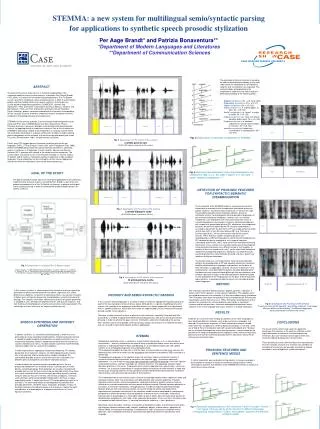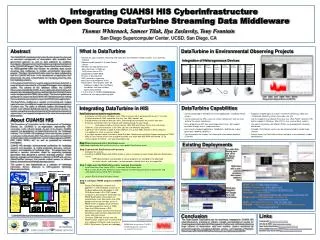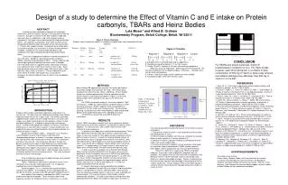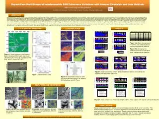
Abstract
RESEARCH POSTER TITLE HERE - USUALLY 50 PT, UPPERCASE AND CENTERED Author N. One 1 , Author N. Two 2 , Author N. Three 1 1 Department of Neuroscience, Uniformed Services University, Bethesda, MD 2 Walter Reed Army Institute of Research, Silver Spring, MD. Abstract

Abstract
E N D
Presentation Transcript
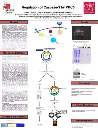
RESEARCH POSTER TITLE HERE - USUALLY 50 PT, UPPERCASE AND CENTEREDAuthor N. One1, Author N. Two2, Author N. Three11Department of Neuroscience, Uniformed Services University, Bethesda, MD2Walter Reed Army Institute of Research, Silver Spring, MD Abstract The abstract for your research poster goes here. A rule of thumb is that your poster should be able to be read in under 10 minutes. By keeping the amount of text down, you will also be able to keep the text size large enough to read comfortably at a distance of about 5 feet. Results Figures The Results section often consists of two columns in the center of the poster. This will depend on the amount of material in your Results section, and how many figures you have. Pictures should be in PNG or JPEG format and should be large enough to print well. In general anything taken from the web is too small to print well. It is up to you whether or not to use a border around your figure. Thick borders look bad and take up space. 3/4 point is a good choice. Discussion Colors. Try not to have a clashing color scheme, like bright green and red text on a blue background. If choosing colors is not your thing, Powerpoint has several fine color scheme presets. It’s best to use dark text on a light background - this saves ink, and there’s less risk of smearing. A monochromatic color scheme - different shades of one color - will always look fine, even if it’s not the most exciting. If you want to use a photograph in the background, try to find one that isn’t too busy. Your text must be legible over the photo. Other options are a gradient or patterned background. Background options are under Format > Slide Background. Fig. 2. Figure Legends can also go to the side of the figure. Conclusion Your conclusion goes here. Often authors like to accent certain sections, usually the abstract and conclusion, by using a colored box like this. If you use a box, add a little extra margin so that the text isn’t crowded against the edge of the box. Format Text Box > Text Box > Internal Margin Introduction Fonts Try to use no more than two different typefaces in your poster. A common technique is to use a bold san-serif typeface like Arial or Helvetica for your titles and headings, and a regular serif font like Times New Roman for the body. It is perfectly acceptable to use one typeface for the entire poster, and just use bold for headings and italics for accents. A common misconception is that the more typefaces the better. This just makes your poster look cluttered and, often, difficult to read. Body text size should be at least between 12 and 18 points in this file (24 and 36 points final) in order to be legible from 5 feet. Fig. 1. Figure Legend can be smaller than the body text. You can use a san-serif font, and use an accent color for a little variety. Methods Layout Often the conference you are attending will provide requirements for your poster. If you receive such guidelines, provide them to Graphics with your work order request. Also on your work order put the final size of the poster, and if you would like it laminated. The most common poster size is 6 ft wide by 4 ft high. Graphics’ large-format printer can print a maximum 50 inches wide by any length up to 100 ft. Set up your Powerpoint file to be half size, 36 x 24 inches, to be printed at 200%. Keep in mind that all your measurements (e.g. type and figures) will be 50% of the final print. The USU logo usually goes in the upper left corner. Any other institutions’ logos will go in the upper right. This will depend on your individual situation. Please use the USU logo provided with this sample poster file. It has a transparent background and is of suitable quality for printing. Please do not use a USU logo obtained from the web; web files are too small too print well. If you are using a logo from another institution please obtain a seal suitable for printing if at all possible. If you must use a seal off the Internet be aware that it will look pixelated when printed. References References are often in smaller type than the body of the poster. References are often in smaller type than the body of the poster. References are often in smaller type than the body of the poster. References are often in smaller type than the body of the poster. References are often in smaller type than the body of the poster. Acknowledgements Acknowledgements are usually in smaller type too. Table 1. Figure Legend can be smaller than the body text. You can use a san-serif font, and use an accent color for a little variety.
RESEARCH POSTER TITLE HERE - USUALLY 50 PT, UPPERCASE AND CENTEREDAuthor N. One1, Author N. Two2, Author N. Three11Department of Neuroscience, Uniformed Services University, Bethesda, MD2Walter Reed Army Institute of Research, Silver Spring, MD Abstract The abstract for your research poster goes here. A rule of thumb is that your poster should be able to be read in under 10 minutes. By keeping the amount of text down, you will also be able to keep the text size large enough to read comfortably at a distance of about 5 feet. Results Figures The Results section often consists of two columns in the center of the poster. This will depend on the amount of material in your Results section, and how many figures you have. Pictures should be in PNG or JPEG format and should be large enough to print well. In general anything taken from the web is too small to print well. It is up to you whether or not to use a border around your figure. Thick borders look bad and take up space. 3/4 point is a good choice. Discussion Colors. Try not to have a clashing color scheme, like bright green and red text on a blue background. If choosing colors is not your thing, Powerpoint has several fine color scheme presets. It’s best to use dark text on a light background - this saves ink, and there’s less risk of smearing. A monochromatic color scheme - different shades of one color - will always look fine, even if it’s not the most exciting. If you want to use a photograph in the background, try to find one that isn’t too busy. Your text must be legible over the photo. Other options are a gradient or patterned background. Background options are under Format > Slide Background. Fig. 2. Figure Legends can also go to the side of the figure. Conclusion Your conclusion goes here. Often authors like to accent certain sections, usually the abstract and conclusion, by using a colored box like this. If you use a box, add a little extra margin so that the text isn’t crowded against the edge of the box. Format Text Box > Text Box > Internal Margin Introduction Fonts Try to use no more than two different typefaces in your poster. A common technique is to use a bold san-serif typeface like Arial or Helvetica for your titles and headings, and a regular serif font like Times New Roman for the body. It is perfectly acceptable to use one typeface for the entire poster, and just use bold for headings and italics for accents. A common misconception is that the more typefaces the better. This just makes your poster look cluttered and, often, difficult to read. Body text size should be at least between 12 and 18 points in this file (24 and 36 points final) in order to be legible from 5 feet. Fig. 1. Figure Legend can be smaller than the body text. You can use a san-serif font, and use an accent color for a little variety. Methods Layout Often the conference you are attending will provide requirements for your poster. If you receive such guidelines, provide them to Graphics with your work order request. Also on your work order put the final size of the poster, and if you would like it laminated. The most common poster size is 6 ft wide by 4 ft high. Graphics’ large-format printer can print a maximum 50 inches wide by any length up to 100 ft. Set up your Powerpoint file to be half size, 36 x 24 inches, to be printed at 200%. Keep in mind that all your measurements (e.g. type and figures) will be 50% of the final print. The USU logo usually goes in the upper left corner. Any other institutions’ logos will go in the upper right. This will depend on your individual situation. Please use the USU logo provided with this sample poster file. It has a transparent background and is of suitable quality for printing. Please do not use a USU logo obtained from the web; web files are too small too print well. If you are using a logo from another institution please obtain a seal suitable for printing if at all possible. If you must use a seal off the Internet be aware that it will look pixelated when printed. References References are often in smaller type than the body of the poster. References are often in smaller type than the body of the poster. References are often in smaller type than the body of the poster. References are often in smaller type than the body of the poster. References are often in smaller type than the body of the poster. Acknowledgements Acknowledgements are usually in smaller type too. Table 1. Figure Legend can be smaller than the body text. You can use a san-serif font, and use an accent color for a little variety.