Download
1 / 41
410 likes | 429 Vues
Understand various Earth components by studying local environment, entering data into GLOBE database to visualize in graphs, maps. Learn about relationships in Earth system science using data.

E N D
Gaining a better understanding of the various components of the Earth system Phenology Atmosphere Hydrology Soil Land Cover
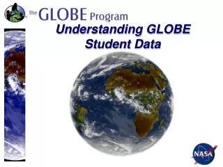
Students begin by studying their own local environment – looking at the air, the land, the soil, and the water.
Students enter their data into the GLOBE database via the Internet or via Email data entry.
Students can visualize their data in several ways. Raw Data Graphs Maps Google Earth
Data can be displayed as individual data in a map This map displays the maximum air temperature in Europe on February 27, 2007.
These data can then be placed on an x, y scatter plot to allow students to see the relationship between temperature and latitude.
Drawing a straight line through these points will help students understand this relationship.
Data can also be displayed as contours (this map displays maximum air temperature in Eastern U.S. on March 28, 1999). Scientists often ask, “Are the data reasonable?”
Look at the colors near Chicago and New York City. Where do these colors lie on the temperature scale? Are these temperatures reasonable for late March in northern latitudes?
When we display the data in an x, y plot we can see that there may be a couple of errors. 55 C at 40 Latitude and 30 C at 42 Latitudedon’t seem like reasonable values for late March. What might have happened to cause these errors?
Student data can be compared to Environmental Models North America Europe Maximum Temperature recorded at GLOBE sites for the preceding 24 hours Maximum Temperature recorded at GLOBE sites for the preceding 24 hours Maximum Temperature predicted for this date by the NOAA Environmental Modeling Center Maximum Temperature predicted for this date by the NOAA Environmental Modeling Center
Data can also be displayed in graphs. This is mean air temperature for a school in Pennsylvania.
Math extension: how is mean temperature calculated? Can students create a mean temperature graph by using maximum and minimum data? They can then compare their graph with that generated by the GLOBE Web site.
If students understand that the mean is between the maximum and minimum, then they will be able to successfully create a mean temperature graph using maximum and minimum data (below left). Overlaying their mean graph on a maximum/minimum graph (above left) they should see their line fitting in between the two existing lines. Maximum and minimum values, as an example, for 5 January were 20 and 15 respectively (see the values circled to the left). The mean can be found by adding the two variables and dividing by the number of digits, e.g. 2. These two values add up to 35, therefore the mean would be 17.5 (35/2). We can see that one day in early January there was a day in which the mean was approximately 18.
Data from multiple schools can be displayed in a graph. • This is the mean air temperature for the school in Pennsylvania combined with the mean air temperature for a school in Australia. • Can you see how air temperature and seasons differ • between Northern and Southern hemispheres?
Data from up to six schools can be displayed in a graph. This is the mean air temperature for the school in the U.S. and the school in Australia combined with a school in Benin, West Africa. Now, air temperature and seasonal fluctuations can be seen for Northern and Southern hemispheres as well as near Equatorial.
Data sets are created on demand. This allows for a closer look at a particular year or years.
Data can be displayed in stacked graphs for easier observation.
Graphs of data can also be used as a tool to explain relationships in the natural world. Graphs of data can also be used as a tool to explain relationships in the natural world.
What environmental data might be represented here? Whatever data are displayed, they seem to be inversely proportional….
What if we knew that these data were from the same location and that the red line represented Surface Water (SW) Temperature? What might the green line represent?
Here is a clue: Henry's Law (Chemistry Extension) The value of the Henry's Law constant is found to be temperature dependent – the value generally increases with increasing temperature. As a consequence, the solubility of gases generally decreases with increasing temperature. The decrease in solubility of gases with increasing temperature is an example of the operation of Le Chatelier’s principle.
Henry’s Law states that as temperature increases the solubility of a gas decreases.
Dissolved Oxygen fits both Henry’s law and the pattern of the graph.
Student data can display what Henry’s Law states. Notice that as the red line (Water Temperature) increases the green line (Dissolved Oxygen) decreases.
Data from other parts of the world show the same relationship.
Schools in the Southern Hemisphere see the same relationship.
What is the relationship between precipitation and soil moisture?
Soil moisture values drop during dry periods and rise again with the introduction of rainfall. Notice that during the dry months the green line (10 cm) falls more than the light blue line (90 cm).
Students can then look beyond GLOBE data and begin asking questions about their environment.
What is the relationship between malaria occurrences and rainfall? This school in Benin graphed cases of malaria in the community with temperature and precipitation.
This school in Benin graphed cases of malaria in the community with temperature and precipitation. Cases of Malaria Temperature Precipitation This student research has since sparked a related Madagascar Malaria project and a Thailand Dengue Fever project
Student Research Conferences Helsinki, Finland June 30 - July 4, 1998 Fayetteville, Arkansas, USA June 25 - 28, 2000 Sibenik, Croatia June 29 - July 4, 2003 Cape Town, South Africa June 22 - 28, 2008
GLOBE Learning Expedition – South Africa 2008 June 22 – 28, 2008, in Cape Town, South Africa • Over 500students, teachers and scientists from more than 50 countries • Students from each country presented their winning research projects • Field campaigns mixed students, teachers and scientists in collaborative investigation of the local environment • Country representatives presented cultural presentations, including dance, music and story-telling
Students also have the opportunity to interact with their peers and NSF scientists in GLOBE’s Earth System Science Projects (ESSPs) Season and Biomes – Students monitor the seasons in their biome and learn how interactions within the Earth system affect their local environment and how it in turn affects regional and global environments. Carbon Cycle – Through field exercises, computer modeling, and remote sensing, students will gain knowledge about current carbon cycle research, develop strong analytical skills, and increase their overall environmental awareness. Watershed Dynamics– Students conduct science investigations on local and regional watersheds using real-time and historical scientific data from the dataset being constructed by the Consortium of Universities for Advancement of Hydrologic Science (CUAHSI). From Local to EXtreme Environments (FLEXE) – Students collect data from their local environment and compare it with data from an extreme deep-sea environment, their analysis guided by scientists. Scientific reporting, peer review, and communication with scientists at sea during a research cruise cap the students' experience.
The GLOBE Student Climate Research Campaign (SCRC) is a two-year event that engages students from around the world in the process of investigating and researching their local climate and sharing their findings globally. SCRC is comprised of learning activities, international collaborative discussions on climate, data collection, and short-term and longer-term research investigations. Students will gain a fundamental understanding of climate and the climate system through inquiry-based, hands-on activities and international collaboration before exploring climate through research. Climate is the critical issue of our time and understanding climate from a scientific perspective is critical to addressing local climate impacts. Coming September 2011 Engage Your Students in Understanding Climate
GLOBE Students have entered over 21 million measurements to date. Imagine the possibilities for student research!
GLOBE partnering students, teachers and scientists to gain a better understanding of our planet
And it can begin by using your mouse to go to the GLOBE Home Page: www.globe.gov Musmusculusphoto by George Shuklin