Enhancing User Support: Online Documentation Strategies
200 likes | 253 Vues
Explore the importance of effective documentation in user support, focusing on online resources and interactive help features. Learn about shaping content, usability, and advantages. Discover innovative approaches for crafting online tutorials and guiding users through complex processes efficiently. Tips for designing readable content and effective online help systems are also discussed.

Enhancing User Support: Online Documentation Strategies
E N D
Presentation Transcript
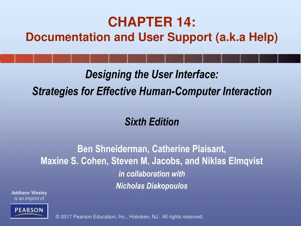
Designing the User Interface: Strategies for Effective Human-Computer Interaction Sixth Edition Ben Shneiderman, Catherine Plaisant, Maxine S. Cohen, Steven M. Jacobs, and NiklasElmqvist in collaboration with Nicholas Diakopoulos CHAPTER 14: Documentation and User Support (a.k.a Help)
Documentation and User Support (a.k.a Help) Topics • Introduction • Shaping the Content of the Documentation • Accessing the Documentation • Reading from Displays versus Reading from Paper • Online Tutorials and Animated Demonstrations • Online Communities and Avenues for User Support • The Development Process
Introduction • When it comes to learning about computer systems many people experience anxiety, frustration, and disappointment • Even though increasing attention is being paid to improving interface design, complex systems can still benefit context-sensitive, online help
Shaping the Content of the Documentation • This particular quick start guide is for Microsoft OneNote 2016 • it points out common actions for users • Its goal is to minimize the learning curve for users upgrading from a previous version • The quick start guide is four pages, this is the first page • Explanations are provided for the toolbar and the ribbon in addition to other commonly used features
Organization and Writing Style • The documentation content is organized as single source topics created, during the authoring process, with the intention of reuse • The various documentation end-products (compiled help, website, print) are mapped from the various combinations of the single source topics
Reading from paper versus from displays • The heat maps from the eye tracking study • Red indicates the area where the user looked most, yellow indicates fewer views, and blue indicates the fewest views • Gray is used for areas that were not viewed • The image on the left is from an article in the “About us” section of a corporate web site, the center image is a product page on an e-commerce web site, and the image on the right is from a search engine results page • (Jakob Nielsen)
Writing for the Web • Break your text into short sections with clear headings • Start with your key message • Write short sentences and short paragraphs • Use lists and tables – tables may not work well for mobile devices • Write meaningful links (do not use: “click here”) • Illustrate your content
Advantages of Online Documentation • Physical advantages • available whenever on web-connected electronic device, can’t get lost or misplaced, physical workspace not needed, can be updated rapidly • Navigation features • can provide index and other search facilities, can link to other external materials and sources • Interactive services • can bookmark, annotate, and tag, can include graphics, sound, color, and animation, screen readers or other tools can be provided for users with disabilities
Online Help • This figure provides a step by step approach to the activities in a database migration application • The details involved in each step can be found on the left hand side • The actual action and activity is in the middle • On the bottom is a road map for the steps involved the steps are marked as to their status (completed, in progress, not started) • For novices it would be easy to insert links to more detailed tutorial-type information • www.fmpromigrator.com
Online Help (continued) • This shows a small tool-tip or fly-over help on Microsoft Word • Moving the mouse (cursor) over a particular icon causes an explanation of the icon to appear on the screen
Online Help (concluded) • Since this is a complicated music interface, interactive help is provided for many of the fields • This figure shows all the help balloons open • Several standard icons are used such as new, import, record, play, but other specific icons explain the various modes that are available using the tool • http://www.saxopedia.com/2013/12/07/calypso-score-the-perfect-ipad-music-score-reader/
Reading from paper versus from displays • Visual fatigue and stress from reading computer displays are common problems, but these conditions respond well to rest, frequent breaks, and task diversity • Even if users are not aware of visual fatigue or stress, their capacity to work with displays may be below their capacity to work with paper documentation
Reading from paper versus from displays (concluded) • Designers should be aware how poor information design can make reading more difficult and disrupt the process • Some guidelines for supporting reading are: • Don’t use uncommon or unfamiliar vocabulary • Avoid difficult to read typefaces (all caps is harder to read) • Avoid text on busy backgrounds • Avoid information buried in repetition • Do not use centered text New eBook devices will be created that support the metaphor from physical books, allowing the user to flip the pages to scan the contents of the book.
Online manuals and help (example) The National Institute for Health’s site for seniors (http://www.nihseniorhealth.gov) has controls to adjust the text size, adjust the contrast, and turn speech on or off. The font used is a sans-serif font, and the font size is larger than the typical size used on the Web. Several ways are provided to navigate through the information (alphabetical, grouping by category, etc.).
How highlighting, fonts etc. help the user • This is a specialized interface called Tagged Comments • The comments section can be found in the lower right corner • Comments can be read and briefly scanned by looking at the included icons (smiley faces) • In the upper right corner, the user can filter the comments by category • The tutorial content is seen on the left • Another window that does not show in this figure would allow a user to submit a comment
Development process guidelines • Seek professional content writers and copywriters • Prepare user documentation early (before implementation) • May act as an alternative to the formal s/w specification. • Set up guideline documents and coordinate and integrate across all involved departments • Review drafts thoroughly • Field-test early editions • Provide feedback mechanisms for readers • Revise to reflect changes regularly