Download
1 / 49
500 likes | 518 Vues
Learn to optimize typography in web design with CSS, focusing on font selection, measurement units, and text spacing properties for better readability and aesthetics.

E N D
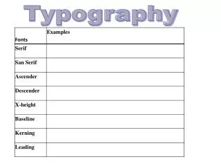
Understanding Type Design Principles • Choose fewer fonts and sizes • Choose available fonts • Design for legibility • Avoid using text as graphics
Choose Fewer Fonts and Sizes • Your pages will look cleaner when you choose fewer fonts and sizes of type • Decide on a font for each different level of topic importance, such as page headings, section headings, and body text • Communicate the hierarchy of information with changes in the size, weight, or color of the typeface
Use Available Fonts • The user’s browser and operating system determine how a font is displayed • To control more effectively how text appears on your pages, think in terms of font families, such as serif and sans-serif typefaces
Avoid Using Text as Graphics • Save text graphics for important purposes, such as the main logo for your page or as reusable navigation graphics • Remember that including text as graphics means users cannot search for that text • Whenever possible, use HTML-styled text on your pages
Understanding CSS Measurement Units • CSS offers a variety of measurement units, almost to the point of offering too many choices • For example, to specify font size, you can use any of the measurement units listed in the following table
Absolute Units • Specify a fixed value P {margin: 1.25in;} • Cannot be scaled to client display • Should only be used when exact measurements of destination medium are known
Relative Units • Enables scalable Web pages that adapt to different display types and sizes • Recommended method for Web page design • Relative measurement values such as em and px are designed to let you build scalable Web pages that adapt to different display types and sizes • The W3C recommends that you always use relative values
The em Unit • The em is a printing measurement, traditionally equal to the horizontal length of the capital letter M in any given font size • In CSS the em unit is equal to the font size of an element • It can be used for both horizontal and vertical measurement
The ex Unit • The ex unit is equal to the height of the lowercase letter x in any given font • As shown in the figure, the height of the lowercase letter x varies widely from one typeface to another
The px Unit • Pixels are the basic picture element of a computer display • The size of the pixel is determined by the display resolution • Pixel measurements work well for computer displays, but they are not so well suited to other media, such as printing
Percentages • Percentage values are always relative to another value • For example, the following rule sets the font size for the <body> element to 1.5 times the size of the browser default: body {font-size: 150%;} • Child elements inherit the percentage values of their parents • For example, the < b> text in the following example is 125% larger than the <p> that contains it: p {font-size: 12pt;} p b {font-size: 125%;}
Using the CSS Font Properties • font-family • font-size • font-style • font-variant • font-weight • font (shorthand property)
Specifying Font Family • Allows specification of generic font family names (e.g., sans-serif) or a specific name (e.g., Arial) • p {font-family: sans-serif;} • p {font-family: arial;}
Specifying Font Size • The following rule sets the <p> element to 1.5em Arial: • p {font-family: arial; font-size: 1.5em;}
Specifying Font Style • The font-style property lets you specify italic or oblique text • p {font-style: italic;}
Specifying Font Variant • The font-variant property lets you define small capitals, which are often used for chapter openings, acronyms, and other special purposes • h1 {font-variant: small-caps;}
Specifying Font Weight • The font-weight property lets you set the weight of the typeface • p {font-weight: bold;}
Using the Font Shortcut Property • The font shortcut property lets you abbreviate the more verbose individual property listings • The following rules produce the same results p {font-weight: bold; font-size: 18pt; line-height: 24pt; font-family: arial;} p {font: bold 18pt/24pt arial;}
CSS Text Spacing Properties • text-indent • text-align • line-height • vertical-align • letter-spacing • word-spacing
Specifying Text Indents • Use the text indent property to set the amount of indentation for the first line of text in an element, such as a paragraph • The following rule sets an indent of 24 points: • p {font-family: text-indent: 24pt;}
Specifying Text Alignment • Use the text-align property to set horizontal alignment for the lines of text in an element • p {text-align: justify}
Specifying Line Height • CSS allows you to specify either a percentage or absolute value for the line height, which is more commonly called leading • The following rule sets the line height to 2 em: • p {line-height: 2 em;}
Specifying Vertical Alignment • The vertical-align property lets you adjust the vertical alignment of text within the line box • Vertical-align works on inline elements only
Specifying Vertical Alignment (continued) • You can also use vertical alignment to align text with graphics • The following rule, added to the <img> element with the style attribute, sets the vertical alignment to top: <img src=”image.gif” style=”vertical-align: text-top;”>
Specifying Letter Spacing • To adjust kerning, the printer’s term for adjusting the white space between letters, use the letter spacing property • The following rule sets the letter spacing to 4 points • h1 {letter-spacing: 4pt;}
Specifying Word Spacing • The word-spacing property lets you adjust the white space between words in the text • The following code sets the word spacing to 2 em • h1 {word-spacing: 2em;}
Summary • Use type to communicate information structure; be sparing with your type choices, and use fonts consistently • Remember that HTML text downloads faster than graphics-based text; use HTML text whenever possible • Use browser-safe fonts that will display as consistently as possible across operating systems
Summary (continued) • Standardize your styles by building external style sheets and linking them to multiple documents • Test your work; different browsers and computing platforms render text in different sizes • Use type effectively by choosing available fonts and sizes; design for legibility and use text to communicate information about the structure of your material
Summary (continued) • Choose the correct measurement unit based on the destination medium • For the computer screen, ems, pixels, or percentage measurements can scale to the user’s preferences
Summary (continued) • Use the font properties to control the look of your letter forms • Specify font substitution values to ensure that your text is displayed properly across different platforms • Use the text spacing properties to create more visually interesting and legible text