Download

1 / 6
60 likes | 185 Vues
This project by Elizabeth Pappenfus and Madison Anderson examines the interrelationships among illiteracy, free lunch programs, diabetes prevalence, and populations aged 65 and over across various counties. Findings reveal that Traverse and Aitkin Counties have higher percentages of seniors compared to Hennepin and Anoka. A significant correlation exists between rates of free lunch and diabetes, particularly in Cass and Mahnomen counties. Clustering patterns highlight that higher rates of illiteracy correlate with higher percentages of free lunch assistance, indicating socio-economic challenges in certain areas.

E N D
MDS and Cluster Project By: Elizabeth Pappenfus & Madison Anderson
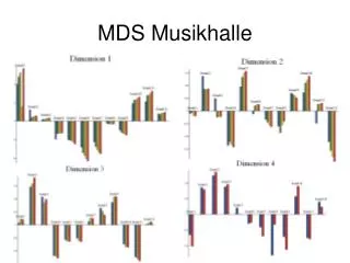
Distant Graph on Illiteracy, Free Lunch, Diabetics & 65 & over
The first thing to note is how Traverse and Aitkin Counties are towards the top because those percentages of 65 and over are larger in comparison to Hennepin and Anoka counties that have smaller percentages of 65 and over. The horizontal dimension is showing the distant between % of free lunch where Cass has a large % of children receiving free lunch and % diabetic where Carver and Washington have a smaller percentage. Everything else that centers towards the middle is not really significant in their percentages of over 65, illiteracy, diabetics, and free lunches. Overall illiteracy, didn’t have too much of an impact on the distances. It correlated more with free lunches and diabetics, but nothing too significant. Diabetic and free lunches went strongly together and had shorter distances from each other as seen in Cass county and Mahnomen.
On the far right, we see a cluster of counties that have high percentages of illiteracy and mid-high percentages of free lunches. On the far left, we see a cluster of high percentages of diabetic, free lunches, and 65 and over. Diabetic data is striped due to the fact that the range of % was from 6-11. The graph of illiterate and over 65 shows how correlated illiteracy can be in older counties than younger ones. We see clearer clusters for illiterate and free lunches and for free lunches and over 65. This means that there are more distinct counties that have high percentages of illiteracy and free lunches and free lunches and over 65. Diabetics and over 65 we see a clear cluster of low diabetics and low over 65 populations but we also see a few outliers in the green cluster that may suggest just odd distributions of either over 65 or diabetics within that cluster.