Download
1 / 21
210 likes | 318 Vues
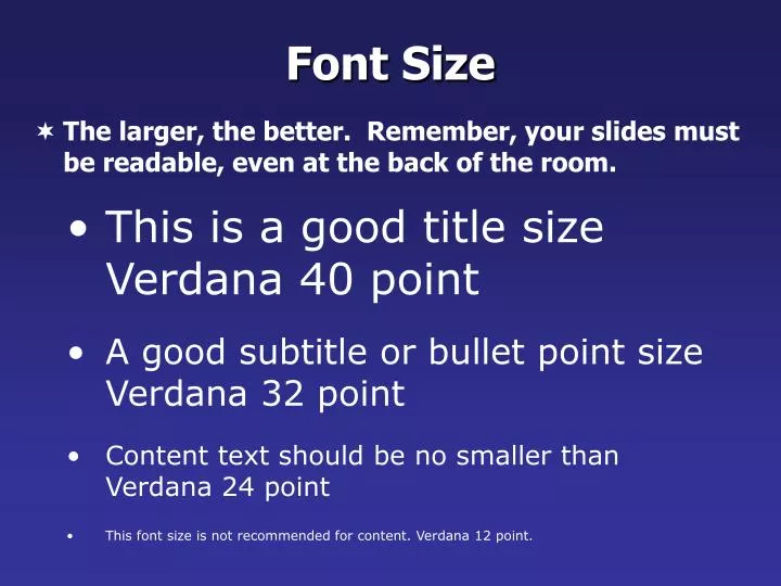
Font Size. The larger, the better. Remember, your slides must be readable, even at the back of the room. This is a good title size Verdana 40 point A good subtitle or bullet point size Verdana 32 point Content text should be no smaller than Verdana 24 point

E N D
Font Size • The larger, the better. Remember, your slides must be readable, even at the back of the room. • This is a good title size Verdana 40 point • A good subtitle or bullet point size Verdana 32 point • Content text should be no smaller thanVerdana 24 point • This font size is not recommended for content. Verdana 12 point.
Don’t ! Font Size • Combining small font sizes with bold or italics is not recommended: • What does this say? Garamond Font, Italic, Bold 12pt. • This is very difficult to read. Times Font, Bold, 12pt. • This point could be lost. Century Gothic Font, Bold, Italic, 14pt. • No one will be able to read this. Gill Sans Font, Condensed Bold, 12pt • Small fonts are okay for a footer, such as: TIPS Presentation: 3/8/2004 Dawn Thomas, CRM
Don’t ! Fonts • Don’t Sacrifice Readability for Style • Don’t Sacrifice Readability for Style • Don’t Sacrifice Readability for Style • Don’t Sacrifice Readability for Style
Caps and Italics • DO NOT USE ALL CAPITAL LETTERS • Makes text hard to read • Conceals acronyms • Denies their use for EMPHASIS • Italics • Used for “quotes” • Used to highlight thoughts or ideas • Used for book, journal, or magazine titles
Do !! Use the Same Backgroundon Each Slide
Don’t! • Don’t use multiple backgrounds in your presentation • Changing the style is distracting
Colors • Redsandorangesare high-energy but can be difficult to stay focused on. • Greens,blues,andbrownsare mellower, but not as attention grabbing. • Reds and Greens can be difficult to see for those who are color blind.
Don’t ! Avoid These Combinations • Examples: • Green on Blue • Dark Yellow on Green • Purple on Blue • Orange on Green • Red on Green
Colors • White on dark background should not be used if audience is more than 20 ft away. • This set of slides is a good example. • You can read the slides up close. • The further away you get, the harder it is to read. • This is a good color combination if viewed on a computer. • A dark background on a computer screen reduces glare.
Don’t Colors • Large Hall Events • AvoidWhite Backgrounds • The white screen can be blinding in a dark room • Dark Slides with LightColored Text Work Best
BackgroundColors Remember: Readability! Readability! Readability! This is a good mix of colors. Readable! This is a bad mix of colors. Low contrast. Unreadable! This is a good mix of colors. Readable! This is a bad mix of colors. Avoid bright colors on white. Unreadable!
Graphs and Charts Make sure the audience can read them!
Graphics and Charts Don’t ! Avoid using graphics that are difficult to read. In this example, the bright colors on a white background and the small font make the graph hard to read. It would be very difficult to see, especially in the back of a room. 8
Don’t ! This graph contains too much information in an unreadable format. 10
Do ! Good Graph These are examples of good graphs, with nice line widths and good colors.
Do ! Charts and Graphs 80 Mode A 70 60 Mode B 50 40 Mode C 30 20 10 0 North Europe Australia America
Do ! Points to Remember • Keep bullet points brief • Use the same background for each slide • Use dark slides with light colored text in large hall events
Don’t Avoid the “All Word” Slide Another thing to avoid is the use of a large block paragraph to introduce your information. Attendees do not like to have what is on the screen, read to them verbatim. So, please use short, bulleted statements and avoid typing out your whole presentation on to the slides. Also, it is difficult for some to listen and read a large amount of text at the same time.
Limit Animation ! • Use the same animation throughout the entire presentation • Using more than one can be very distracting • The audience will only see the animation and not the message you’re trying to get across Bam! Don’t
Do ! Limit Animation ! • Use the same animation throughout the entire presentation • Using more than one can be very distracting • The audience will only see the animation and not the message you’re trying to get across
YOU • Do not use the media to hide you • The audience came to SEE you • The media should ENHANCE the presentation, not BE the presentation • If you’re only going to read from the slides, then just send them the slides! • Remember, only you can prevent “Death by PowerPoint”