Fanzine Website Proposal
This proposal outlines a dynamic and engaging website dedicated to the Audrey Hepburn Children's Fund. Featuring Audrey Hepburn's official signature, the site combines modern design with classic appeal, making it accessible for a diverse, primarily female audience. A sleek splash page introduces visitors with rotating images linked to various sections, while a customized mouse cursor enhances the user experience. The website includes easy navigation options, including a search box and direct donation links to support UNICEF. The overall visual style is simple yet effective, aiming to attract both admirers of Audrey and new fans alike.

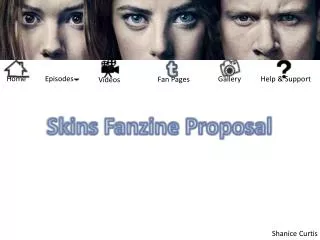
Fanzine Website Proposal
E N D
Presentation Transcript
Fanzine Website Proposal Audrey Hepburn By Lauren Mayer
Research Information about donating to the charity ‘Audrey Hepburn Children's Fund’ Splash page – Introduces the website before entering it Her actual signature is appeared at the top of the page that makes the website more official, next to the site name Rotating images, each individual image links to the areas of the website made in flash Customized mouse including curser trail, compliments the female target audience and younger audiences. Each figure is a link, name appears at the bottom. This means you can only see what is in the website one at a time Dotted border that contributes the simplicity of the website
Research Rollover links are a tad too bright and don’t fit in with the scheme of the website, to fit the target audience Search box to help navigate around the website using key words Navigation both along the top and bottom. Horizontal navigation guides you around the entire website whereas vertical navigates the individual page White background that makes the website look more modern in comparison the classic images. The overall visual style is quite plain, although it is simple it is effective Buttons that guide the audience down to read more information and images rather than a scroll bar at the side of the web page
Research Contact numbers and address’ Links to the store and popular items that contribute to the Unicef charity Links to PayPal to donate
Target Audience • Aimed at a more female audience – Curser trail, simple colour scheme • Website used blue – intend to use purple/lilac • Range of ages • Middle aged and above – who admired her from a young age through her life • Young adults – who admire her now after her life has ended • Galaxy advert shows her iconic image, appeal to a variety of audiences • Film fans – people who educate in films, study classics
Assets • Customize cursor - stars • Music – soundtrack from her films – “moonriver” Breakfast at Tiffanys • Advertisement of her children’s fund • Clips, trailers and scenes from her iconic films
Site Map Splash Page Audrey Hepburn’s Children’s Fund Contact Life Biography Filmography Home Photography Style Introduction Movie stills 1929-1940 About Iconic roles 1940-1948 1948-1952 Store 1952-1960 1960-1968 Make a donation 1968-1980 1968-1993
Navigation Methods • A home button on each page to refer back to the main page • Rollover images linking to other sites for example, movie posters to find our more about that film • Main navigation bar • Youtube links • Links to make a donation to her children’s fund • Email addresses
Visual Style • Gradient background to make the website seem modern, clean and fresh in comparison to the classic images • Include a splash of purple color to compliment her and that will be more inviting to the female target audience • Subtle rollover links that suit more to the color such as lilacs • Italic body text • 80% size font • Include more colours in the navigation and borders the brighten up the website, not too much to make it look tacky • Dashed or dotted border to the make the website remain classy • White body to keep the simplistic look
Navigation Bar Dimensions: 960px – 30px Header Dimensions: 960px – 150px Section Dimensions: 810px – 550px Float Left Sidebar Dimensions: 150px – 550px Float left Line height – 38px Text align - Centre Footer Dimensions: 960px – 38px
Meta Data • Audrey • Hepburn • Gregory Peck • Films: • How to Steal a Million My Fair Lady Paris When It Sizzles Charade Breakfast at Tiffany's The Nun's Story Funny Face Sabrina Monte Carlo Baby Roman Holiday • Secret People • Unicef • Moon river • Style/fashion • Icon