Download

1 / 20
210 likes | 395 Vues
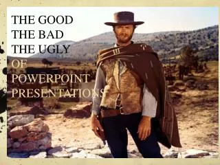
The Good, the Bad, and the Ugly in PowerPoint Slide Shows. Karin A. Bast UW-La Crosse Summer 1998 http://www.uwlax.edu/itlc/PPT/intermed/index.htm. What You’ll See and Hear. Examples of good and bad design Graphics Sound Animation Transitions Samples of slide layouts

E N D
The Good, the Bad, and the Ugly in PowerPoint Slide Shows Karin A. Bast UW-La Crosse Summer 1998 http://www.uwlax.edu/itlc/PPT/intermed/index.htm
What You’ll See and Hear • Examples of good and bad design • Graphics • Sound • Animation • Transitions • Samples of slide layouts • Tips for presenting slide shows
The Good … • Constant color scheme • 5 to 7 words per line • 5 to 7 bullets per page • No clutter • Skip “a”, “an”, “the” where possible
The Good ... • One concept per slide • No complete sentences • Highlights of the subject • No pages of text • Simple and consistent animation • Unobtrusive transitions
The Good … • One template or background • Consistent use of color and fonts • Bold and italics used sparingly • Color evokes emotional response • Black and white causes short attention span • Clip art used only where appropriate
The Bad … • Change of color scheme • Gratutous clip art • Distracting transitions • Long sentences, lots of text on the slideinstead of bullets. Small fonts make readability difficult in the back of the classroom. Overuse of bold, italics, font sizes, colors.
The Bad cont. • Cont. instead of just the same title • Sound that doesn’t add anything • Too much clutter • I particularly dislike full sentences that wrap to the next line and could have been cut instead of running on. • Too many bullets • Running off the slide due to above • Putting text below slide space
The Bad cont. • Cont. instead of just the same title • Sound that doesn’t add anything • Too much clutter • I particularly dislike full sentences that wrap to the next line and could have been cut instead of running on. • Too many bullets • Running off the slide due to above • Putting text below slide space
The Bad ... Switching color for no reason just distracts. Sometimes you need a paragaraph for a quote or definition. Put it on a slide by itself instead of crowding your slide with a number of lines. This is hard to read. What do you think of the color and the long paragraph? How about the misspelling?
The Bad … • This is my students’ favorite clipart. • Note that sound may or may not help the audience attend to what you are saying. • Most included sounds are short but you can record your own. Note style change
The Ugly ... • Too much of anything • Sickening transitions • Bad color schemes • Distracting sounds
Too much of a good thing The Ugly … • Since all three of our kids have started college, the Bast family outflow has taken a BIG upsurge!
Examples of What’s Available • Title slide • Bullet • Combination text and graphic • Organization chart • Chart (graph) • Word Tables
Tips for Presenting Shows • Know your content • Have “Handout” or outline nearby • Try not to get ahead of your slides • Use a cordless mouse so you aren’t tethered • Keep light on in room • Maintain eye contact
Tips for Presenting Shows • Stop for discussion if appropriate • Use other media as well • overheads, handouts, blackboard • Provide handouts to audience • Vary class from day to day (not PowerPoint every time!) • Use Pack and Go for large shows
Tips for Presenting Shows • Use StyleChecker • Always spellcheck • Practice the show • Remember it’s YOU not the show they should pay attention to