Engaging Multimedia Advertising for Out and Up’s New Adventure Centre
820 likes | 942 Vues
Out and Up, a company specializing in team-building exercises for young adults, has launched a new activity centre featuring an assault course and café in a beautiful woodland area. To attract youth groups (ages 17-23), we aim to create an interactive multimedia advertising campaign that highlights the centre's exciting offerings. This campaign will reflect Out and Up’s reputation for thrilling experiences while utilizing modern technology to engage the audience visually and interactively. The product will maintain a consistent style and effectively lead to bookings.

Engaging Multimedia Advertising for Out and Up’s New Adventure Centre
E N D
Presentation Transcript
Scenario for the project: • ‘Out and Up’ is a company that runs team-building exercises for young adults. The company has recently bought a small plot of woodland and has set up an activity centre that includes an assault course and a café. • ‘Out and Up’ want to use new technology to advertise this new activity centre to youth groups. You have been asked to produce an interactive multimedia product that would advertise the facilities available at the centre in a manner that would appeal to adults between the ages of 17 and 23. ‘Out and Up’ are aware that this advertising could take many different forms and are happy for you to decide on an appropriate format for your product. However, the product must have a consistent style throughout. • ‘Out and Up’ already has a reputation for creating exciting team-building exercises and wants to continue this reputation with the new activity centre. They are keen that the advertising that is created for the centre should reflect their reputation. Therefore, they have asked that the advertising uses a range of interactivity and effects to create an advert that appeals to the target audience, is visually exciting and leads to bookings being made at the new centre.
Gathering Requirements: Sense of Audience and Purpose where? why? what? who? how?
Gathering Requirements: Task Who is the target audience? Why is it needed? – entertain, educate, inform, persuade Where will it be used (platform)? Whatneeds to go in it (content)? How will I go about producing it?
Identify your client's requirements All will... Pass • Describe some aims of the website and the audience • List the main sections of the website with brief descriptions Most will... Merit • Describe a range of aims of the website and the audience • List the main sections of the website with “good” descriptions • Give reasons for your choices Some will... Distinction/ Distinction* • Detailed descriptions of the main sections • Explain in detail how your website will be suitable for the purpose and audience • Give well-thought out reasons for your choices
Questions • What are the different sections? • What social media and advertising features does it use? • What navigation does this website use? • Is the navigation easy to use? • What page layout does this website use? • Does this website have a consistent layout? • What colour scheme does this website use? • Does this website use consistent styles? • How do you get back to the home page? • Is it easy to return to the home page? • What interactive elements does this website use? For example, interactive buttons, video or audio • Is the content easy to understand? • Is the content suitable for the purpose and audience? • Is there any accessibility features? For example, increase text size, audio narration, alt-descriptions.
Creating a structure chart All will... Pass • Create a navigational map to show only the main menu Most will... Merit • Create a navigational map to show the main menu and sub-categories with each section Some will... Distinction(*) • Create a logical navigational structure
Creating a website using storyboards All will... Pass • Design at least 3 web pages • Choose a colour scheme and house style • Use a consistent layout • Uses a simple navigational structure • Some interactive elements Most will... Merit • Storyboard all the web pages in your website • Use a consistent layout and house styles • Use more then one way to navigate the site using a main and side menu • Use a range of interactive elements Some will... Distinction(*) • Detailed storyboards using a range of interactive elements and some accessibility features • Explain the suitability of the web page design
Success Criteria - Navigation All will... Pass • Identify different types of navigation • Identify some rules for creating “good” navigation and apply it to your product Most will... Merit • Identify a range of rules for creating “good” navigation and apply this to your product Some will... Distinction • Write a detailed description about “good” navigation for your product
Storyboards • Consistent layout • Menu options • Describe the content – images, text and video • Label colour codes • Describe interactive elements i.e. roll-over effects and video controls, audio button
Web design • Web design process http://www.youtube.com/watch?v=QUeLejt3_Nw • How does the internet work? http://www.youtube.com/watch?v=7_LPdttKXPc&feature=watch-vrec
Stages in the Design Process Fit for audience and purpose? Gather Requirements Design Development Test
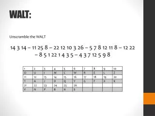
Lesson: Storyboarding & Navigation WALT: • What are the different types of navigation? • What is “good” navigation? • Label and justify your choice of navigation in your storyboard. • Design a menu for your Information point.
Linear ... • A linear structure guides the user through a direct flow of pages, then directing them out the other end of the experience. • Often a linear structure allows navigation both backward one step and forward one step. • The end of a sequence may exit the program, or loop back to the beginning. Advantages of a linear experience • You can guide a user through the experience with very few distractions, buttons or options. You can get users to see something they wouldn’t otherwise have seen. Warnings • If you’re going to attempt to lock people into a linear experience make sure there is a payoff for the user. If they get bored you may experience what is called ‘dropoff’, especially when you reach a barrier page like a form or a page where they need to read a lot of text. Always let the user see the pot of gold at the end of the tunnel, and it can be a good idea to show progress. Uses: Step by Step Tutorial, Booking Process
Hierarchy ... • This structure is used often for many kinds of information, and people are frequently familiar with it. • Of course, you still have to make good decisions about where to place each display so that the relationships in the hierarchy make sense to the learners! • Navigation in a strict hierarchical structure requires that users return to a higher level before they can move laterally and make another choice at that level.
Mesh… A mesh structured website is what makes up 99% of the web. A website that links to multiple pages and they generally all link back to each other. There is no set order and your experience ends when you are done. Going to a theme park would be an example of a mesh experience. Pros • Web users are very familiar with the mesh system. It allows them to quickly find areas they need or want quickly. Lots of information can be provided, providing users the freedom to see what they want and move on. Sites can be expanded with growth quite easily. Cons • Users can miss important content. Relies heavily on information layout and page structure to make sure the user understands the key areas. Only a few key areas can be emphasized.
Visual Effects _ using Filters and Textures Gradient Shadow Effect Bevel - Flat Bevel - Smooth
Starter: Exploring Different Types of Navigation • Look at this website • Kids National Geographic • http://kids.nationalgeographic.co.uk/kids/ • Robotics: Sensing-Thinking-Acting. • http://www.thetech.org/exhibits/online/robotics/ • The Killers: • http://www.thekillersmusic.com/ Make a list of all the different ways you can navigate the website.
Hotspot Image Navigation Bar
Interactive/ Creative Navigation Bars • http://www.icff.co.uk/ • http://vandelaydesign.com/blog/galleries/creative-navigation/
Different Types of Navigation • Navigation Bars and Menus • Action Buttons i.e. Home, Next, Back, • links in blocks of text • Clickable Image/ Hotspot Image • Keyword Search • Site map • Breadcrumb navigation
Golden Rules of “Good” Navigation • Always have: • Link back to a home page i.e. Clickable Logo • A consistent layout • Keep the main navigation (Global menu) and sub navigation (Local menu) always in the same place on every page. • Use of familiar symbols and icons • Button/ menu names that make sense • Make links obvious i.e. underlined or different colour text
User interaction • rollover effects • mouse changes • sound effects • drag and drop • video controls • Scroll bars • Drop down menu
Decide on A House style • Define your colour scheme and explain how it will be used: Go to - http://colorschemedesigner.com/ • Define Font styles and explain how it will be used
Possible Use of Colours • Menu button • Roll over button • Border for images • Backgrounds • Hyperlink text • Title • Sub titles • Logo • Banner
Style and Theme • Theme: • Urban – graffiti – skateboarding – street - • http://www.graffiticreator.net/ • Cartoon-like – superhero – space - futuristic • Character/ Avatar i.e. Energiser Girl • Logo design • Colour scheme • Typeface • Graphical Effect
Use a storyboard and structure chart to show the layout, content and navigation of your website WALT
Design Create a visual plan of the website: • Structure Chart • Storyboard Why? • Experiment with different ideas • Help you to plan & organise content • Help you to keep track of progress
Types of design methods High-level Structure chart Overview show how all the pages link together Storyboard More detailed sketch layout, content and styles of individual pages Low-level
Level 1 Structure Chart Hierarchical Organization Level 2
Structuring content Home: Link to main topics and give a brief description Level 1: Main Topic – more detailed description using bullet points and link to sub-topics Level 2: Sub-topic - detailed description External Links
Page Name: Low-level storyboard: Example 2 Example Layouts

