Developing for Mobile
Developing for Mobile. Jackie Calapristi. Agenda. Why you should go mobile Mobile Design Options Responsive Design Tips & Tools to Help You Build Meta Viewport Tag Media Queries A Word on HTML5 Best Practices for all Mobile Design. Why you should go mobile facts and figures.


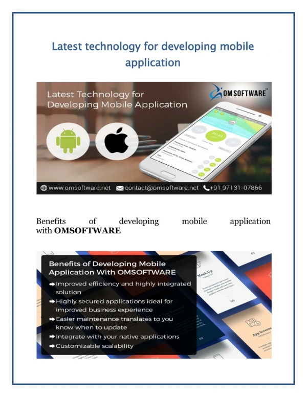
Developing for Mobile
E N D
Presentation Transcript
Developing for Mobile Jackie Calapristi
Agenda • Why you should go mobile • Mobile Design Options • Responsive Design • Tips & Tools to Help You Build • Meta Viewport Tag • Media Queries • A Word on HTML5 • Best Practices for all Mobile Design
Why you should go mobilefacts and figures • 83 million people on mobile web • Smartphones now outsell PCs • Mobile websites reach all audiences, apps do not • Website mobile traffic grew by 50-100% this year • Your website likely is impossible to use on mobile • Don’t get left behind
Mobile Web Design options • Responsive Web Design • Separate Mobile Specific Site • Native App
Responsive designA closer look • Responsive Design-Sasquatch! • Client-side innovation, the browser size determines the page • Server-side technology, the server detects all environment rules
Determining User Mobile DeviceNo simple task! • Server-Side • Not in HTTP Request • PHP and HTTP Accept Code • Client-Side • Media Queries • Examine User-Agent String • .NET IsMobileDevice property • Not Reliable • $$$$ • Dedicated Device Detection Product https://deviceatlas.com/
Tools & Tips for ResponsiveDesign • Test with Mobile Emulators • Opera • Use Responsive Frameworks • Twitter Bootstrap • Foundation • Skeleton • Responsive Website Tutorials • jQuery Plugins • CSS3 • JavaScript
Meta Viewport Definition: A phone browser’s visible screen area What it looks like: <meta name="viewport" content="width=device-width, initial-scale=1, maximum-scale=1, user-scalable=yes "> Purpose: Set’s the viewport width and initial-scale on mobile devices Features: • initial-scale=1, maximum-scale=1Renders the page 100% • user-scalable=yes Allows user to zoom
Media Queries Definition:CSS3 module to define styles for screen and print media types What it looks like: @media screen(min-width: 700px) and (max-width: 800px), handheld and (orientation: landscape) { ... } Purpose:Tailored CSS for multiple viewport sizes and devices Features: • (min-width: 700px) and (max-width: 800px ) Renders for screen with this size viewport • Screen, Handheld Adjusts for screens and for handheld devices
Using an online tutorialsteps with code handout • Add a Meta Viewport • <meta name="viewport" content="width=device-width, initial-scale=1, maximum-scale=1"> • For CSS: Use percentages rather than fixed widths • Add multiple Media Queries for different screen sizes: • @media screen and (max-width: 600px) { … }
That was a basic example • It will probably take a lot of time and testing to make sure your site is responsive across all platforms
A note on html5The flash killer & why you should use it • HTML5 = HTML + CSS + JS • Full mobile/cross browser support • Meta Tags: • Viewport • Full screen browsing mode • Add as Home Screen Icons • Your Website ~ Native App! • Better User Interactions • Cleaner Code (Ex: Class/IDs become tags, one line for animations) • <!DOCTYPE HTML>
Conclusion • One size does not fit all • Many Options for Mobile development • Many Resources, too! • Be sure to utilize Emulators, Templates, HTML5 and Best Practices