Designing Effective PowerPoint Presentations: Tips for Color, Font, and Content
90 likes | 208 Vues
Learn how to create engaging PowerPoint presentations by optimizing color choices, font sizes, and content per slide. Avoid common mistakes and keep your audience engaged by following these simple guidelines.

Designing Effective PowerPoint Presentations: Tips for Color, Font, and Content
E N D
Presentation Transcript
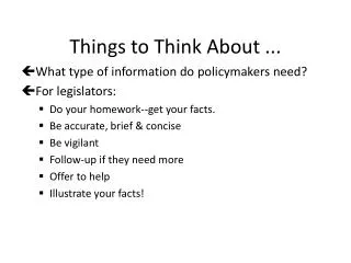
A Few Things to Think About When You Design Your PowerPoint Presentation
Color • Use colors that people can read.
Not a Good Choice • If you use a light color font with a light background, people can’t read it easily. • If you use a light color font with a light background, people can’t read it easily. • If you use a light color font with a light background, people can’t read it easily. • If you use a light color font with a light background, people can’t read it easily.
Not a Good Choice • If your text is dark and your background is dark, your readers will have a hard time reading your notes! • If your text is a little dark and your background is a little dark, your readers will have a hard time reading your notes! • If your text is dark and your background is a little dark, your readers will have a hard time reading your notes! • If your text is very dark and your background is very dark, your readers will have a hard time reading your notes!
The Best Choice • Use contrasting colors (dark on light or light on dark), so your readers can see your message clearly.
Font and Font Size • Last week we talked about fonts. Rememberthat you canchangethe font sizein a slide. • Be careful: If you use a really small font size, people can’t read it. • Be careful: if you use a really fancy font, people might have a problem reading it!
Words Per Slide • A PowerPoint presentation is like an outline. • Don’t use a lot of words. You will say a lot of things to your audience that they won’t see on the screen. That’s why you are there!
Don’t Do This! • If there are many, many words on your slide, it makes the slide look “busy”. You don’t want to have paragraphs on a slide, for example. You don’t always even want sentences. Just a few “Key Words” (like a computer search!) to remind your audience of what is important. You, the presenter, the human being, are more important than your beautiful slides. (Really!). You need to know what you are talking about. You should not look at your slides a lot! Never, ever stand with your back to your audience reading a slide. The slides are not there to help you. They are there to help your audience understand you. I have written a lot of words on this slide so you will see that you do NOT want to do this! Just a few bullet points with a few words or maybe a few words with an image or two.
Remember: • Don’t read the screen! Look at the people you are talking to!
