Download
1 / 63
630 likes | 660 Vues
Learn common mistakes in graphics, such as excess information, multiple scales, and incorrect line usage. Understand the importance of clear scales, proper legends, and avoiding misleading elements. Improve your data visualization for impactful presentations.

E N D
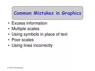
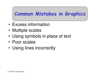
Common Mistakes in Graphics • Excess information • Multiple scales • Using symbols in place of text • Poor scales • Using lines incorrectly
Excess Information • Sneaky trick to meet length limits • Rules of thumb: • 6 curves on line chart • 10 bars on bar chart • 8 slices on pie chart • Extract essence, don’t cram things in
What’s ImportantAbout That Chart? • Times for cp and rcp rise with number of replicas • Most other benchmarks are near constant • Exactly constant for rm
Multiple Scales • Another way to meet length limits • Basically, two graphs overlaid on each other • Confuses reader (which line goes with which scale?) • Misstates relationships • Implies equality of magnitude that doesn’t exist
Using Symbolsin Place of Text • Graphics should be self-explanatory • Remember that the graphs often draw the reader in • So use explanatory text, not symbols • This means no Greek letters! • Unless your conference is in Athens...
Poor Scales • Plotting programs love non-zero origins • But people are used to zero • Fiddle with axis ranges (and logarithms) to get your message across • But don’t lie or cheat • Sometimes trimming off high ends makes things clearer • Brings out low-end detail
Using Lines Incorrectly • Don’t connect points unless interpolation is meaningful • Don’t smooth lines that are based on samples • Exception: fitted non-linear curves
Pictorial Games • Non-zero origins and broken scales • Double-whammy graphs • Omitting confidence intervals • Scaling by height, not area • Poor histogram cell size
Non-Zero Originsand Broken Scales • People expect (0,0) origins • Subconsciously • So non-zero origins are a great way to lie • More common than not in popular press • Also very common to cheat by omitting part of scale • “Really, Your Honor, I included (0,0)”
The Three-Quarters Rule • Highest point should be 3/4 of scale or more
Double-Whammy Graphs • Put two related measures on same graph • One is (almost) function of other • Hits reader twice with same information • And thus overstates impact
OmittingConfidence Intervals • Statistical data is inherently fuzzy • But means appear precise • Giving confidence intervals can make it clear there’s no real difference • So liars and fools leave them out
Confidence Intervals • Sample mean value is only an estimate of the true population mean • Bounds c1 and c2 such that there is a high probability, 1-a, that the population mean is in the interval (c1,c2): Prob{ c1 < m < c2} =1-awhere a is the significance level and100(1-a) is the confidence level • Overlapping confidence intervals is interpreted as “not statistically different”
Reporting Only One Run(tell-tale sign) Probably a fluke(It’s likely that withmultiple trials this would go away)
1960 1980 Scaling by HeightInstead of Area • Clip art is popular with illustrators: Women in the Workforce
The Troublewith Height Scaling • Previous graph had heights of 2:1 • But people perceive areas, not heights • So areas should be what’s proportional to data • Tufte defines a lie factor: size of effect in graphic divided by size of effect in data • Not limited to area scaling • But especially insidious there (quadratic effect)
1960 1980 Scaling by Area • Here’s the same graph with 2:1 area: Women in the Workforce
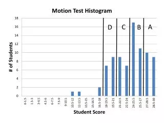
Histogram Cell Size • Picking bucket size is always a problem • Prefer 5 or more observations per bucket • Choice of bucket size can affect results:
Histogram Cell Size • Picking bucket size is always a problem • Prefer 5 or more observations per bucket • Choice of bucket size can affect results:
Histogram Cell Size • Picking bucket size is always a problem • Prefer 5 or more observations per bucket • Choice of bucket size can affect results:
Special-Purpose Charts • Histograms • Scatter plots • Gantt charts • Kiviat graphs
Tukey’s Box Plot • Shows range, median, quartiles all in one: • Variations: minimum quartile median quartile maximum
Scatter Plots • Useful in statistical analysis • Also excellent for huge quantities of data • Can show patterns otherwise invisible
Gantt Charts • Shows relative duration of Boolean conditions • Arranged to make lines continuous • Each level after first follows FTTF pattern
Gantt Charts • Shows relative duration of Boolean conditions • Arranged to make lines continuous • Each level after first follows FTTF pattern F T F T T F F T T F F T T F
Kiviat Graphs • Also called “star charts” or “radar plots” • Useful for looking at balance between HB and LB metrics HB LB
Useful Reference Works • Edward R. Tufte, The Visual Display of Quantitative Information, Graphics Press, Cheshire, Connecticut, 1983. • Edward R. Tufte, Envisioning Information, Graphics Press, Cheshire, Connecticut, 1990. • Edward R. Tufte, Visual Explanations, Graphics Press, Cheshire, Connecticut, 1997. • Darrell Huff, How to Lie With Statistics, W.W. Norton & Co., New York, 1954
Ratio Games • Choosing a Base System • Using Ratio Metrics • Relative Performance Enhancement • Ratio Games with Percentages • Strategies for Winning a Ratio Game • Correct Analysis of Ratios
Choosing a Base System • Run workloads on two systems • Normalize performance to chosen system • Take average of ratios • Presto: you control what’s best