Monitoring Improvement Using a Run Chart
Monitoring Improvement Using a Run Chart. Priscilla Swanson, RN, CCM, CHC, CPHQ Nancy Siegel, MPH, PA-C June 10, 2013 QHOC meeting. Difference between a Run Chart and a Control Chart. Both plot a single line of data over time Run charts are the simplest of charts and show a general picture

Monitoring Improvement Using a Run Chart
E N D
Presentation Transcript
Monitoring Improvement Using a Run Chart Priscilla Swanson, RN, CCM, CHC, CPHQ Nancy Siegel, MPH, PA-C June 10, 2013 QHOC meeting
Difference between a Run Chart and a Control Chart • Both plot a single line of data over time • Run charts are the simplest of charts and show a general picture • Run charts can easily show amount of variation • A control chart has an upper and lower limit with a center line; the lines are calculated based on data being plotted • A control chart provides more specific information and insight into your process
Why Use a Run Chart? • Make your team’s aim tangible • Understand process variation • Analyze data for patterns • Monitor progress over time • Show off your results
What Is a Run? • A sequence of consecutive points that all lie on the same side of the line • Disregard points exactly on the line
Counting Runs Source: IHI.org
Run Chart Decision Rules that Signal a Change • Rule 1 – Shift; 6 or more consecutive points above or below the median. Skip all values that fall on the median. • Rule 2 – Trend; 5 or more consecutive points all going up or all going down. Ignore repeating values. Source: IHI.org
Run Chart Decision Rules that Signal a Change • Rule 3 – Number of runs; are there too many or too few runs? Disregard the points exactly on the line. Tabled critical values are used to determine if too many or too few runs exist. • Rule 4 – Astronomical point; a dramatically different value. Source: IHI.org
Example Run Chart Source: IHI.org
How Many Runs? • How many runs should we expect if the values all come from the same unchanged process with the baseline median? • If there are fewer runs (or more), we have a signal that our change has made a difference in the process. • Reference a table to determine expected number of runs. Source: IHI.org
Expected Runs Table Source: IHI.org
How to Determine the Median • Write all the values in order in a continuous list from low to high. Find the middle value by crossing off the highest value, then lowest, then next highest, etc. The one value left is the median. • If two values are left (even number of values), find the halfway distance between the two.
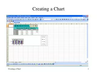
How to Construct a Run Chart • Plot time along the x-axis • Plot the variable you are measuring along the y-axis • Label both the x and y axes and give the graph a useful title • Calculate and place a median of the data on the run chart • Add other information as needed
Resources • www.ihi.org • Brassard, 2010. The Memory Jogger, Tools for Continuous Improvement and Effective Planning. • Rocco J Perla, Lloyd P Provost, Sandy K Murray. “The run chart: a simple analytic tool for learning variation in healthcare processes.” BMJ Quality Safety 2011; 20:46-5.