Download

1 / 43
430 likes | 561 Vues
Learn how to effectively use Excel to create scatter plots and add trendlines with this comprehensive guide. Begin by entering your data points and selecting the right chart type. Discover how to customize titles and axis labels to enhance your graphs. This tutorial covers adding multiple data series, adjusting numerical ranges, and modifying graph layouts to suit your needs. With step-by-step instructions, you'll gain the essential skills to visualize your data effectively. Try creating a complex graph on your own and have fun with Excel!

E N D
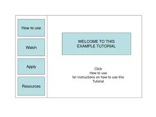
How to use EXCEL By: Ms. Lieu
3. Move arrow to the top. Click on the tab “INSERT”. Then click on “SCATTER.” Pick the first box below.
6. Click on the first button for chart layout. This is to add the title and legend.
If you can on any of the numbers you can change the range of numbers used. Or you can get rid of the lines on the graph too. 7. Fix by typing in the correct axis titles. You can change the title too.
8. Adding a trendline (y=mx +b). Right click on any one point. A window should appear and click on “Add trendline.”
9. A window will appear. Click the graph that fits “best”. USUALLY LINEAR. Near the bottom click display equation and more.
Congratulations!!! You have learned the basics how to use Excel to graph. Now try on your own a more complicated graph. HAVE FUN!!!
Outline • Making Bar Graphs • Making Scatter Plots – 1 series • Making Scatter Plots – Multiple Series
Select Insert Graph (Scatter Plot) • Select “Insert” tab • Select Scatter -You may choose to have points connected by curved or straight lines
Insert Graph Once you select your type of graph, you will get a box that will likely be empty but may have a graph depending on what you had selected prior to inserting the graph
Select Your Data • Select the graph area • Click on the design tab under chart tools • Click on select data Graph area
Select Your Data 1. Click on Add series* * If any data was previously selected, select that series and click remove
Select x-axis data for series 1 Do not select the title, just your data points
1. Once series 1 is added, you will return to the previous box, click “Add” to add another series
Select x-axis data for series 2 Note how the x-axis is the same for this and all series of this graph
1. Once series 2 is added, you will return to the previous box, click “Add” to add another series
1. Once series 3 is added, you will return to the previous box, click “Add” to add another series
Once you have added all series click “ok” and the “Select Data Source” box will close.
Add a title to your graph Under the “Layout” tab in Chart tools, select “Chart Title” and then “Above Chart”
Add a title to your graph A title box, like the one shown here, will appear above your graph
Label the x-axis Under the “Layout” tab in “Chart tools”, select “Axis Titles”, then “Primary Horizontal Axis Title” and “Title Below Axis”
Label the x-axis A title box, like the one shown here, will appear below the x-axis
Label the x-axis Type in your x-axis title
Label the y-axis Under the “Layout” tab in “Chart tools”, select “Axis Titles”, then “Primary Vertical Axis Title” and “Rotated Title”
Label the y-axis A title box, like the one shown here, will appear next to the y-axis
Label the y-axis Type in your y-axis title
And you are done!!! • To copy your graph into a word document, right click on the graph and select “Copy.” In your word document, right click on the blank page and select “Paste” • PRINT OUT YOU GRAPH AND TURN IN.