Interactive Artistic Brochure Design | Kalinga Font Branding
The brochure created by Liam Walker features a square design with a fading light blue strip across the bottom on each page. With a focus on interactivity and artistic appeal, this brochure is intended to stand out and catch the eye of the reader. Inside, you will find small, zig-zagging quotes presented in a unique layout, giving it a modern and engaging feel. The use of the Kalinga font and a mixture of light blue and white text provides a balanced and visually appealing aesthetic. While the front cover showcases the brand's logo and a fountain pen image, the back page is kept simple with the same design element for consistency. Overall, this brochure is carefully crafted to be both stylish and professional, with a touch of creativity.

Interactive Artistic Brochure Design | Kalinga Font Branding
E N D
Presentation Transcript
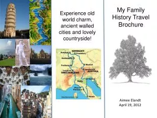
My Brochure Liam Walker
Overview • Above are images of the final drafts for the brochure I created. Ten pages in total, all of which are a square, 210mm/210mm, as I found out whilst doing some research that this size has a number of benefits, such as it being easy to hold, as well as being not too big that people won't be put off reading it, yet not too small that people would just throw it away. On top of this, due to its small size it would likely be put at the top of a pile of brochures, meaning it would be the first to catch the eye.
Front Cover • For the front cover I stuck to a simple design of the fading out, light blue strip across the bottom, with the logo of the brand standing out, which shows consistency within all of the pieces I've done so far. I put in an image of a fountain pen running off from the logo in order to give an artistic, stand out look to the cover, because obviously if the cover stands out and looks interesting or appealing it is more likely to catch attention.
Inside Content • For the content within the inside, I chose to keep to a style where one page has a title on it, whilst the parallel page has the information. I felt that with journalism going rapidly towards online and computerised pieces, that this would almost give a more interactive look to the piece. Almost like a web documentary, where you click on the different titles in order to see different pages. The information is small quotes going in a zig-zag, again to keep the eye interested, and I didn't want it to be an overly formal feel to the brochure as well as top-heavy with text.
Text • For the text itself I stayed with the Kalinga font, again to keep consistency, as it has been used in all other branding aspects so far. I made the background a light blue that fades out, the same as the strip previously used along the bottom of the page in other works and on the front cover to give the brochure some colour and prevent it being too dull and formal. However, I also used some white, very transparent but readable text on the background also, the text is simply journalistic quotes and fit the nature of the piece, rather than just random quotes pulled out of anywhere. It's done in the style that ShutterStock uses, however whereas theirs is for branding and copywrite/legal reasons, mine is simply to give the pages a little more of an interesting look, stand out more, and grab peoples attention.
References • Obviously the quotes are made up and none of the references are real, however if this was to be made into a real life thing, more in depth quotes would've been used with real references and probably more of them too.
Back Page • The final page, back page, I just left blank, as it's not going to be a page anyone really cares about, due to all of the relevant information being inside the brochure. However I did again use the faded light blue strip along the bottom, just like with the cover page in order to neaten the piece up and give it an actual ending rather than just a blank page, because I feel this shows I've put a lot of thought into the piece and makes it look more professional, and less rushed.