Introducing graphs
This guide introduces various types of graphs, tables, and charts for visualizing data, along with their features and suitable applications. Learn about the uses of pie charts, bar graphs, line graphs, flow charts, and maps, and explore the specific vocabulary associated with each type of graph. Enhance your data interpretation skills with this comprehensive overview.

Introducing graphs
E N D
Presentation Transcript
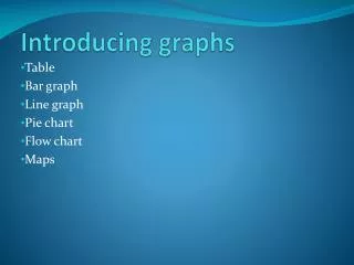
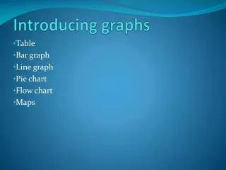
Introducing graphs Table Bar graph Line graph Pie chart Flow chart Maps
Features of Each Type of Graph • patterns not easily identified Table large capacity (eg. 50 rows on a A4) suits nominal as well as numerical data able to show cross-sectional & longitudinal data • Pie chart • nominal & numerical data (%) • suits cross-sectional data unless used in series • limited capacity
Bar graph /Line graph: Similarities: large capacity; suit cross-sectional & longitudinal data easy to identify patterns and trends Differences: bar graphs better for discrete data line graphs more for continuous data
Flow chart: for processes /procedures, usually sequential Maps: multi-directional; locations & directions
Language features: Flow chart: frequent use of conjunctions describing sequence Maps: use of vocab showing locations and directions • Some vocabulary only for line graphs, e.g. fluctuate, rise steadily, plummet, soar , hit a high/low, plateau, level off, decline gradually • Other vocabulary applicable to most graphs, e.g. rank first (ordinal), follow closely behind , account for, increase, decrease
3-Paragraph Schematic Structure Note: paragraphing not an IELTS requirement but for clarity.