Download
1 / 2
20 likes | 42 Vues
Color is undoubtedly the second most crucial aspect of mobile application after functionality. Every kind of interactions, starting from humans to computers, are highly based on how we connect with the graphical user interface elements.

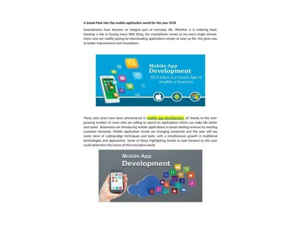
E N D
The Strength Of Color In Mobile App Development Color is undoubtedly the second most crucial aspect of mobile application after functionality. Every kind of interactions, starting from humans to computers, are highly based on how we connect with the graphical user interface elements. During this interaction process, color scheme plays an integral role, in guiding the viewers in seeing and interpreting the app's content. Users depend on the color scheme to interact with the app elements. This article highlights on the various factors a developer needs to consider before creating a specific color scheme for his app. Choosing a particular color strategy is a very challenging task, because there exists innumerable color combinations. You need to select an effective color theme for your mobile app that would sustain usability. Given below are some tips on creating an incomparable color scheme for your mobile app. • How to select colors: Color schemes cover all types of traditional, custom, monochrome, complementary and analogous color patterns and contrasts. Keeping your color palette simple is the key to a great app. Complicated color scheme appears overwhelming in the eye of the audience and the content becomes difficult to understand. In other words, using too many colors in a cluttered manner will mess up your design. Studies have revealed that most business owners prefer simple color combinations comprising of two or three colors for their mobile apps. • How to create a scheme: Take the help of 12-spoke color wheel from the internet to select the primary colors for your app. If you are a beginner, then you can also create new color schemes from a predefined scheme standards. This make the process smoother and easier for first-timers. • Choose monochromatic schemes: Color psychology says that monochromatic schemes are very pleasing to the eyes, specially when in blue and green hues. They are also most easy-to-create since all the colors present in the scheme are chosen from the same color base. Colors gel well in monochromatic schemes thus generating a soothing and clean visual effect. • Choosing complementary colors: Choosing contrasting colors is advisable in those apps where you need to attract the user's attention to a particular call-to-action. In such cases choose a principal color for the base (preferably a light color like light green) and a contrasting color for the notifications icons or call-to-action clicks. Complementary colors must be picked wisely in order to prevent the visual from getting jarred. • Ensure smooth text readability: Color theory is crucial in mobile app development because you have to ensure that the text is clear enough to give a smooth user
experience. Placing two colors with low contrast value can make the text illegible on mobile and tablet screens, specially when the users are using it outdoor under bright light or sun. Thus choosing high value contrasting colors is the best solution to prevent screen glare. Conclusion This article mostly highlights on the fundamentals of color theory in a mobile app design which would ensure best user experience. Understanding all the color schemes is a long term endeavor which one can achieve slowly and steadily by sharpening his usage skills. Web designers working for Wheelistic Web Design take up lots of user testing practices to understand the psychology of color thoroughly. Author Bio: The author of this article regularly writes on various web designing, web development and mobile app development topics. The author shows avid interest in graphics designing and works for https://www.wheelisticwebdesign.com/portfolio/.