Download

1 / 7
70 likes | 187 Vues
Smartphone are the most common hand-held devices used these days. A recent research stated that in year 2015 there will be nearly 5 billion smart devices in the world. This clearly states that it has become quite important now to switch on responsive design, if you haven’t done it yet.

E N D
Why Use Responsive Web Design in 2015 Straight Up Marketing
With the easy availability of Smartphone and other Smart devices, the use of internet has shifted greatly from PCs to hand-held smart devices. A recent research states that in the year 2015, mobile devices will match the desktops in terms of internet usage. This clearly indicates that all online businesses must have a responsive web design which is compatible on all types of devices.
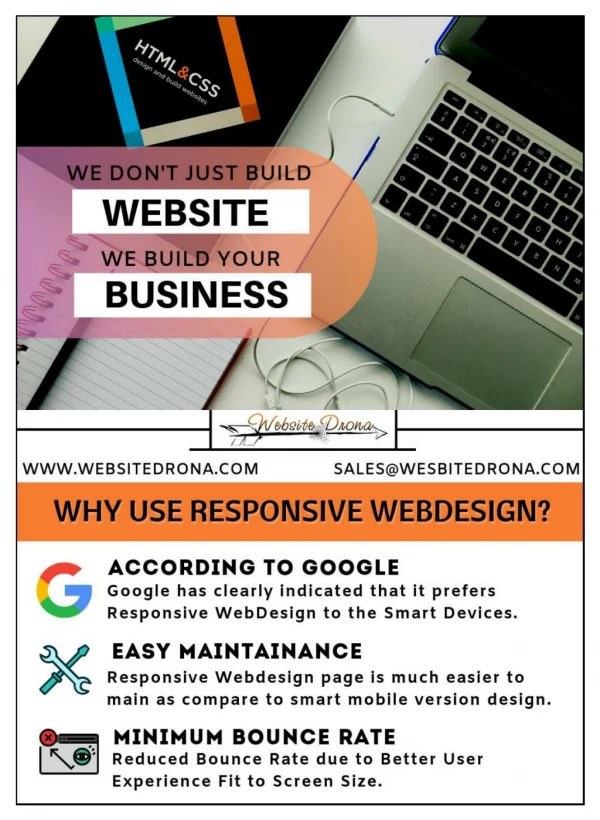
Few reasons that explain the importance of incorporating responsive web design: • Search Engine Optimisation (SEO) • The search engine giant Google clearly indicates that what you should do for search engine optimisation. Out of its numerous valuable suggestions on how to obtain high rankings, one of the most preferred is using responsive web design. The search h engine giant clearly sent a message that it gives importance to responsive designs on mobile templates.
A Better User Experience Results in Reduced Bounce Rate • Various features are offered by a responsive website when accessed on a mobile device. It automatically fits to the screen or loads to the mobile version. If the website is slow and mostly shows page errors then the visitors will return back to the search engine results page looking for alternative sites. This will increase the bounce rate of your website. However, this problem doesn’t arise if the site has a well built-in responsive design.
One SEO Campaign • You will have to manage two different websites, if you don’t choose a responsive design – one for mobile and other for desktop. This will increase the workload of managing two website and you have to manage two different SEO campaigns for each site. However, if you choose responsive web design, then you have to focus on functioning of a single website and a single SEO campaign will be sufficient.
Responsive Web Design – Easier Maintenance • Technically it is far easier to maintain a responsive website compared to maintain the mobile version of a non-responsive website. Smart devices are usually updated on a regular basis, meaning that you have to maintain your site every time to ensure proper working. This will make the maintenance of your mobile site expensive and tiresome. • Even a small negligence from your side will harm the site by increasing the bounce rate. Here, in this world of fast-paced tech development responsive web designis an ideal solution for your online business.
Thank You Straight Up Marketing