Insert Charts
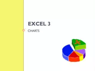
Learn how to insert F26 column, line, pie, bar, area, scatter, stock, surface, doughnut, bubble, and radar charts in PowerPoint 2007. These charts help display data effectively and make comparisons.

Insert Charts
E N D
Presentation Transcript
Multimedia Themes Illustrations Techniques Effects Animations Transitions Styles Ideas Options Welcome to PowerPoint 2007 Tutorial Series Insert Charts F26
Column charts Data that is arranged in columns or rows on a worksheet can be plotted in a column chart. Column charts are useful for showing data changes over a period of time or for illustrating comparisons among items. Line charts Data that is arranged in columns or rows on a worksheet can be plotted in a line chart. Line charts can display continuous data over time, set against a common scale, and are therefore ideal for showing trends in data at equal intervals. In a line chart, category data is distributed evenly along the horizontal axis, and all value data is distributed evenly along the vertical axis Pie charts Data that is arranged in one column or row only on a worksheet can be plotted in a pie chart. Pie charts show the size of items in one data series (data series: Related data points that are plotted in a chart. Each data series in a chart has a unique color or pattern and is represented in the chart legend. You can plot one or more data series in a chart. Pie charts have only one data series.), proportional to the sum of the items. The data points (data points: Individual values plotted in a chart and represented by bars, columns, lines, pie or doughnut slices, dots, and various other shapes called data markers. Data markers of the same color constitute a data series.) in a pie chart are displayed as a percentage of the whole pie PowerPoint Series
Bar charts Data that is arranged in columns or rows on a worksheet can be plotted in a bar chart. Bar charts illustrate comparisons among individual items. Area charts Data that is arranged in columns or rows on a worksheet can be plotted in an area chart. Area charts emphasize the magnitude of change over time, and can be used to draw attention to the total value across a trend. For example, data that represents profit over time can be plotted in an area chart to emphasize the total profit. By displaying the sum of the plotted values, an area chart also shows the relationship of parts to a whole. XY (scatter) charts Data that is arranged in columns and rows on a worksheet can be plotted in an xy (scatter) chart. Scatter charts show the relationships among the numeric values in several data series, or plots two groups of numbers as one series of xy coordinates. A scatter chart has two value axes, showing one set of numerical data along the horizontal axis (x-axis) and another along the vertical axis (y-axis). It combines these values into single data points and displays them in uneven intervals, or clusters. Scatter charts are commonly used for displaying and comparing numeric values, such as scientific, statistical, and engineering data. PowerPoint Series
Stock charts Data that is arranged in columns or rows in a specific order on a worksheet can be plotted in a stock chart. As its name implies, a stock chart is most often used to illustrate the fluctuation of stock prices. However, this chart may also be used for scientific data. For example, you could use a stock chart to indicate the fluctuation of daily or annual temperatures. You must organize your data in the correct order to create stock charts Surface charts Data that is arranged in columns or rows on a worksheet can be plotted in a surface chart. A surface chart is useful when you want to find optimum combinations between two sets of data. As in a topographic map, colors and patterns indicate areas that are in the same range of values. You can use a surface chart when both categories and data series are numeric values Doughnut charts Data that is arranged in columns or rows only on a worksheet can be plotted in a doughnut chart. Like a pie chart, a doughnut chart shows the relationship of parts to a whole, but it can contain more than one data series (data series: Related data points that are plotted in a chart. Each data series in a chart has a unique color or pattern and is represented in the chart legend. You can plot one or more data series in a chart. Pie charts have only one data series.). PowerPoint Series
Bubble charts Data that is arranged in columns on a worksheet so that x values are listed in the first column and corresponding y values and bubble size values are listed in adjacent columns, can be plotted in a bubble chart Radar charts Data that is arranged in columns or rows on a worksheet can be plotted in a radar chart. Radar charts compare the aggregate values of a number of data series (data series: Related data points that are plotted in a chart. Each data series in a chart has a unique color or pattern and is represented in the chart legend. You can plot one or more data series in a chart. Pie charts have only one data series.). You can embed and insert a chart in your presentation. Once embedded, the object becomes part of the destination file. Changes you make to the embedded object are reflected in the destination file When you embed data from a chart in PowerPoint, you edit that data in Office Excel 2007, and the worksheet is saved with the PowerPoint file. You can paste an Excel chart into your presentation and link to data in Excel When you copy a chart from Excel and paste it into your presentation, the data in the chart is linked to the Excel worksheet. If you want to change the data in the chart, you must make your changes to the linked worksheet in Excel The Excel worksheet is a separate file and is not saved with the PowerPoint file. PowerPoint Series
Embed and insert a chart in your presentation Do the following when you want to maintain the data that is associated with the chart in PowerPoint: In PowerPoint, click the placeholder (placeholders: Boxes with dotted borders that are part of most slide layouts. These boxes hold title and body text or objects such as charts, tables, and pictures.) that you want to contain the chart. On the Insert tab, in the Illustrations group, click Chart. In the Insert Chart dialog box, click a chart, and then click OK. Office Excel 2007 opens in a split window and displays sample data on a worksheet In Excel, to replace the sample data, click a cell on the worksheet, and then type the data that you want. You can also replace the sample axis (axis: A line bordering the chart plot area used as a frame of reference for measurement. The y axis is usually the vertical axis and contains data. The x-axis is usually the horizontal axis and contains categories.) labels in Column A and the legend (legend: A box that identifies the patterns or colors that are assigned to the data series or categories in a chart.) entry name in Row 1. PowerPoint Series
Note After you update the worksheet, the chart in PowerPoint will be updated automatically with the new data. In Excel, click the Microsoft Office Button , and then click Save As. In the Save As dialog box, in the Save in list, select the folder or drive that you want to save the worksheet to. Tip To save the worksheet to a different folder, select a different drive in the Save in list or a different folder in the folder list. To save the worksheet to a new folder, click Create New Folder . In the File name box, type a new name for the file. Click Save. In Excel, on the File menu, click Close F1Help should have more on creating an organizational chart etc PowerPoint Series
Under Chart Tools three options with various feature are available: Format lets you tweak the fills, styles and more… Layout lets you tweak all those labels, background etc. Design lets you choose layouts, type and styles PowerPoint Series
The End Thank you for watching this short Lesson This is just one of several free Lessons available All these Ideas are available on the Internet Come back soon! Creator: Frans Kruger 2009 http://outoppie-presentations.blogspot.com www.encryptologic.co.za







![[INSERT SPEAKER’S NAME] [INSERT TITLE] [INSERT DATE]](https://cdn3.slideserve.com/6899353/slide1-dt.jpg)


