Download
1 / 4
40 likes | 65 Vues
These mobile web design practices will make your business site look great and ensure that your visitors have a great UX regardless of whatever device they use.

E N D
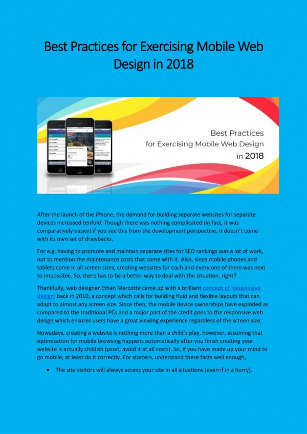
Best Practices Best Practices for Exercising Mobile Web for Exercising Mobile Web Design in 2018 Design in 2018 After the launch of the iPhone, the demand for building separate websites for separate devices increased tenfold. Though there was nothing complicated (in fact, it was comparatively easier) if you see this from the development perspective, it doesn’t come with its own set of drawbacks. For e.g. having to promote and maintain separate sites for SEO rankings was a lot of work, not to mention the maintenance costs that come with it. Also, since mobile phones and tablets come in all screen sizes, creating websites for each and every one of them was next to impossible. So, there has to be a better way to deal with the situation, right? Thankfully, web designer Ethan Marcotte came up with a brilliant concept of ‘responsive design’ back in 2010, a concept which calls for building fluid and flexible layouts that can adapt to almost any screen size. Since then, the mobile device ownerships have exploded as compared to the traditional PCs and a major part of the credit goes to the responsive web design which ensures users have a great viewing experience regardless of the screen size. Nowadays, creating a website is nothing more than a child’s play, however, assuming that optimization for mobile browsing happens automatically after you finish creating your website is actually childish (pssst, avoid it at all costs). So, if you have made up your mind to go mobile, at least do it correctly. For starters, understand these facts well enough, •The site visitors will always access your site in all situations (even if in a hurry).
•Small screen size greatly alters the way users interact with your web content, no matter how mobile-friendly site you make, it won’t be convenient enough when compared to full-screen features. The key here is to keep the mobile content clear and succinct but not at the cost of its quality. Moving on, I have presented 6 of the best mobile web design practices in this article for you to follow if providing an appealing and enjoyable content is your top priority as a site owner. 1.Homepage and navigation There are a few points to keep in mind while considering homepage and navigation for your ‘mobile-friendly’ site such as- •Keeping calls to action above the fold. •Making it easier for users to get back at the main page. •Keep your menus short and easily accessible. •Avoid unnecessary promotions as much as possible. 2.Create ‘responsive’ content Space is always at a premium when it comes to viewing content on smaller screen sizes. However, some common mistake rookies make at this point is trying to squish all the content to the mobile screen that was originally meant for the desktop. But you can avoid this by keeping in mind the different screen sizes from the very start and re-evaluating the existing content (based on their usefulness) accordingly. Next step involves narrowing down the essential content to the point where it becomes easily digestible and crafting concise and to-the-point content out of it. 3.Visible site search Never ever try to hide the search box in a menu as this is one of the first things users’ lookout for when they want information. While searching too, users generally lack the patience to scan through multiple pages for their desired info, so make browsing easy for your users by including misspelling corrections, suggesting related queries, auto-completing queries etc. You can further ease their browsing journey by placing filters above search results.
4.Fluid images and video One of the biggest benefits of using fluid images and videos for your mobile-friendly website is that they are non-negotiable for responsive design, not only in terms of design but cropping as well. Some such ways are- •Rendering images based on room availability in HTML container. •Crop images on smaller screens to retain their impact. •Use Scalar Vector Graphics to change resolution based on image paths rather than pixels. 5.Declutter your site If clutter is bad for your desktop then it is worse for your mobile where you don’t even have much screen space to begin with. Every button, image, icon that you add makes the screen that much complicated and in turn, clutter your interface while overloading your users with too much information. When designing your website for mobile, try to get rid of anything that isn’t absolutely necessary. In this way, by reducing clutter you will significantly improve comprehension. 6.‘Touch-friendly’ design Though featuring concise content and scaling down your website for different screen sizes is important, it isn’t enough for implementing a ‘touch-friendly’ design which requires the design to be navigated with person’s (clumsy) fingers. •Provide large and descriptive buttons for easy click and bump up the font sizes accordingly (at least 16 px). •Completely avoid pop-up boxes and certain effects that cannot be translated easily to mobile devices. Closing Thoughts:
Responsive web design isn’t just a matter of choice anymore since Google has recently prioritised the mobile-viewing experience of any site into its SEO algorithm but has become an essential element to include if you wish to see your site in search results.