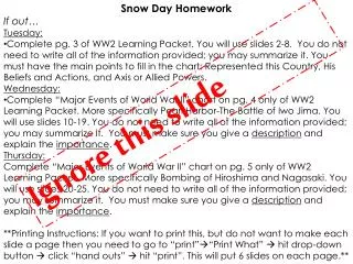
Download

1 / 16
160 likes | 294 Vues
How do you figure out if doing more homework means getting a higher test grade?. Should I do my homework?. In this lesson you will learn how to construct a scatter plot by graphing data. Graphing on a coordinate plane. x. x. x. y. y. y. 10 9 8 7 6 5 4 3 2 1. (2,3). y-axis.

E N D
How do you figure out if doing more homework means getting a higher test grade? Should I do my homework?
In this lesson you will learn how to construct a scatter plot by graphing data.
Graphing on a coordinate plane x x x y y y 10 9 8 7 6 5 4 3 2 1 (2,3) y-axis (4,1) (7,8) 1 2 3 4 5 6 7 8 9 10 x-axis
Does it matter which data goes on each axis? (3,4) is the same as (4,3)
Let’s collect some BIVARIATE data! Should I do my homework?
Scatter plot: a graph of points on a coordinate grid with each axis representing one of the two variables. Test score Hours watching TV
Create a scatter plot using the data provided. 100 90 80 70 60 50 40 30 20 10 Test score 1 2 3 4 5 6 7 8 9 10 Homework completed
Yes! Doing more homework means getting a higher test grade! I will do my homework!
In this lesson you have learned how to construct a scatter plot by graphing data.
Create a scatter plot to compare a person’s height to arm span. 2.0 1.8 1.6 1.4 1.2 1.0 0.8 0.6 0.4 0.2 Arm Span (m) 0.4 0.8 1.2 1.6 2.0 Height (m)
Given the data tables below, determine the best scale for the x-axis and y-axis, then construct the scatter plots.
Make a survey that collects two pieces of data. Ask 10 people and construct your own scatter plot with the results. Write a general statement about the relationship that the scatter plot shows.
Find a data table in your local newspaper that compares two pieces of data. Construct a scatter plot using the data found. Write a general statement about the relationship that the scatter plot shows.
What does this point on the scatterplot represent? 100 90 80 70 60 50 40 30 20 10 Test score 1 2 3 4 5 Hours watching TV
CRCT vs. Benchmark Create a scatter plot from the data given. Decide if it has a positive, negative, or no correlation. What is the line of best fit?