Designing Successful Posters: Engaging Visuals and Effective Messaging
10 likes | 104 Vues
Learn how to create impactful posters that grab attention and convey your message effectively. Discover tips on using visuals, text, layout, and color to make your poster stand out and engage viewers.

Designing Successful Posters: Engaging Visuals and Effective Messaging
E N D
Presentation Transcript
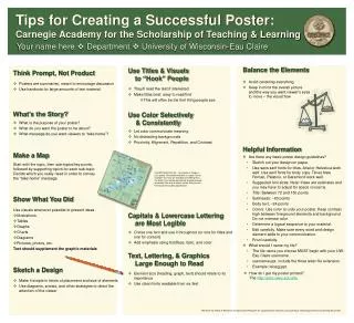
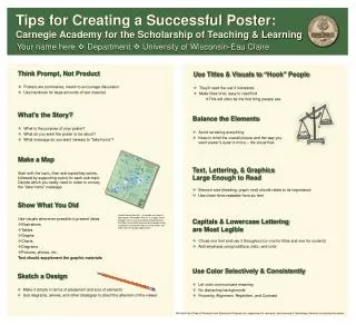
Tips for Creating a Successful Poster: Carnegie Academy for the Scholarship of Teaching & Learning Your name here Department University of Wisconsin-Eau Claire Use Titles & Visuals to “Hook” People • Posters are summaries, meant to encourage discussion • Use handouts for large amounts of text material • They’ll read the rest if interested • Make titles brief, easy to read/find • This will often be the first thing people see What’s the Story? Balance the Elements • What is the purpose of your poster? • What do you want the poster to be about? • What message do you want viewers to “take home”? • Avoid centering everything • Keep in mind the overall picture and the way you want viewer’s eyes to move – the visual flow Make a Map Text, Lettering, & Graphics Large Enough to Read Start with the topic, then sub-topics/key points, followed by supporting topics for each sub-topic. Decide which you really need in order to convey the “take home” message. Think Prompt, Not Product • Element size (heading, graph, text) should relate to its importance • Use clean fonts readable from six feet Show What You Did Insert/Picture/From file… to include an image in your poster. Remember that this is a large “sheet of paper” so if you are including something from the Web it may not be big enough or good enough resolution! Use only the best visuals that you can find to present quality appearance. Use visuals whenever possible to present ideas • Illustrations • Tables • Graphs • Charts • Diagrams • Pictures, photos, etc. Text should supplement the graphic materials Capitals & Lowercase Lettering are Most Legible • Chose one font and use it throughout (or one for titles and one for content) • Add emphasis using boldface, italic, and color Use Color Selectively & Consistently Sketch a Design • Let color communicate meaning • No distracting backgrounds • Proximity, Alignment, Repetition, and Contrast • Make it simple in terms of placement and size of elements • Use diagrams, arrows, and other strategies to direct the attention of the viewer We thank the Office of Research and Sponsored Programs for supporting this research, and Learning & Technology Services for printing this poster.